Bubble Map
What do you think of this template?

 (3.00/ 5)
3 ratings

 4 Slides
 File size: 16:9
 Fonts: Lato Black, Calibri
 Supported version
PPT 2010, PPT 2013, PPT 2016
Supported version
PPT 2010, PPT 2013, PPT 2016

Product details
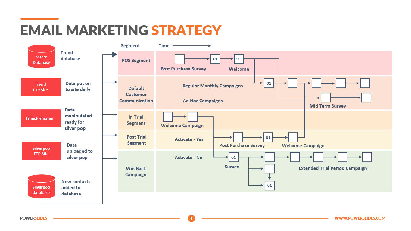
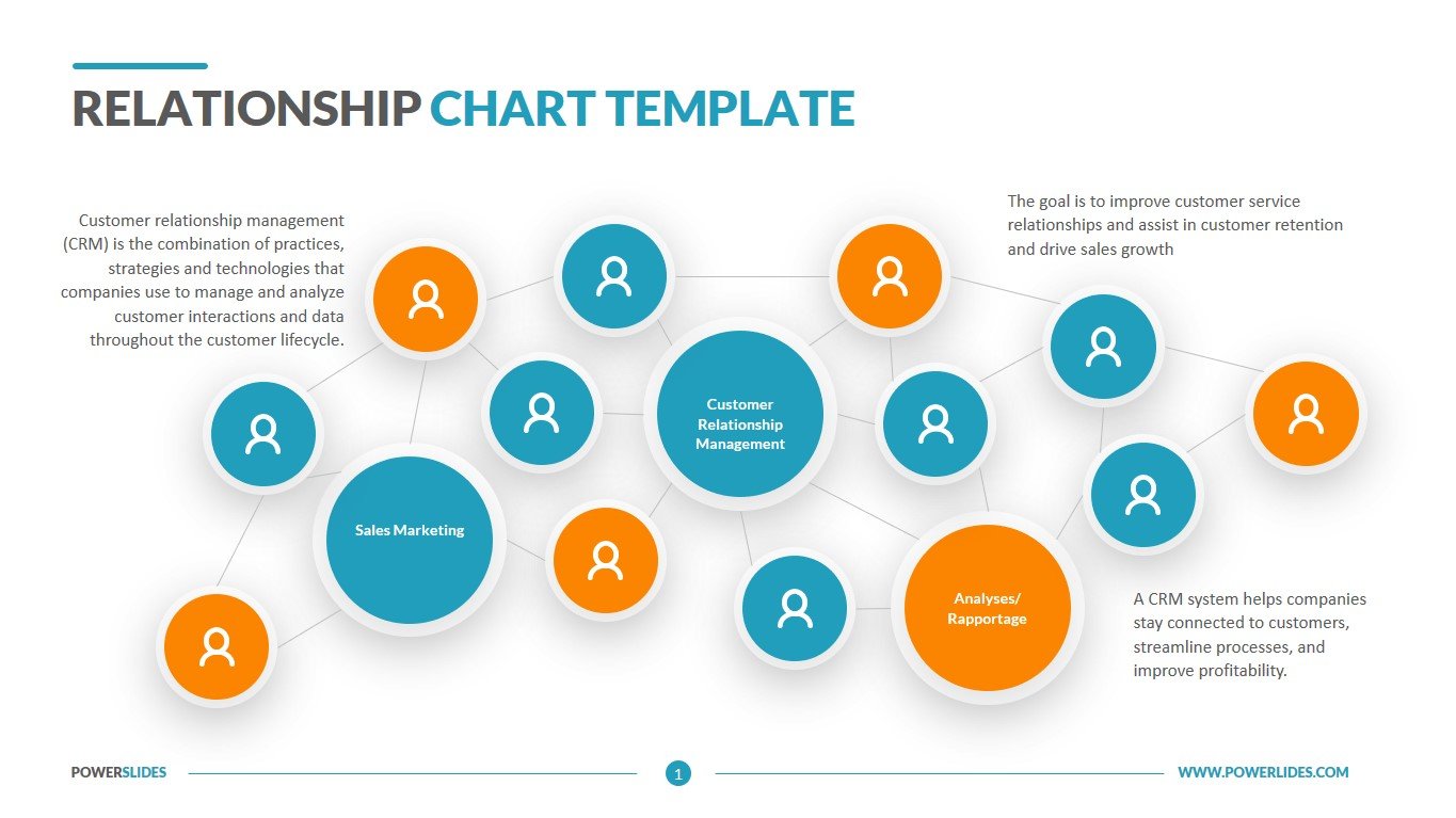
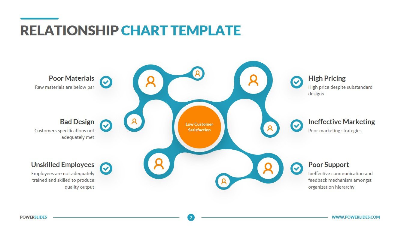
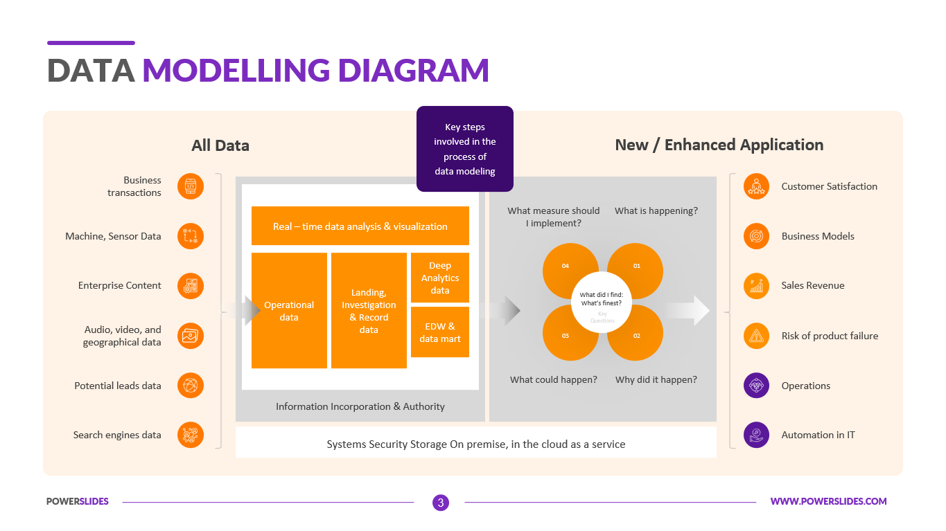
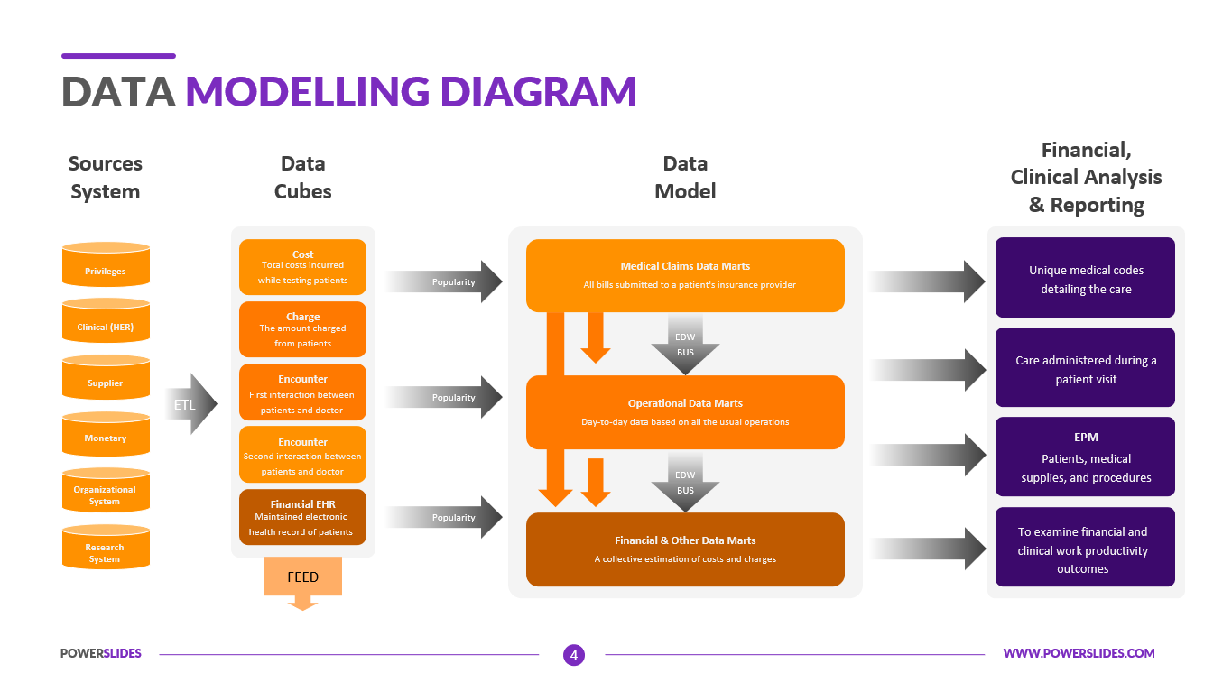
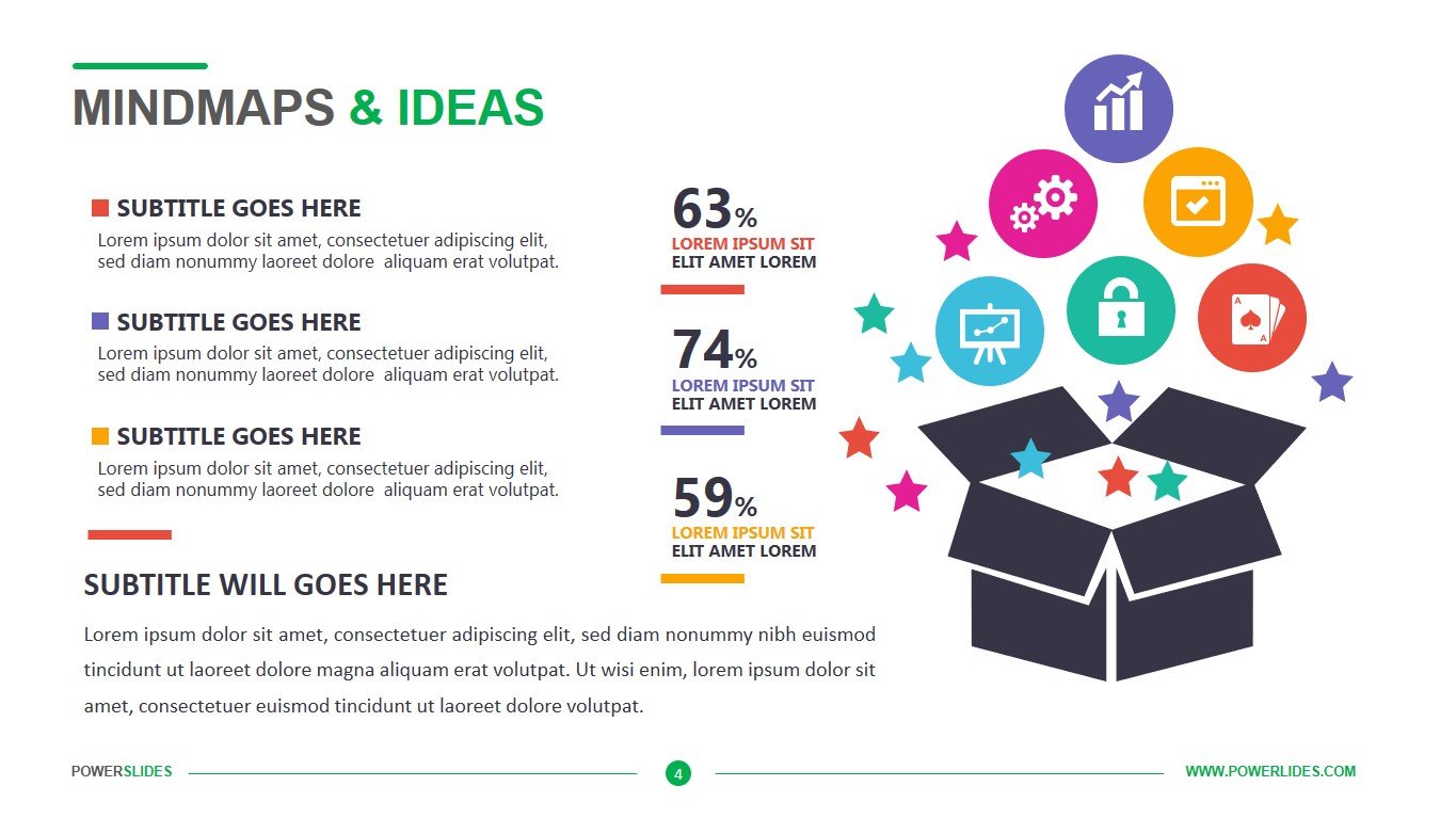
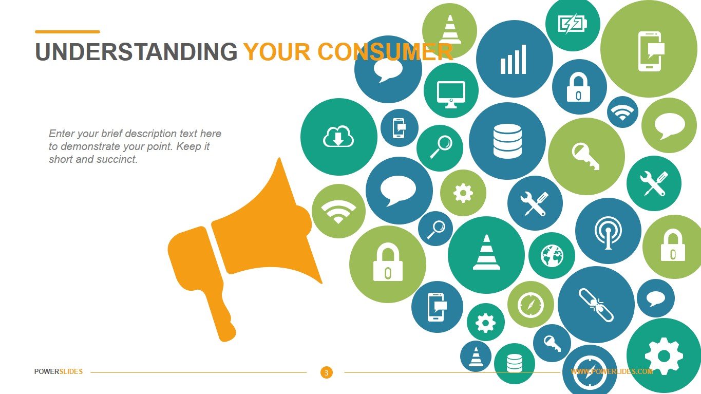
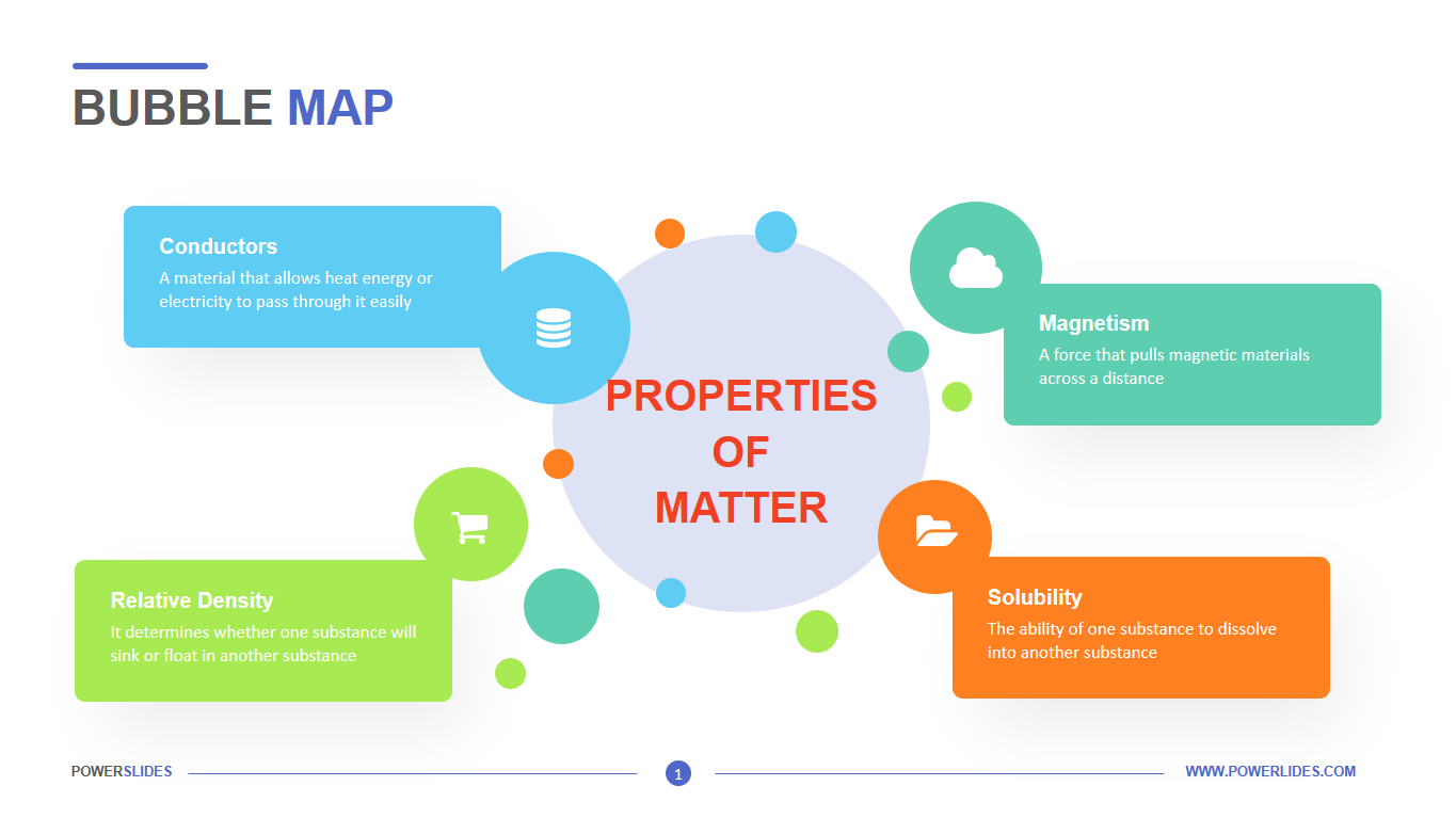
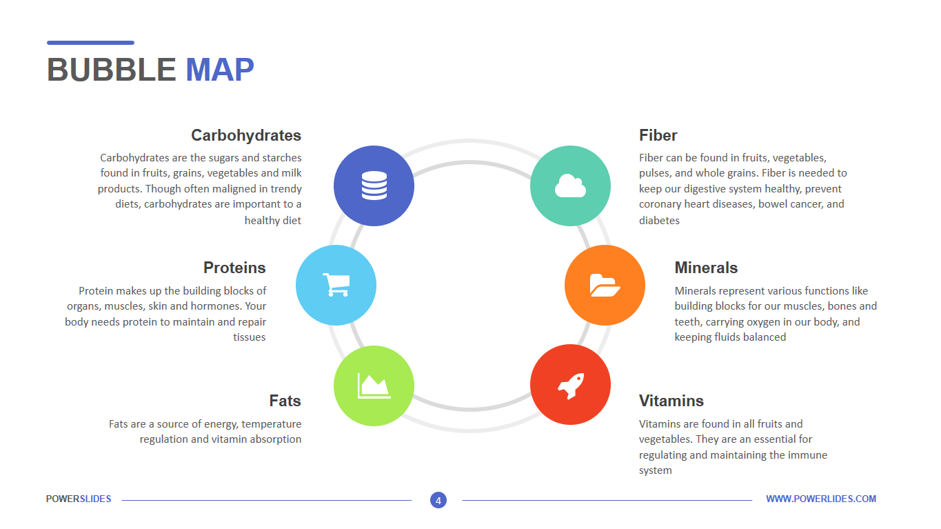
Bubble Maps are a simple, fast, and effective way to identify trends. They summarize your data by creating circles of different sizes that represent the value of information in each geographic area, by data category, or by the group. On a geographic map, the area represented by each bubble can range from the size of a zip code to an entire country. The larger the bubble, the higher the value of your data in this area. When you have thousands of rows of data in a spreadsheet, it can be difficult to understand and interpret. Bubble Maps help you discover new ideas in seconds by aggregating data. For example, you can represent bubbles on a map based on the number of customers in each city. Bubbles are also color-coded based on their overall meaning. For example, you can specify yellow for a smaller value and red for a larger value. This allows you to instantly compare regions and see. Depending on your goals, you can summarize anything. You can present data on the number of customers by region or their profitability, prior to customer social media preferences or a sample by age. Bubble maps are simple, which makes them easy to use for reports, presentations, and even embedded on a web page. Some of the other benefits of bubble maps are creating bubble maps from excel data, summarizing geographic regions of different sizes, customizing icons and colours, and visualizing sales revenue by region, high and low. You can also use bubble maps when comparing sales group data for different regions or managers. You can display circles to match the manager or region. Then, around each circle, display circles of different sizes and colours. The size of the circle will show the sales volume and the colour will correspond to the product group. Thus, it will immediately be seen which of the regions is the leader in sales, and which product is most in-demand in this region.
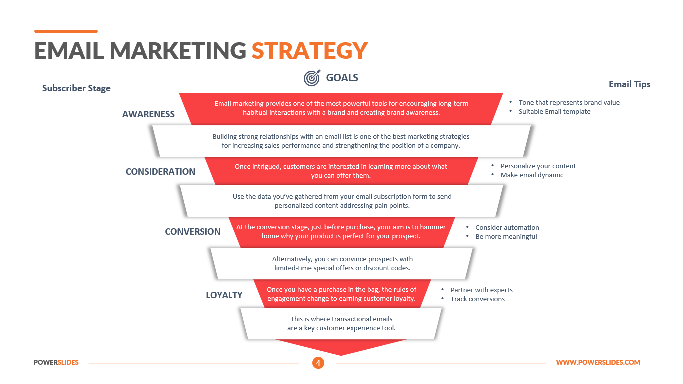
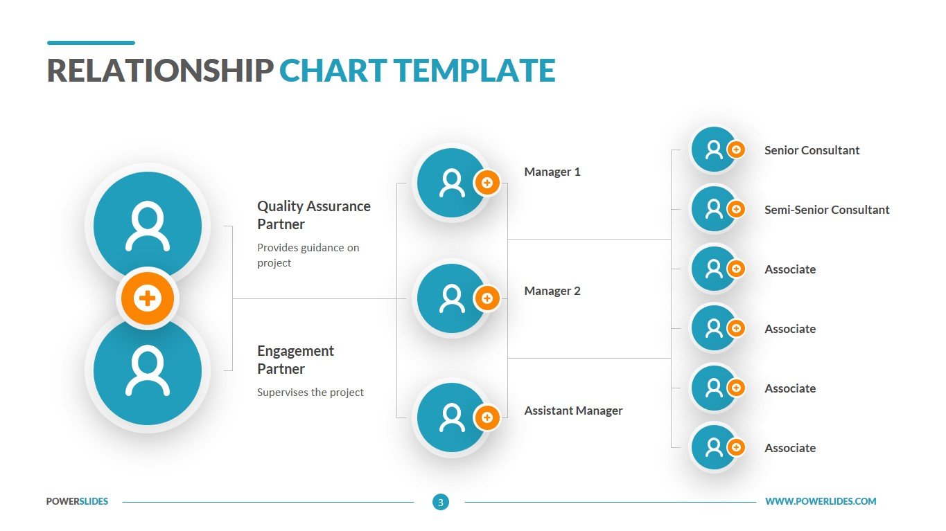
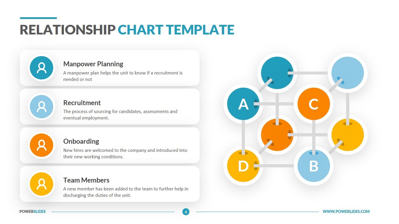
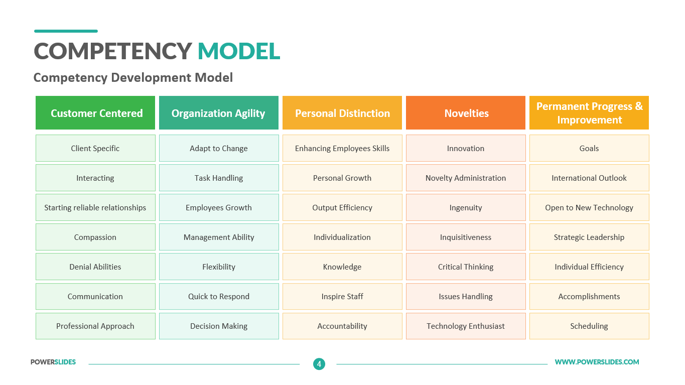
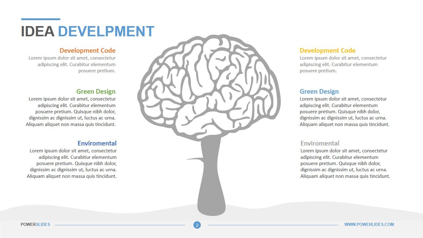
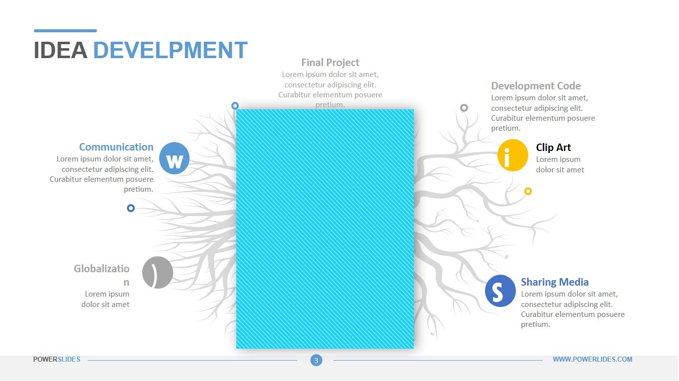
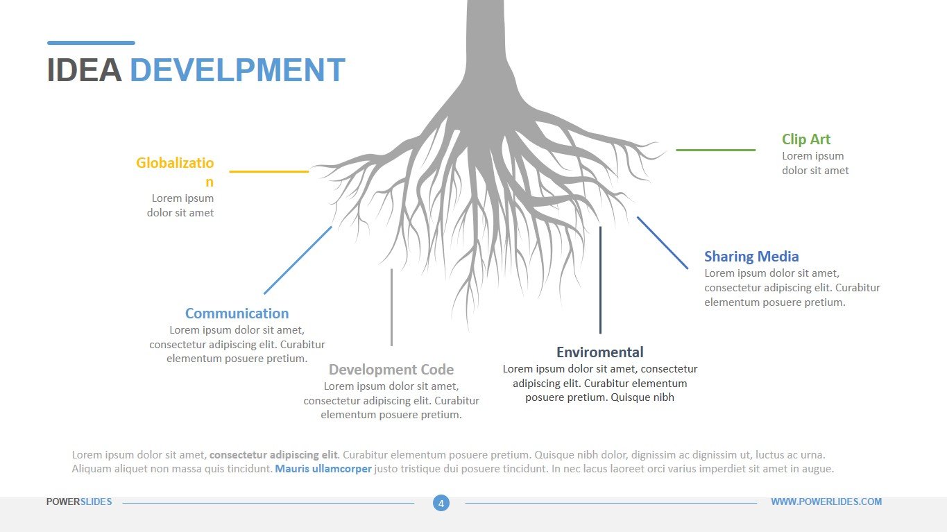
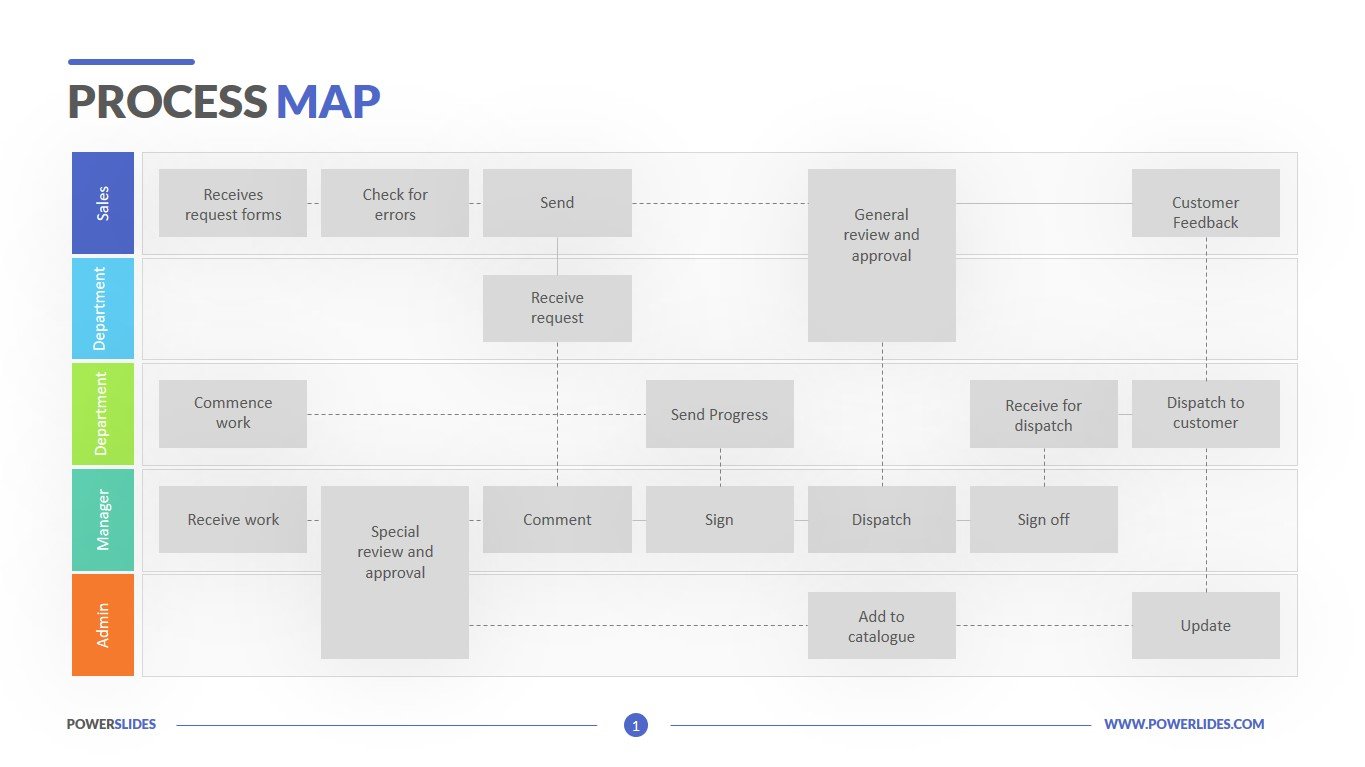
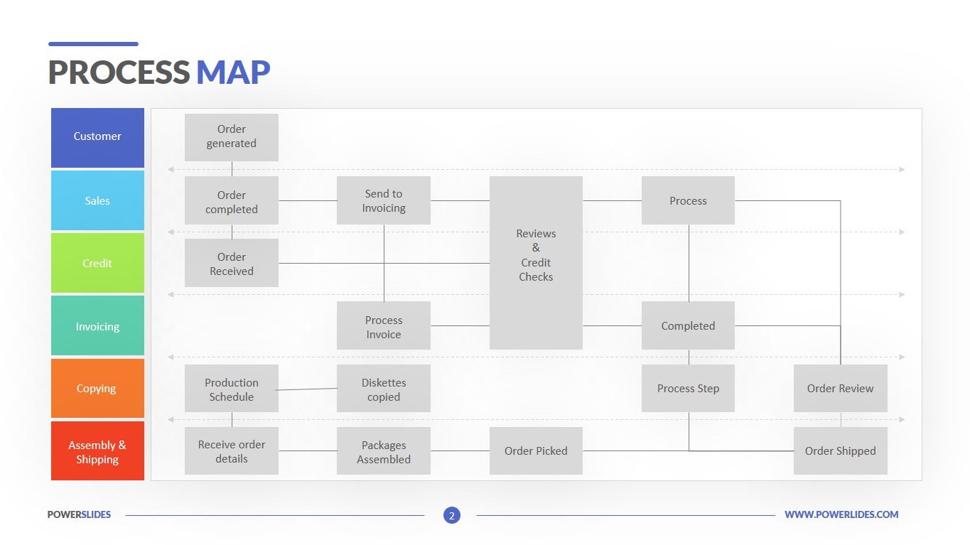
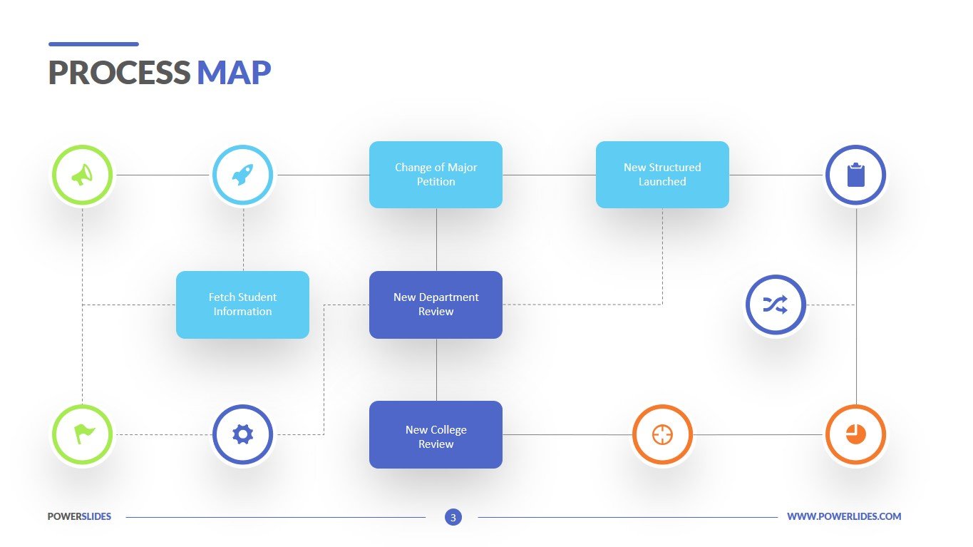
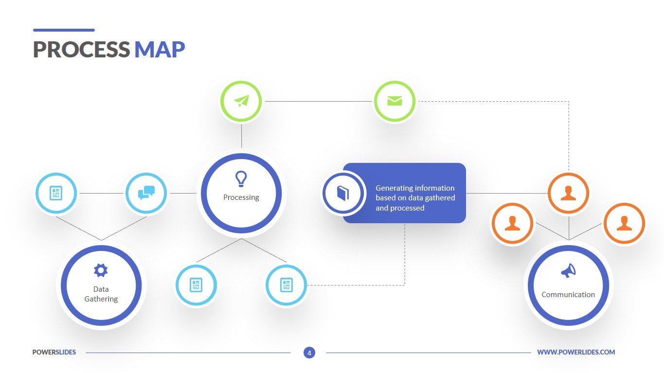
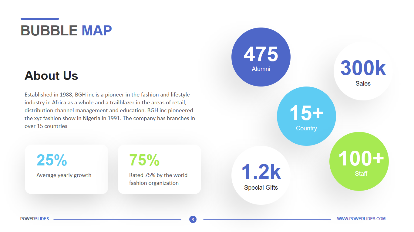
Bubble Map template consists of four professional slides. This template has all the tools you need to build a professional bubble map. All slides in the template are made in a bright colour scheme. If necessary, you can independently edit the slides of this template according to your needs. This template will be primarily useful for sales managers when analysing sales in regions. Also, this template can be used by marketers when preparing a report on the past advertising campaign. For example, you can indicate which advertising channels were involved and how each of them affected the sales of the product. The slides of this template can be used by public relations professionals when preparing a candidate’s campaign. The slides of this template can also be used by HR managers when analysing employee categories by age, education level, and years worked in the company.


