Box & Whisker Plot
What do you think of this template?

 (3.17/ 5)
19 ratings

 4 Slides
 File size: 16:9
 Fonts: Lato, Calibri
 Supported version
PPT 2010, PPT 2013, PPT 2016
Supported version
PPT 2010, PPT 2013, PPT 2016

Product details
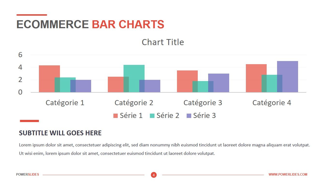
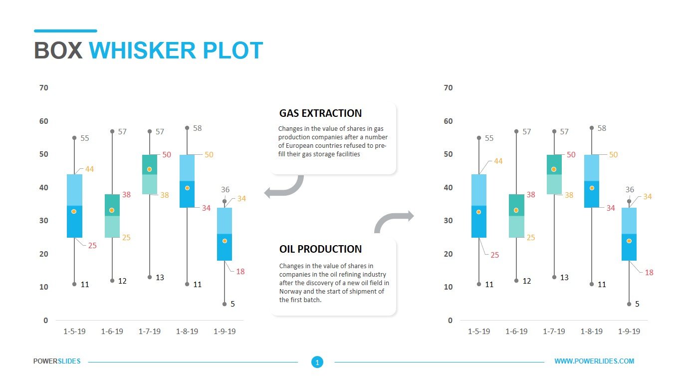
When working with large amounts of data, common visualization tools such as graphs and charts are not always lacking. Sometimes you need a tool with more fine tuning – box and whisker plot. A box and whisker plot is a way of summarizing a set of data measured on an interval scale. It is often used in explanatory data analysis. This type of graph is used to show the shape of the distribution, its central value, and its variability. This box and whisker plot template is specifically designed for business and corporate use to represent variations in a set of data. Consisting of four-slide, this powerpoint template is completely customizable. So that you can fill the data sets according to your need. It can also be used in research purposes as well as for organizational use. You can independently customize its color scheme to match your corporate colors.
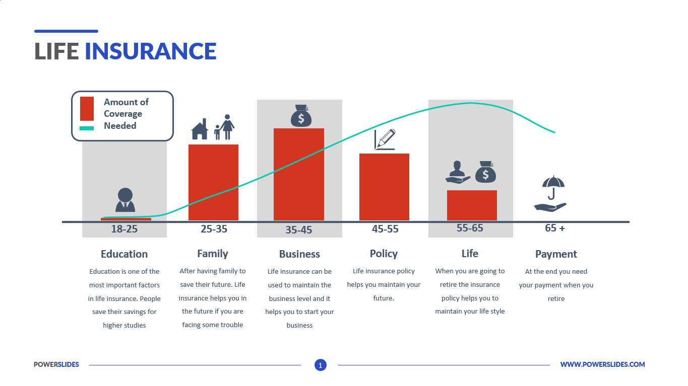
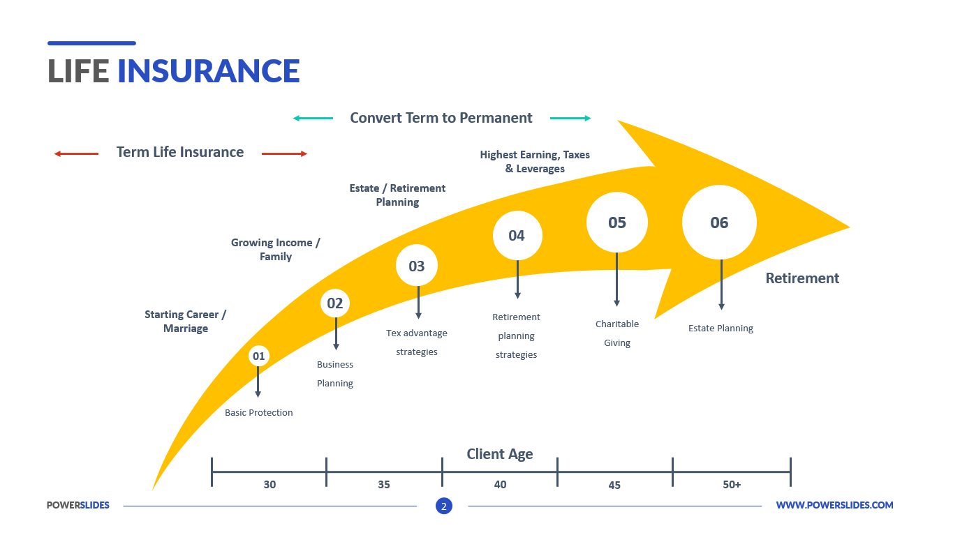
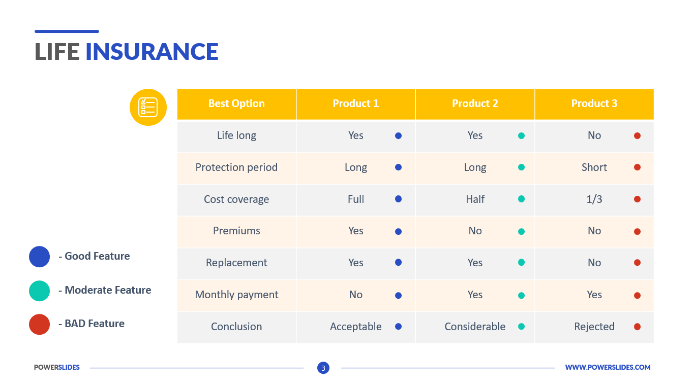
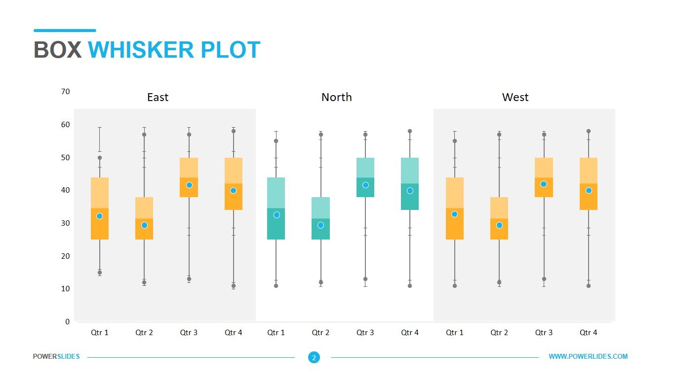
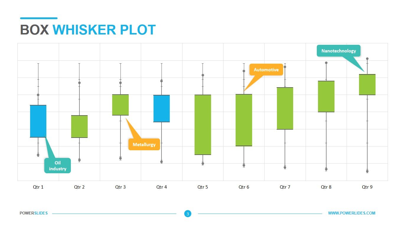
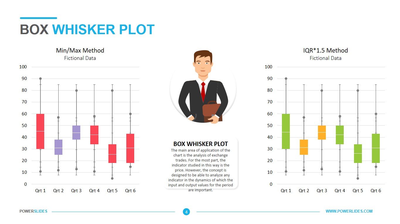
Let’s take a closer look at the Box & Whisker Plot template. The first slide consists of a combination of green and blue, 9 quartiles. With dialogue boxes at the top or bottom of every second quartile. This slide will be useful when working with large amounts of data. For example, you have a sample of supermarket sales in the last week. All products in this sample are divided into groups, and the groups, in turn, are divided into price categories – high, medium, low. This slide will allow you to present the distribution variances, which will help you further determine the necessary actions to increase sales. The second slide is a hybrid of comparison chart and box and whisker plot. With monthly divisions, you can represent the statistical data in the form of comparison of two years with descriptions alongside. You can use it when comparing the sales of two similar products, or your product and a competitor. This analysis will reveal what influences the increase in sales of the analyzed products. This slide can be used by the company’s financiers and economists for their daily work. The third slide consists of blue and turquoise colored, three groups of four quarters; East, North, and West. You can use it when comparing the three products. For example, financiers can use this slide to analyze the risks of three different investments in an enterprise’s cash. For example, when investing in new equipment that will allow you to get income in the long term. Or an investment in a risky venture with quick large profits, but at the same time having high risks. The fourth slide consists of two box and whisker plots. The first one being the Min/Max method fictional data and the second one being IQR*1.5 Method fictional data. The one on the left consists of bright red and purple colors with 6 quartiles and the one on the right consists of green and orange colors with 6 quartiles. There’s also a dialogue box in the middle for the explanation. This slide can be used by insurance professionals. You can use this slide to provide an analysis of the potential risks to different consumers. For example, create the likelihood of fire when using gas equipment at an enterprise or the risk of contracting a virus for a doctor in the infectious diseases department of a hospital.


