Data Charts
What do you think of this template?

 (2.00/ 5)
4 ratings

 4 Slides
 File size: 16:9
 Fonts: Lato Black, Calibri
 Supported version
PPT 2010, PPT 2013, PPT 2016
Supported version
PPT 2010, PPT 2013, PPT 2016

Product details
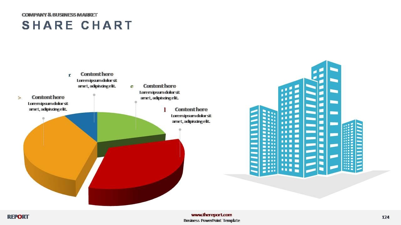
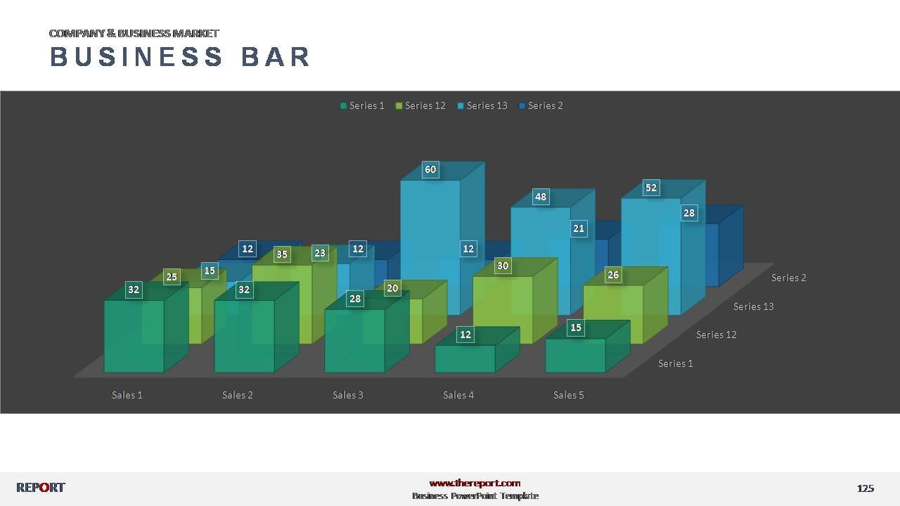
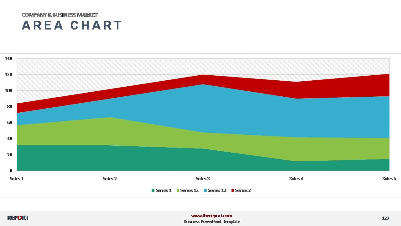
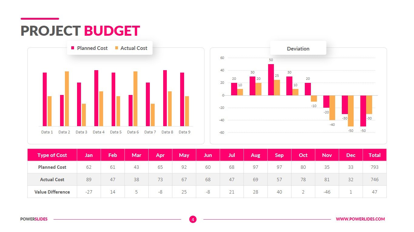
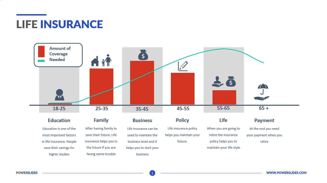
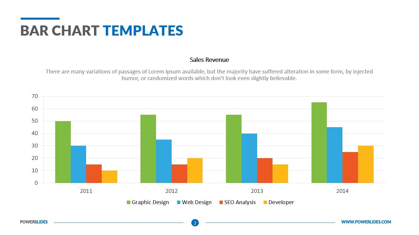
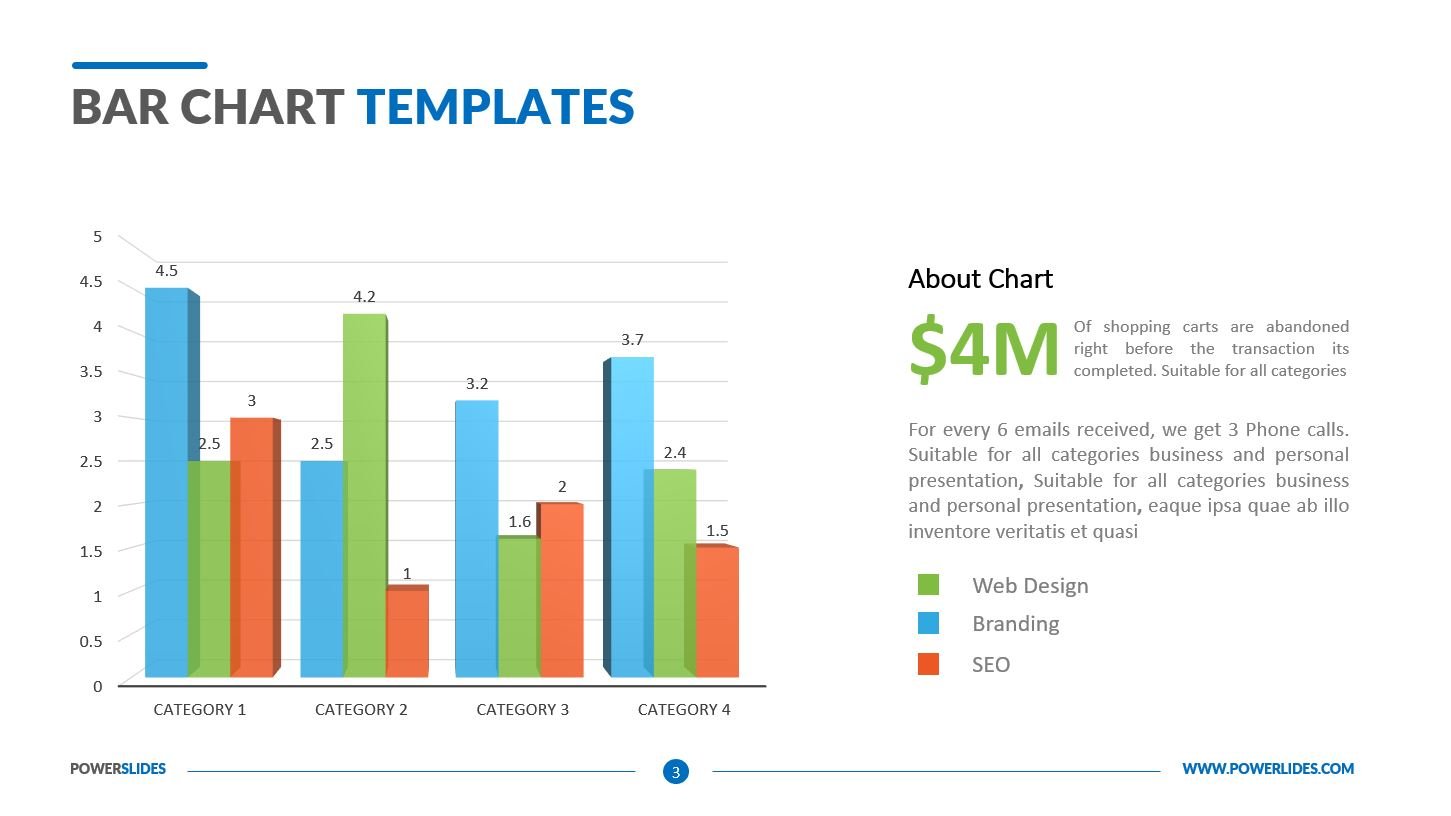
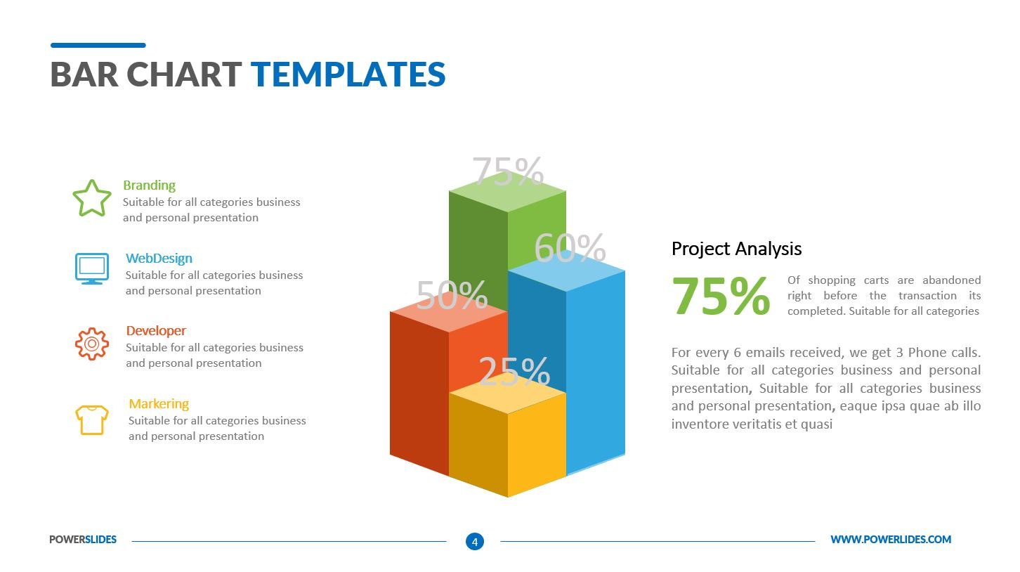
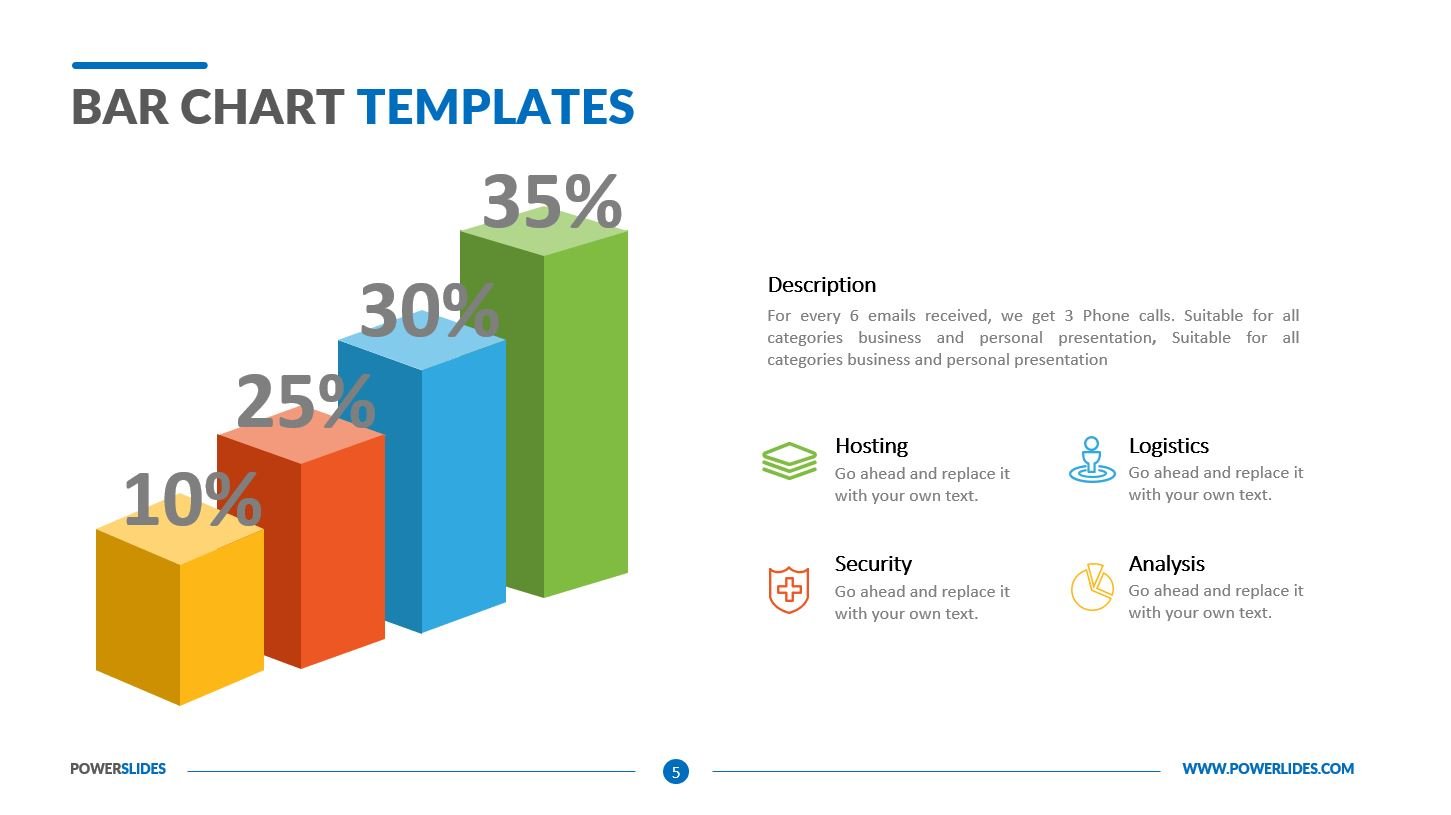
Many of them faced the need for analysis. You could do analysis in a month with a small number of indicators. This data can be relatively easy to tabulate and this information will be clear to your audience. But what if you analyse many indicators for a year? How to present them in a form understandable to the audience. To do this, you need to learn how to build charts. A chart is a visual presentation of data. A chart can convey what is usually a table with rows of numbers in a picture. This allows the viewer to quickly grasp comparisons and trends more easily than looking at the raw data. A bar chart shows the differences between categories or trends over time using the length or height of its bars. They may be shown using vertical or horizontal bars. Bar graphs have two axes. One axis shows categories, while the other a range of values. Clustered or grouped bar charts are similar to stacked bar graphs in that they let you show subcategories in addition to regular categories on your chart. When the bars you want to group are only loosely related, you will definitely want to use a clustered representation. Clustered bar graphs are also useful when you have more than 3 subcategories that are part of a whole. A pie chart is a graphic that shows the breakdown of items in a set as percentages by presenting them as slices of a pie. The key to a pie chart is that all of the slices must equal 100%. An area chart functions similarly to a line chart with values displayed over time. The purpose of the area chart is to help you compare two or more quantities as they make up part of a whole. It works well for showing a trend, for example if you wanted to compare which type of car sale contributes a bigger portion of your total sales over time.
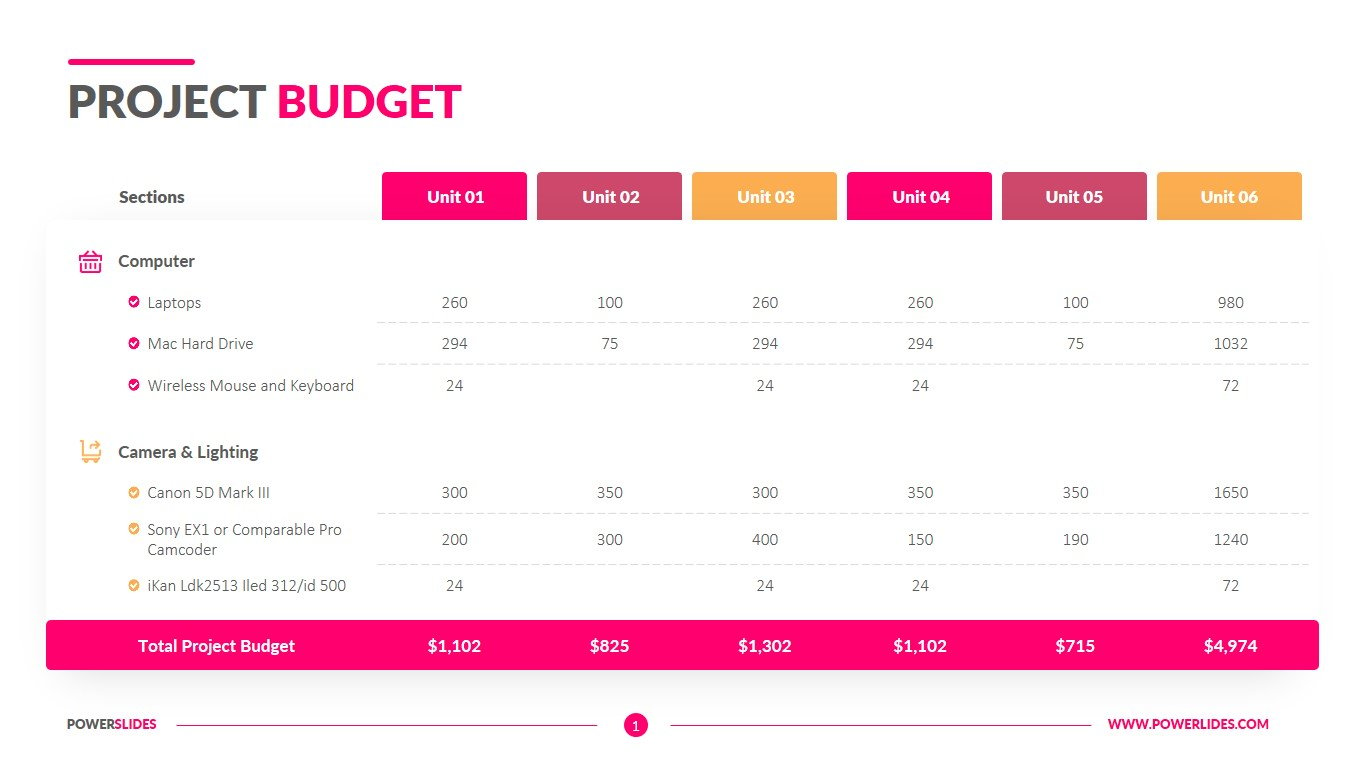
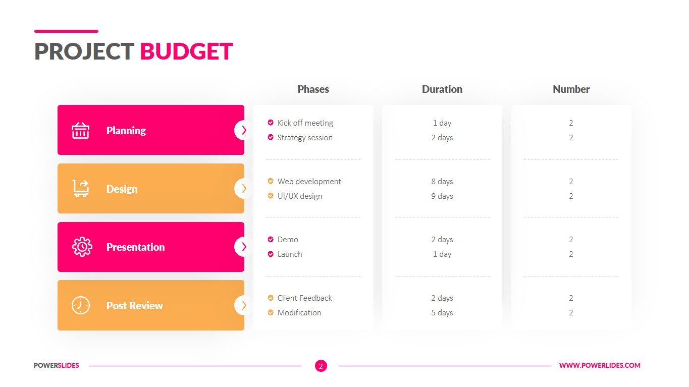
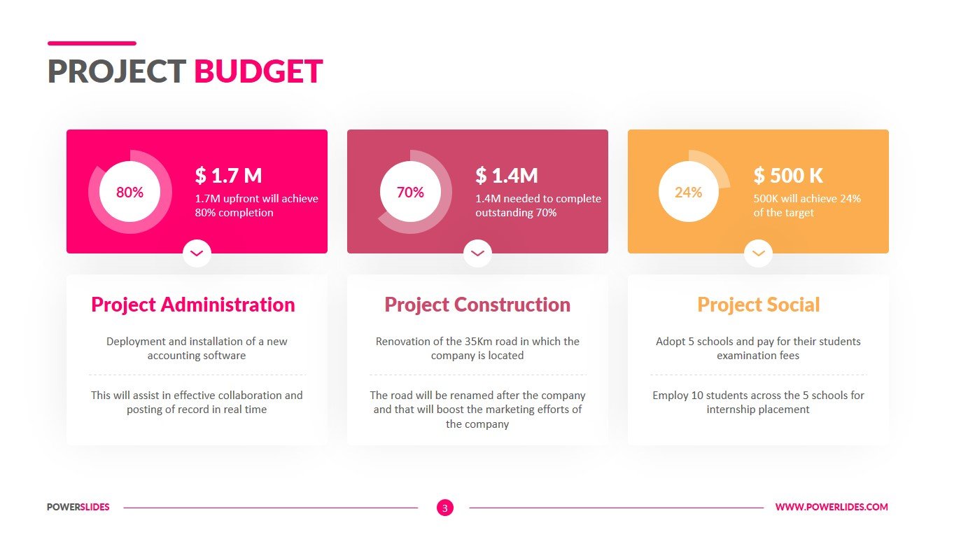
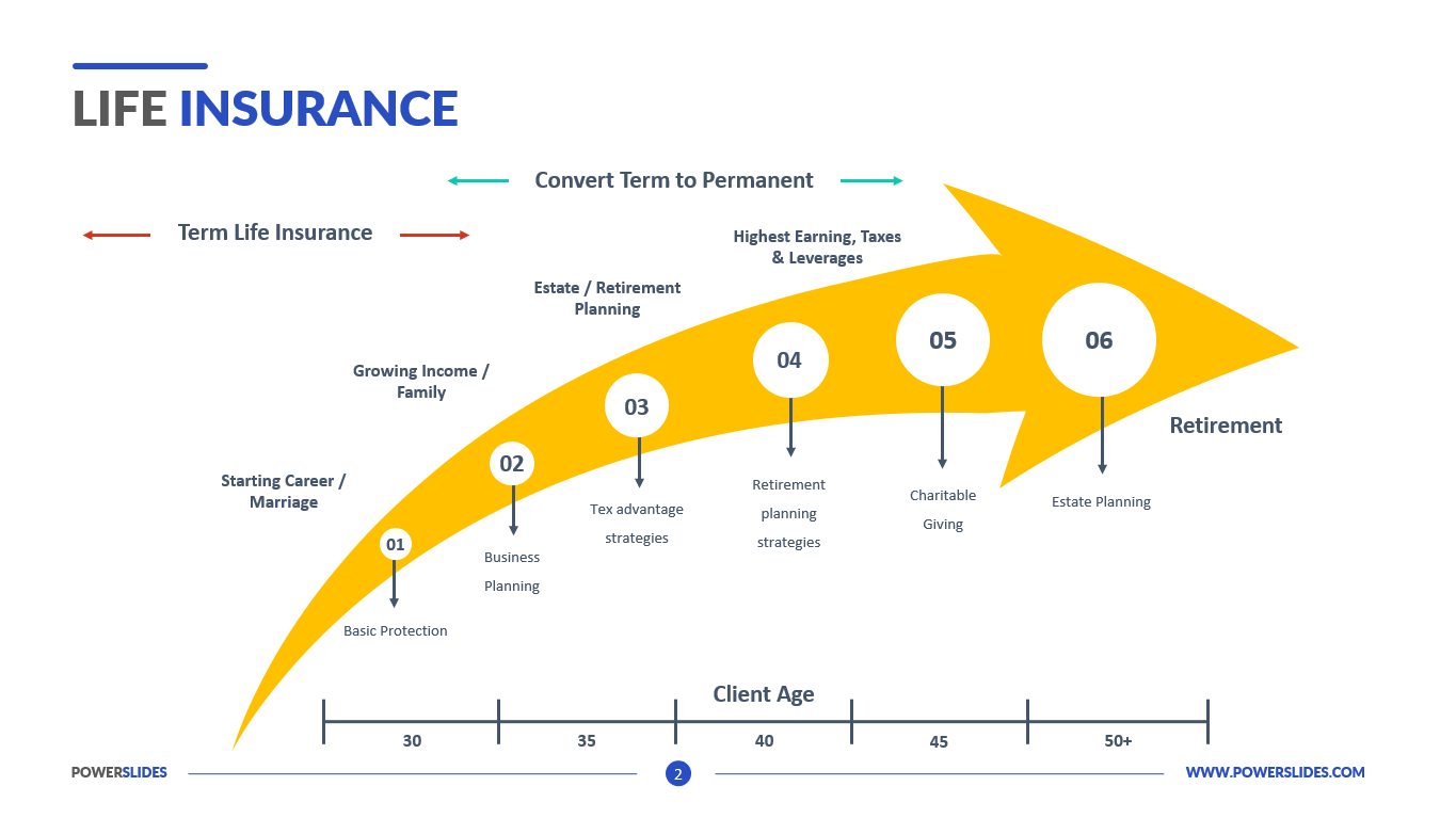
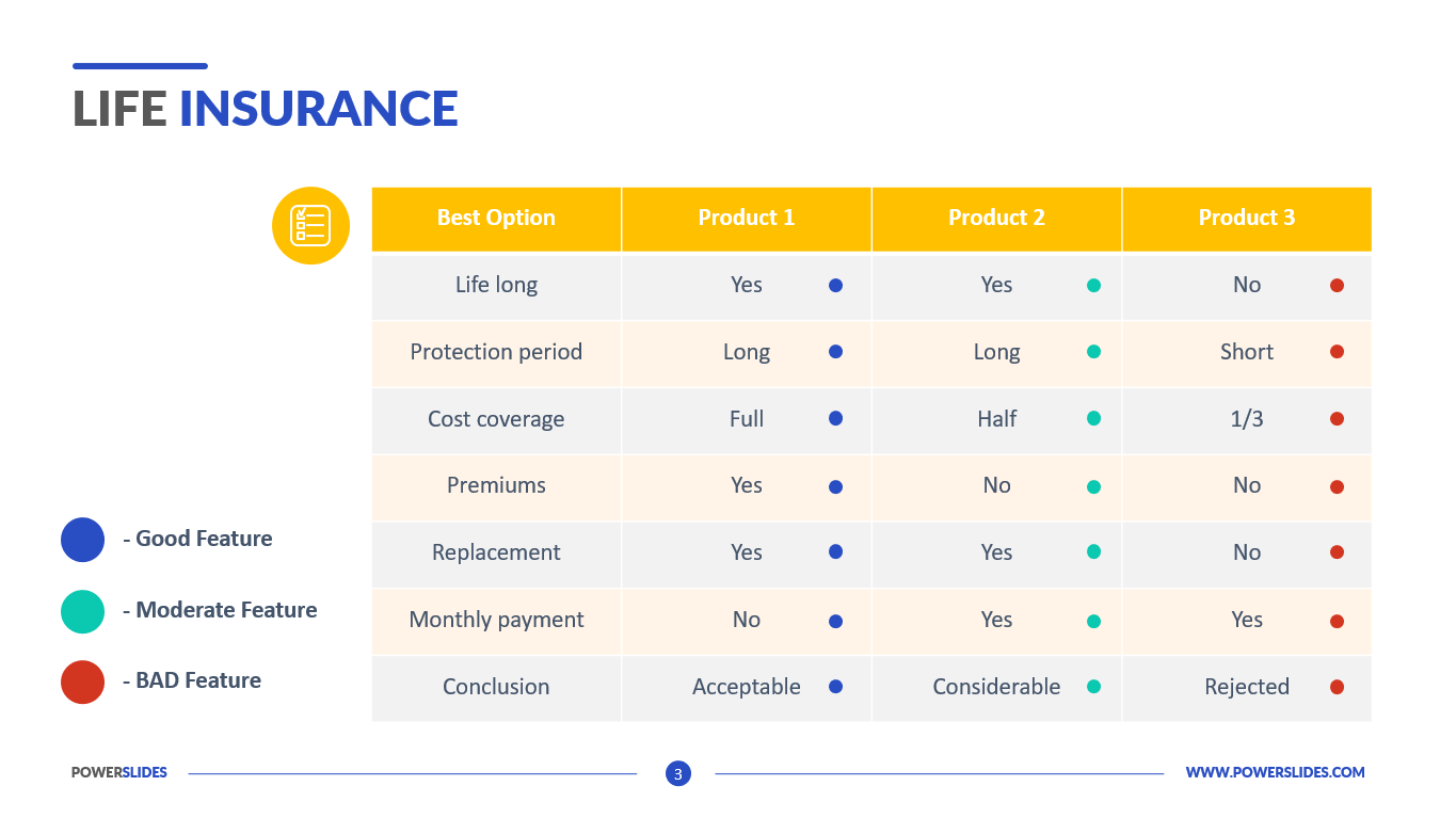
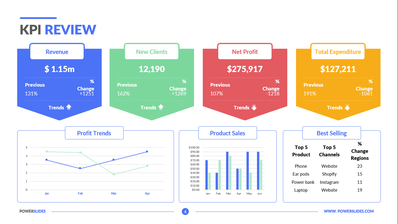
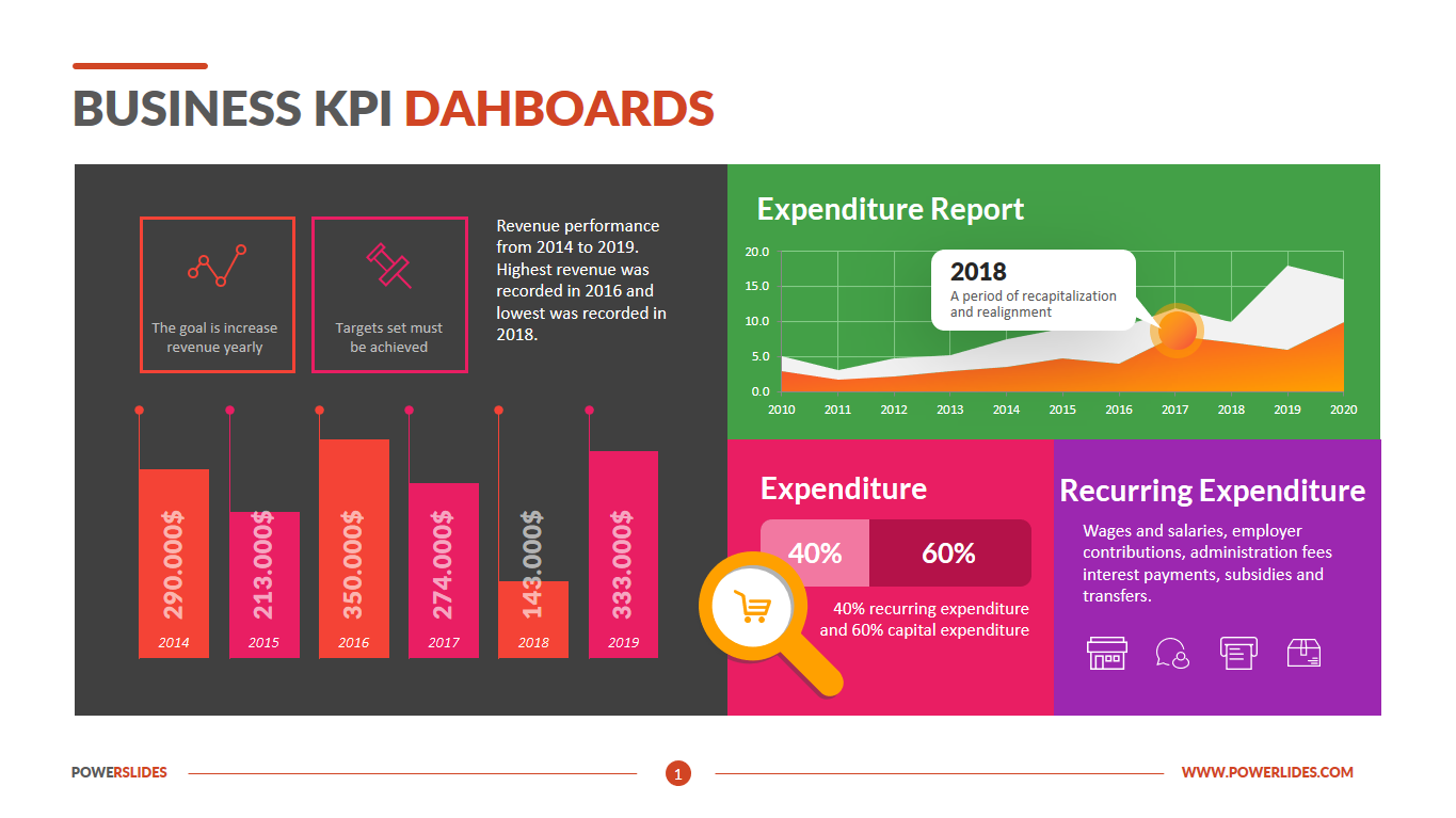
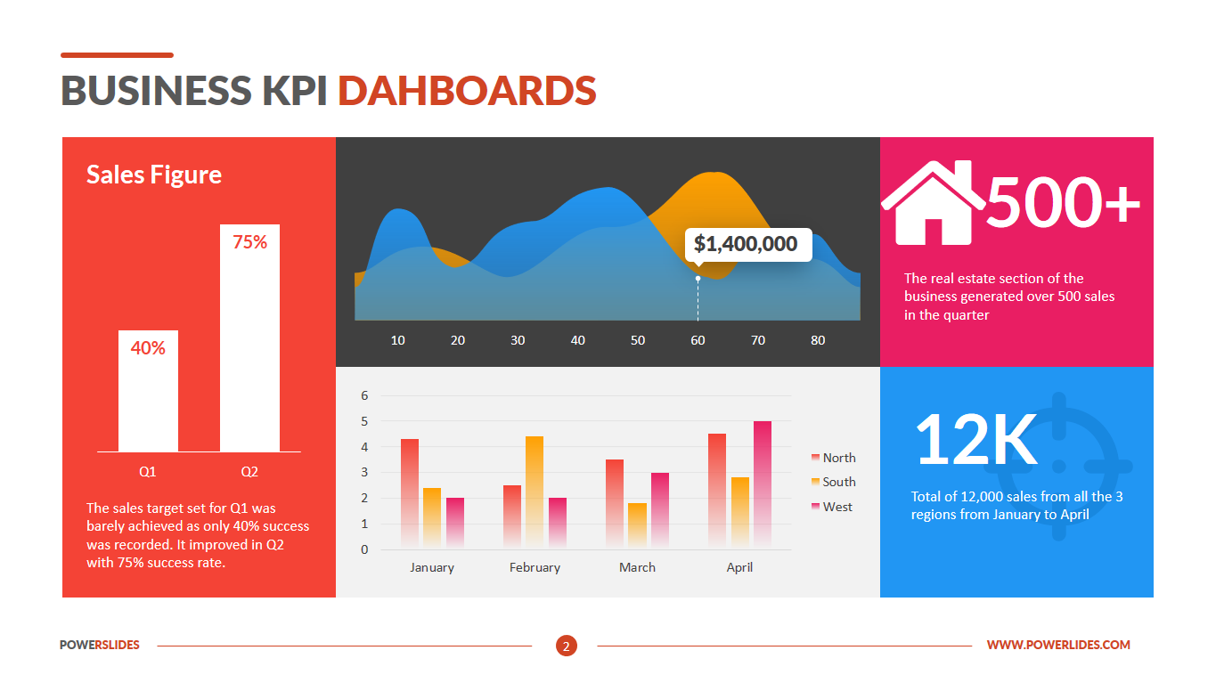
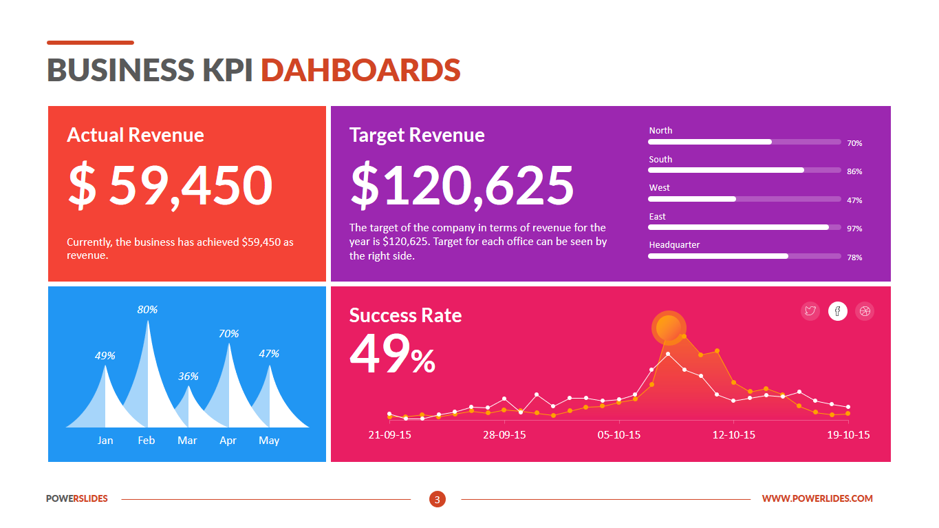
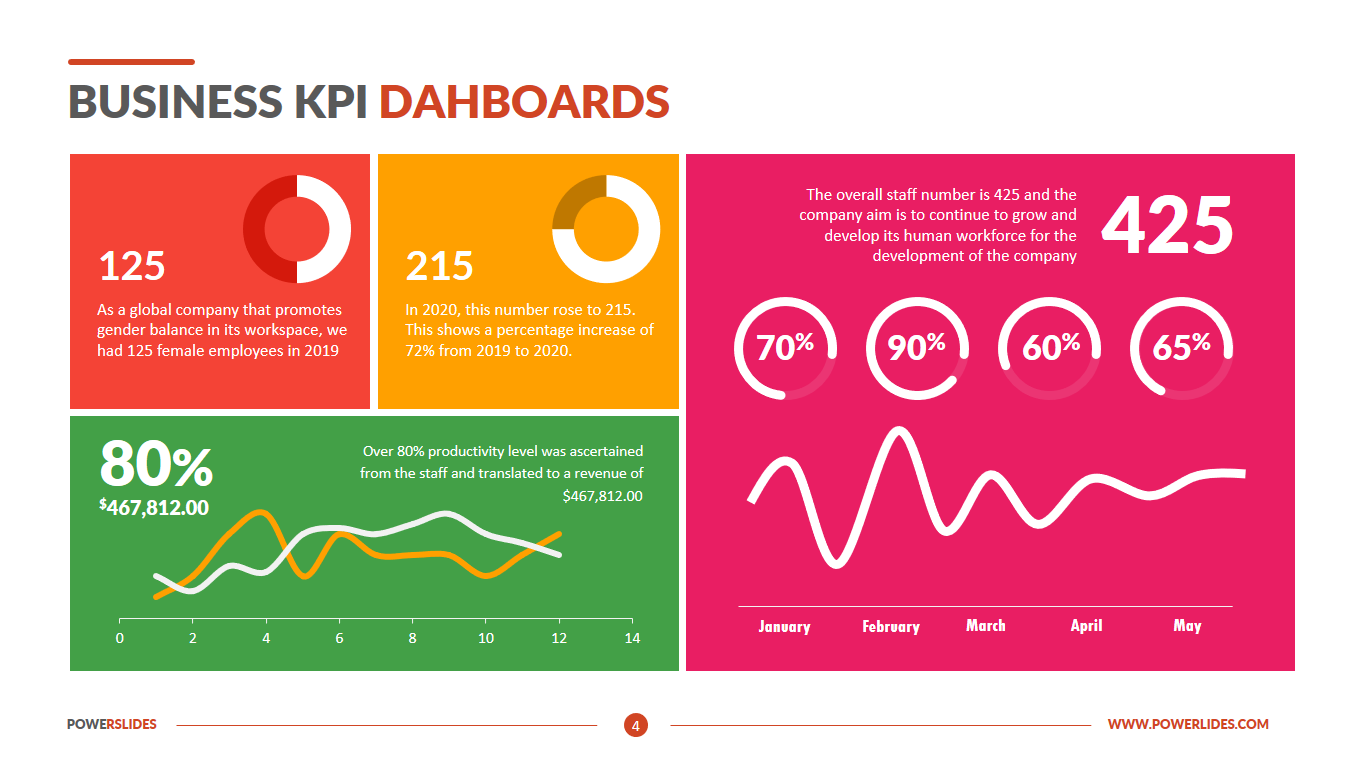
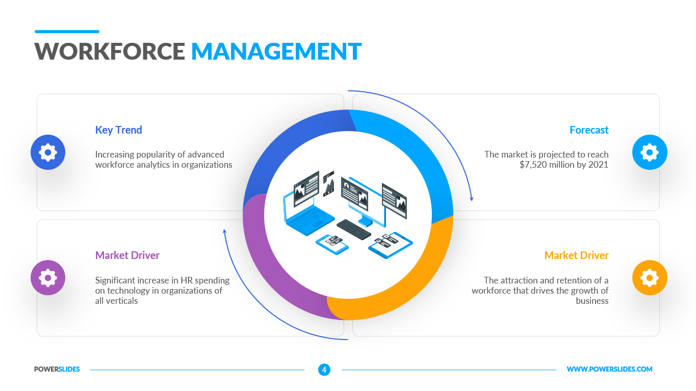
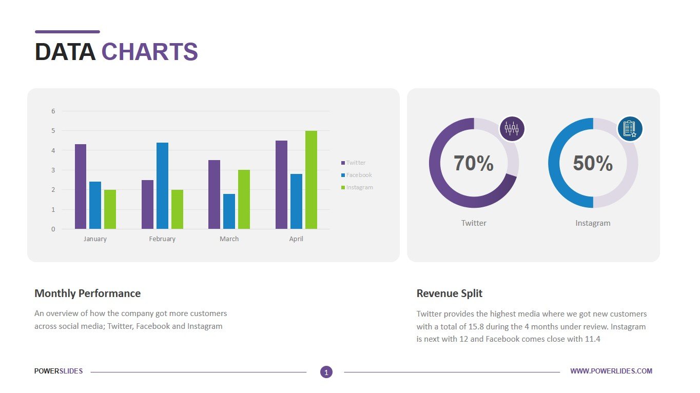
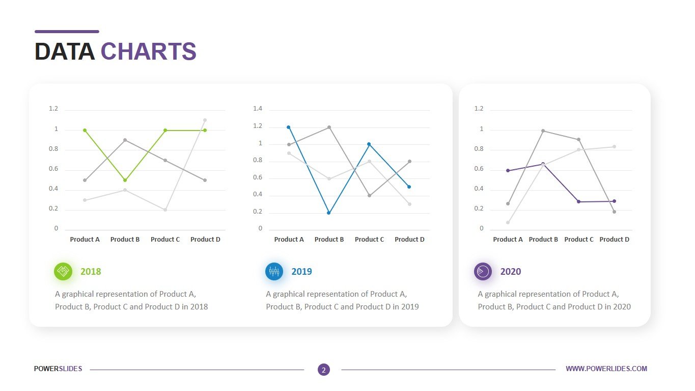
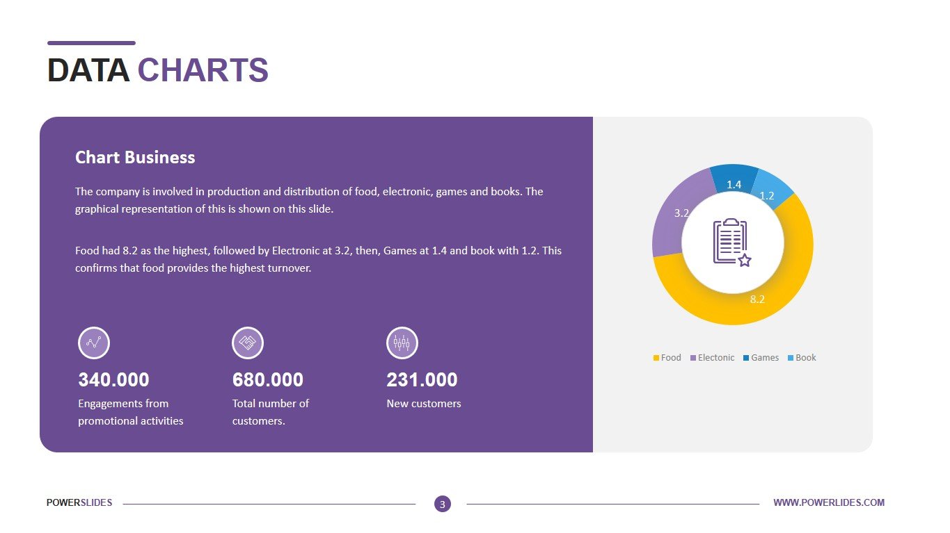
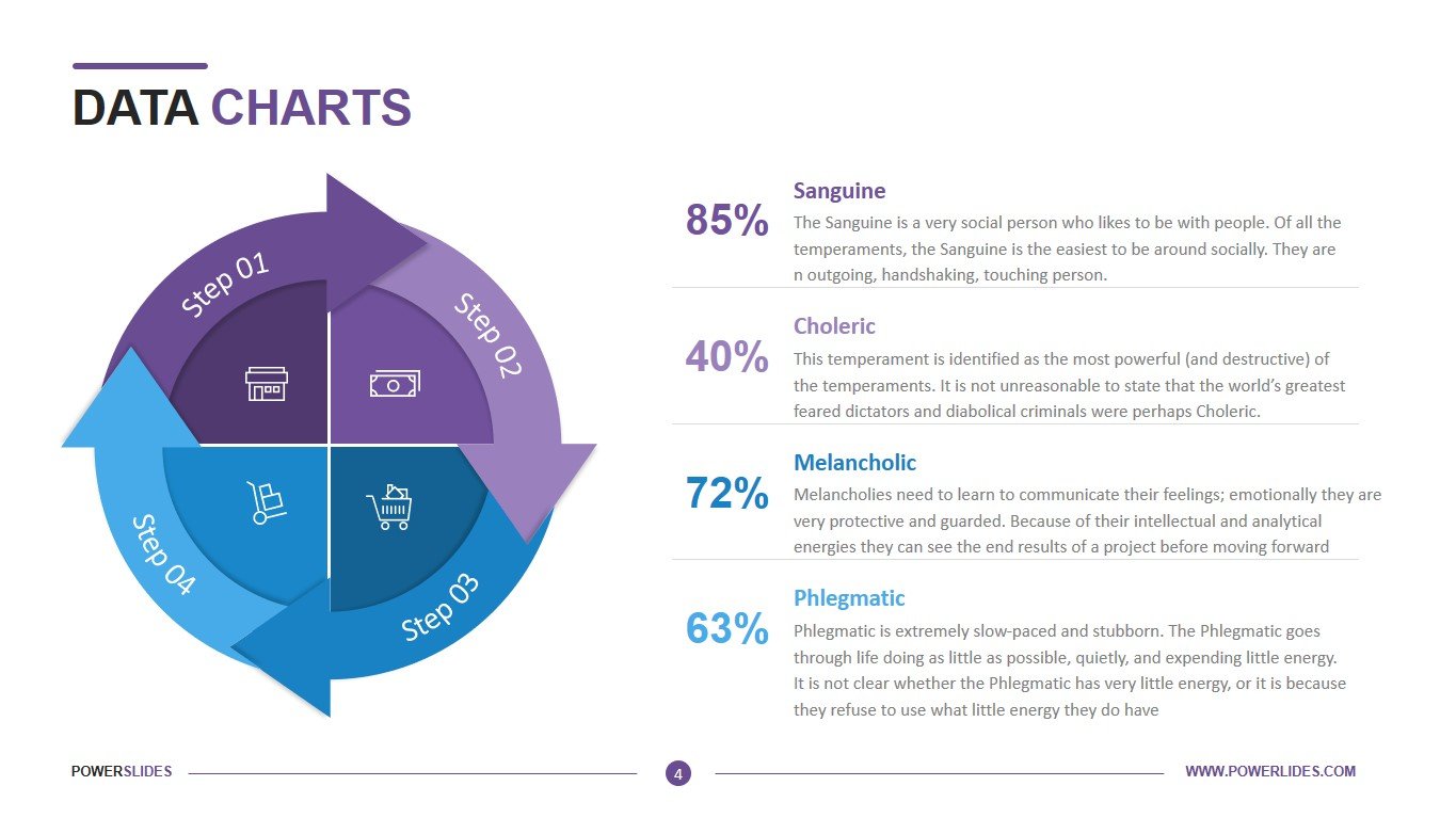
The Data Charts template contains four slides that contain a wide variety of charts. The first slide gives you the ability to display your data in bar charts and donut charts. This slide will primarily be useful to financiers and economists. You will be able to present your complex analytical calculations in a simple and accessible form. The next slide gives you the ability to display your data in three blocks using graphs. This slide can be used by salespeople to analyse their sales over time or in different regions. The third slide gives you the opportunity to present your sales by category using a pie chart. You can also give a description on the left side of the slide. This slide can be used by startups in preparation for meeting with investors. Also, this slide will be useful for marketers when segmenting the market or building a promotion model by age categories of customers. All slide elements are easily customizable to suit your needs.


