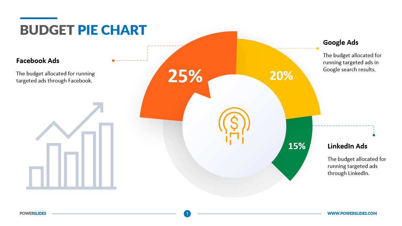
Budget Pie Chart
What do you think of this template?


 (3.80/ 5)
19 ratings

 4 Slides
 File size: 16:9
 Fonts: Lato Black, Calibri
 Supported version
PPT 2010, PPT 2013, PPT 2016
Supported version
PPT 2010, PPT 2013, PPT 2016

Product details
Most people know that they should have a budget, but figuring out how to make one can seem complicated. How do you decide how much of your income goes to groceries versus entertainment? And how do you account for bills that change monthly, like your electric bill? Many people find that it helps them to have a visual representation of where their money goes. Making a pie graph can help you create a budget, stick to it and visualize your monthly expenses.
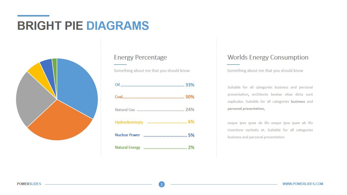
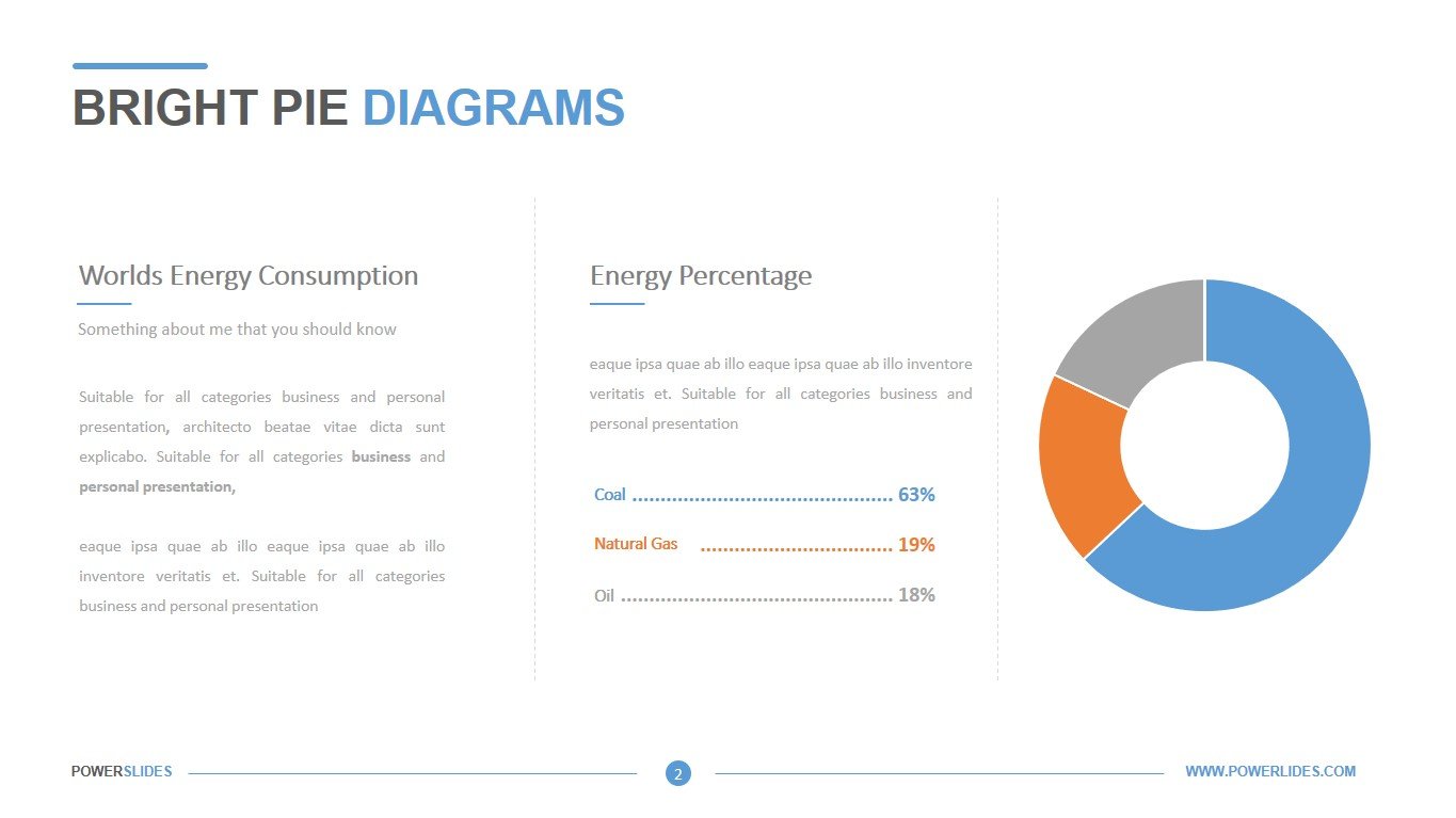
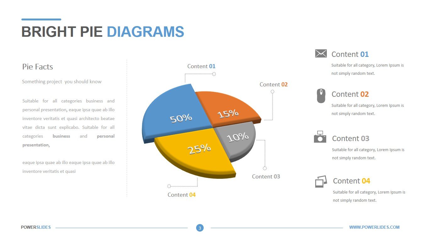
A pie graph or pie chart uses data to break down a whole into different parts that are each represented by a slice within a circle. When it comes to budgets, each slice of the pie graph represents a different category of expense. Pie graph budgets are especially helpful for people who like to have a visual representation of their budget each month because it shows you an overall picture of your spending and can help you determine if you’re paying too much in one category over another.
Pie graphs use your financial data to create their picture. This data comes from your bills and monthly spending. In order to create an accurate pie chart, you need to know how much money you’re spending each month. This data is gathered through collecting all monthly expenses. Using that data allows you to create a chart with accurate slices for each expense category.
This template will be primarily useful for financiers when preparing reports and drawing up a company’s budget plan. You can group expenses or income items of a company into specific groups. Then, you can present the data using a pie chart and identify the categories with the highest value.
Also, this template can be used by department heads when leaving the department’s annual budget. You can define categories such as staff training, stationery, business travel, purchasing raw materials, and others. You can compare the data obtained with the actual expenses for the last year and analyze the reasons for the increase or decrease in the department’s expenses.
University professors can use this template to prepare courses on financial analysis or budgeting. Economists and analysts can also use this template. Startup executives can use the slides from this template in preparation for their investor meeting.
Public relations professionals can use this template when preparing social survey data analytics. You can group the answers by age or income level, education, or place of residence.
Budget Pie Chart is a professional and modern template that contains four stylish and fully editable slides. The template is designed in a warm color scheme and contains a lot of infographics. If necessary, you can change all the elements of the slide in accordance with your corporate requirements. This template will be useful for company executives, department heads, financiers and economist. Budget Pie Chart Template will be a worthy addition to your collection of professional presentations.


