Tornado Chart Template
What do you think of this template?
 (5.00/ 5)
5 ratings

 5 Slides
 File size: 16:9
 Fonts: Lato Black, Calibri
 Supported version
PPT 2010, PPT 2013, PPT 2016
Supported version
PPT 2010, PPT 2013, PPT 2016

Product details
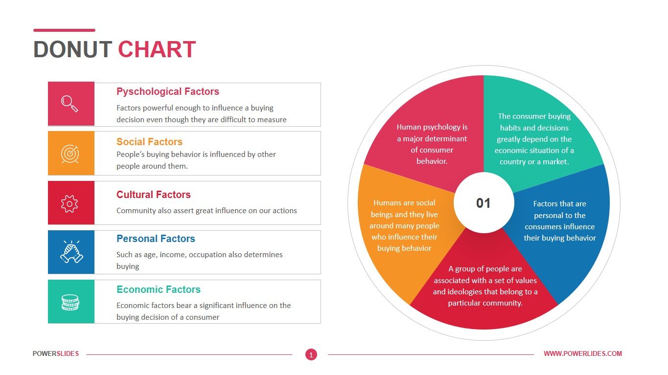
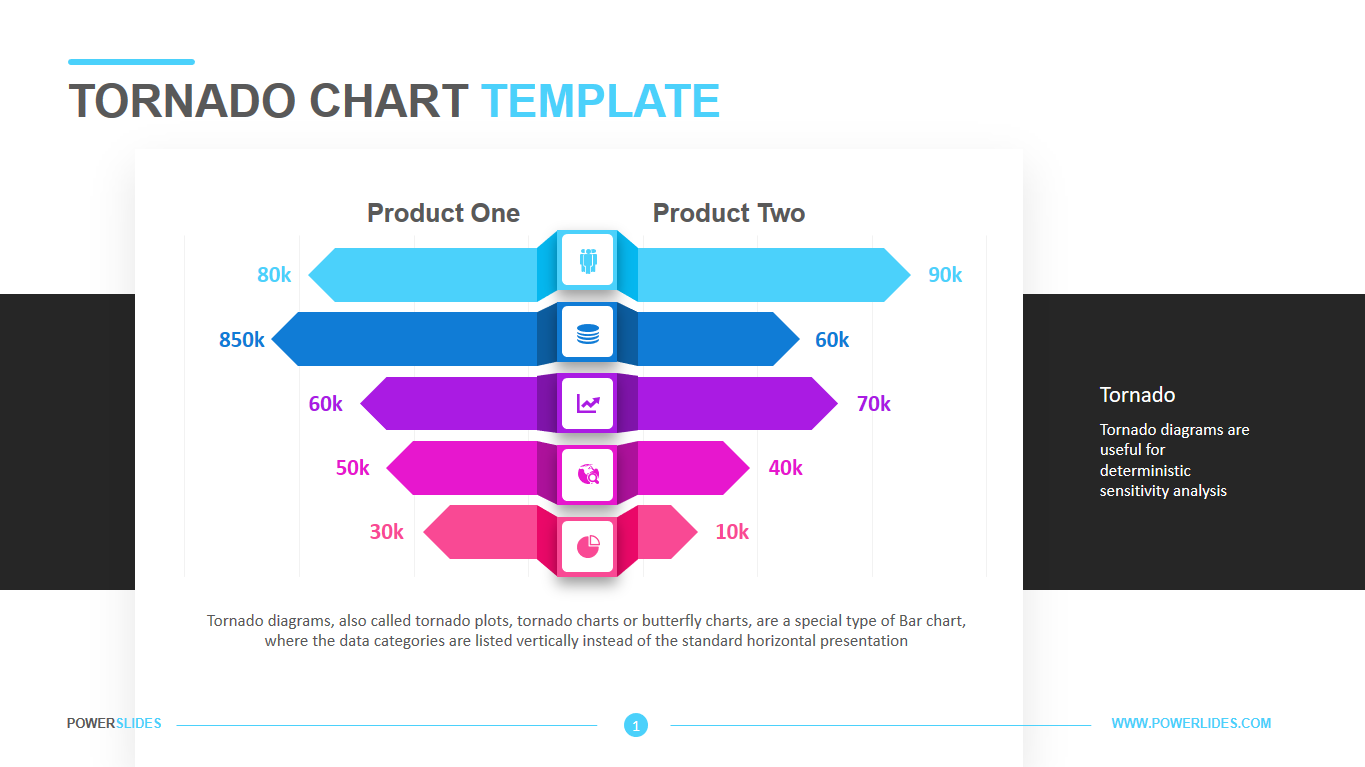
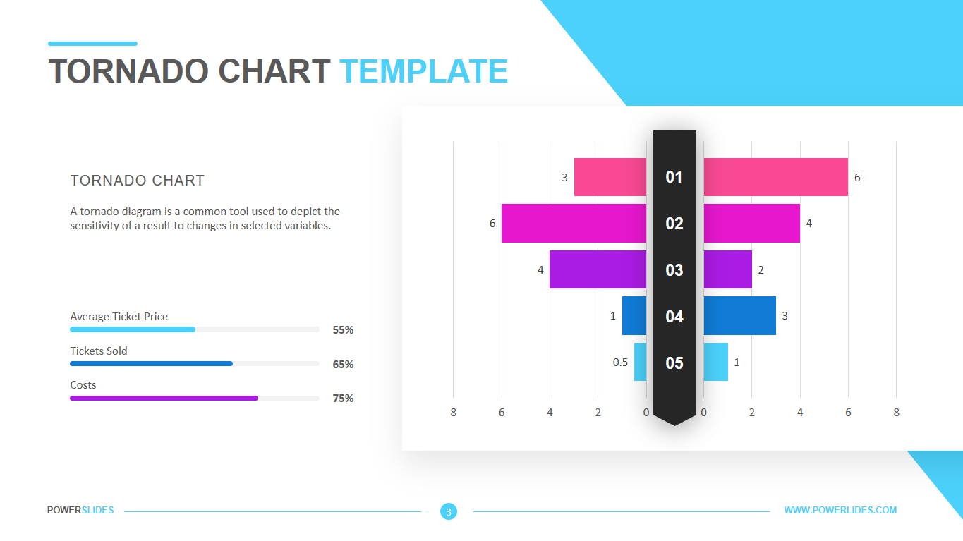
There are different types of charts used in project management. The tornado diagram is a special bar chart that is used in sensitivity analysis. The sensitivity analysis is a modeling technique that determines which risks have the most impact on the project. As one of the tools used in sensitivity analysis, the tornado diagram is used to compare the importance of different variables.
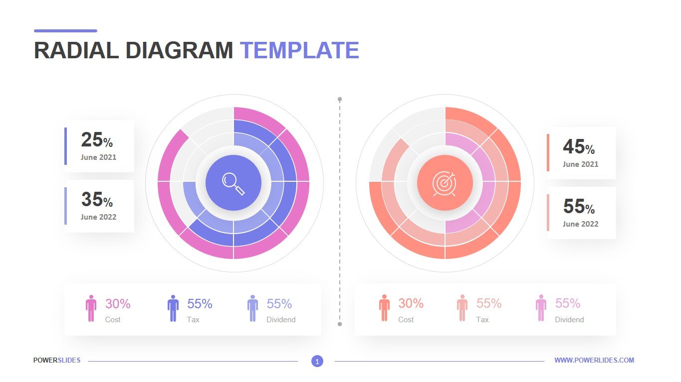
The tornado diagram is one of the methods used to display the sensitivity analysis. It is used to compare the relative importance as well as the impact of variables with a high degree of uncertainty to those that are stable. It is also used in analyzing the risk-taking scenarios at specific risks that can have greater benefits than negative impacts.
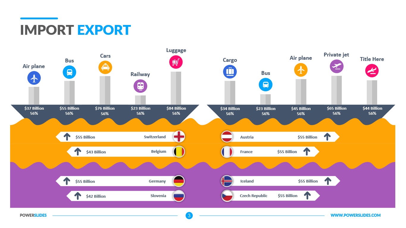
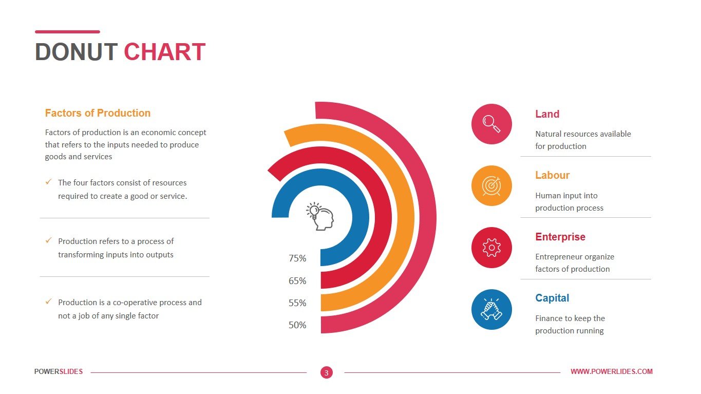
As a special type of bar chart, it displays the comparison of the relative importance of different variables. For this particular chart, the Y-axis contains uncertain variables at their base values while the X-axis contains the correlation of the uncertainty to a studied and known output. Thus, the bar contains a horizontal bar but is ordered vertically to show the uncertainties that have decreasing correlation from the base values.
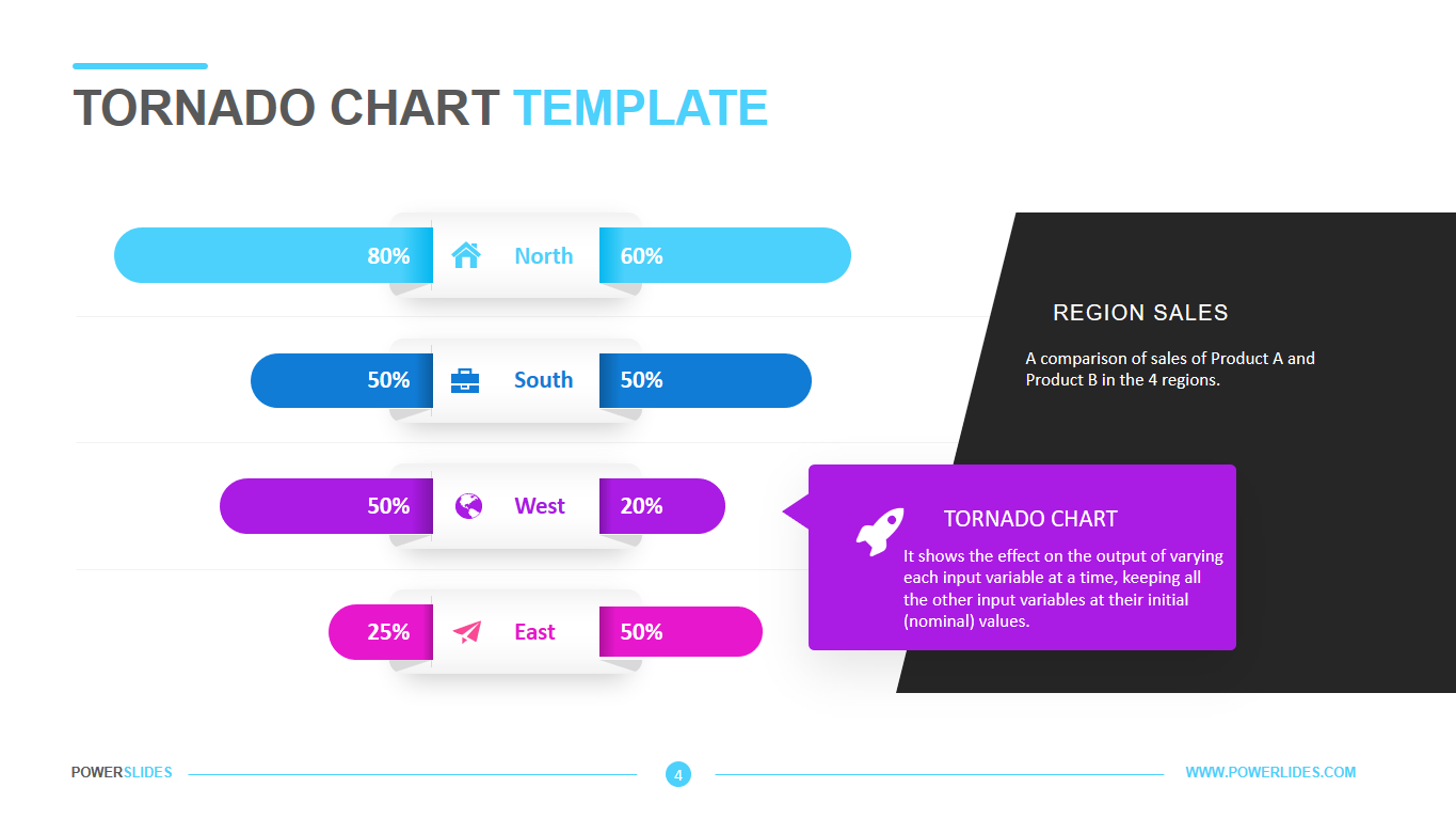
A tornado chart helps you save time and increase efficiency. This diagram is a unique bar chart that performs sensitivity analysis. For risk and financial analysts, planners and strategy officers, the diagram provides an idea of which factors are most important and the ability to assess the sensitivity of a result to change. This template is ideal for presenting to executives, clients, product managers and investors.
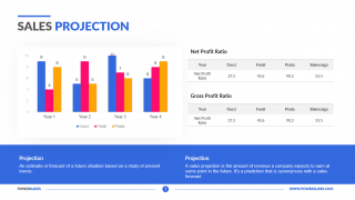
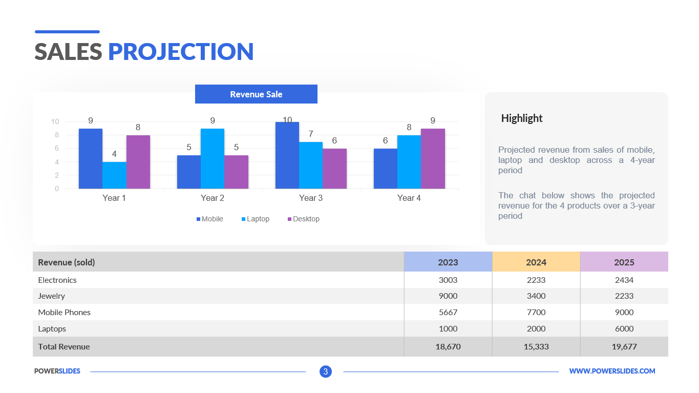
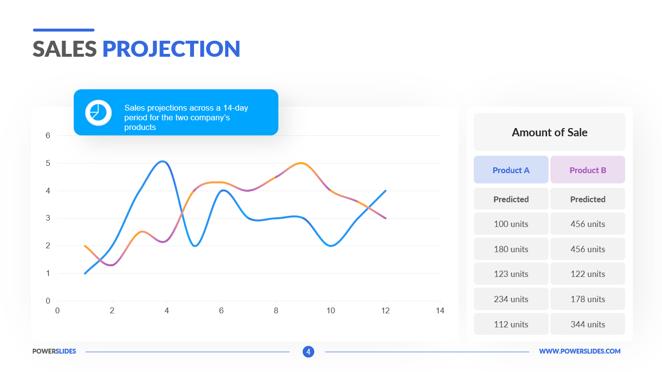
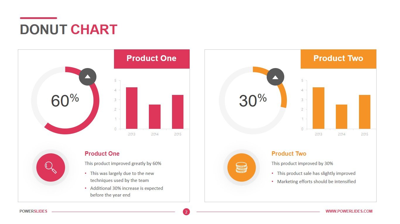
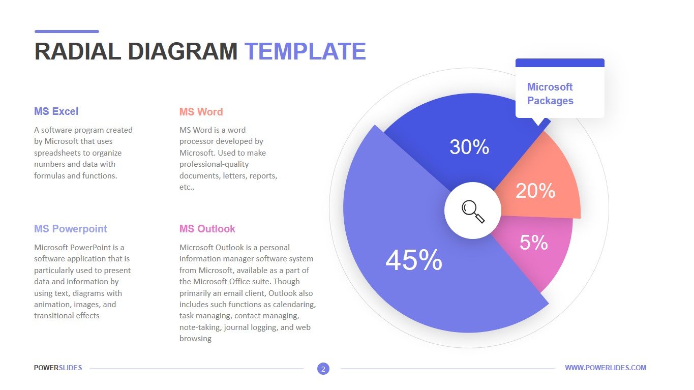
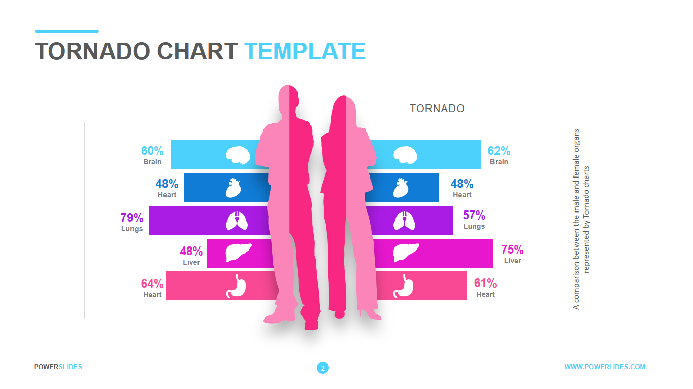
This template can be used by marketers when preparing a marketing campaign to promote a product. You can present a comparative analysis of your company’s product and that of a competitor. This template can also be used by healthcare professionals to prepare disease rates for each category. For example, you can use the second slide of this template for this purpose.
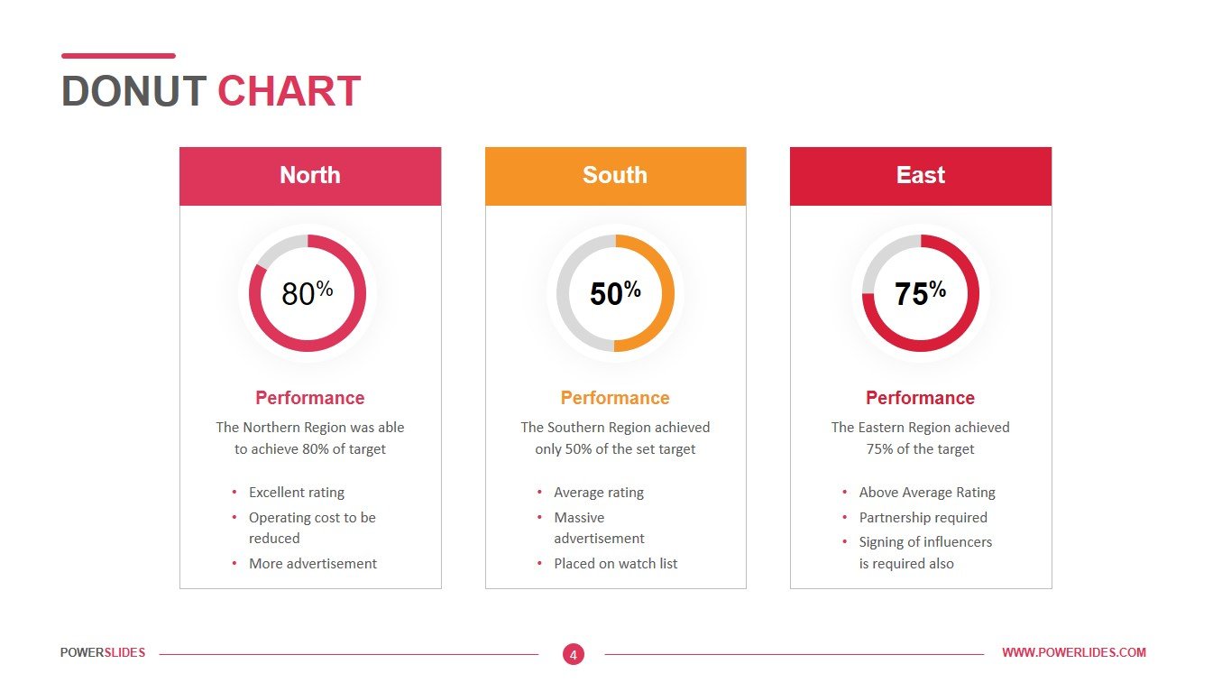
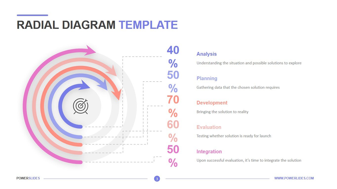
Also, this template can be used to control the progress of work on a project. The project manager can prepare an analysis of the planned indicators and the actual performance of the project. CEOs can use this slide when preparing a report for shareholders on the good governance of the company. Startup executives can use this template to predict risk and reward for various product options.
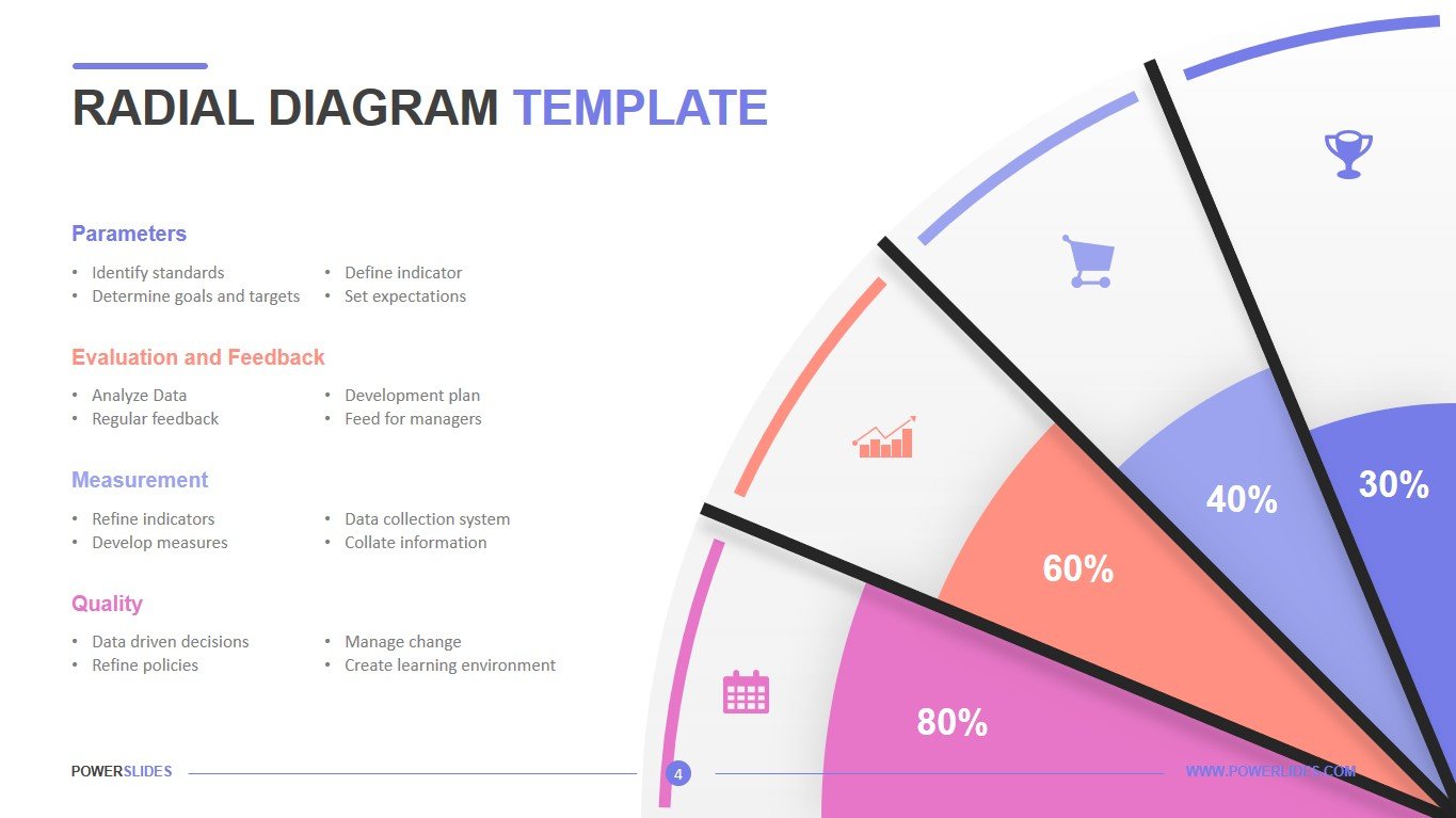
This PowerPoint template is flexible to meet your business structure and can be customized. Available in five design variations, this tornado chart template provides a comparison for products, consumer types, and more. Ideal for presenting your marketing, sales, distribution and advertising strategy, this template conveys key figures and data points for socioeconomic, psychological, medical and other factors. All text, colors, iconography and graphics are editable.


