Harvey Balls Diagram
What do you think of this template?


 (3.60/ 5)
18 ratings

 6 Slides
 File size: 16:9
 Fonts: Lato Black, Calibri
 Supported version
PPT 2010, PPT 2013, PPT 2016
Supported version
PPT 2010, PPT 2013, PPT 2016

Product details
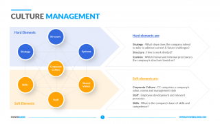
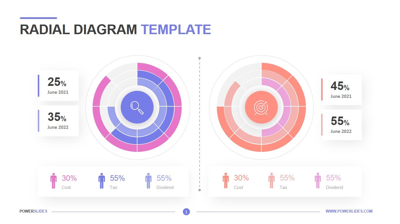
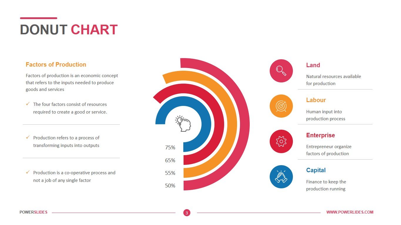
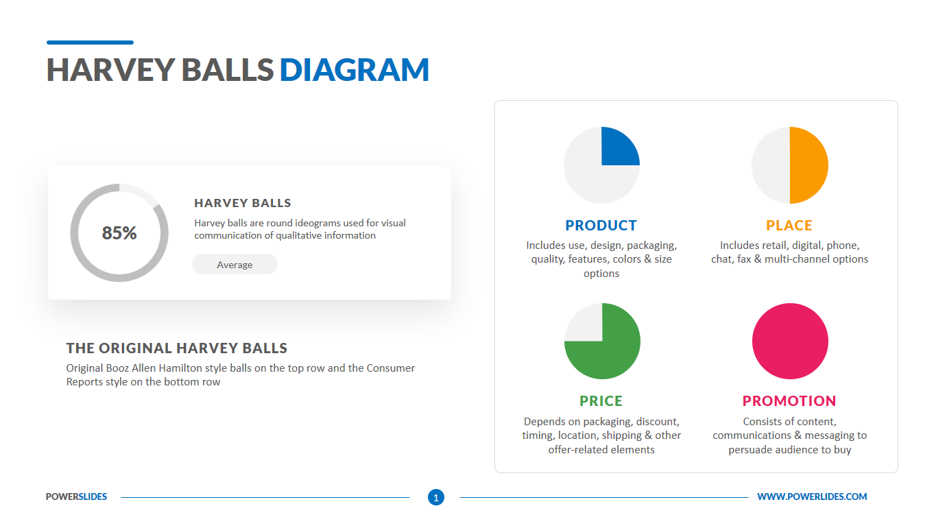
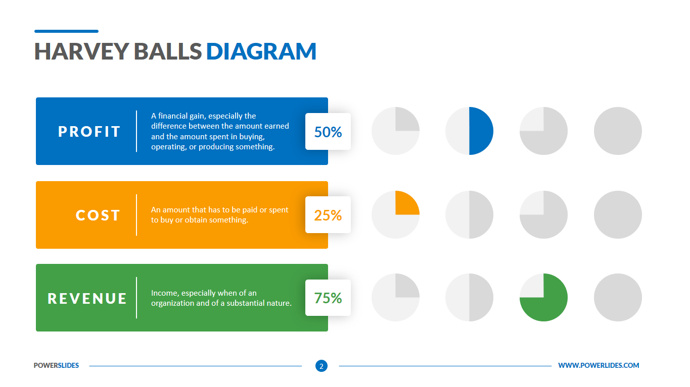
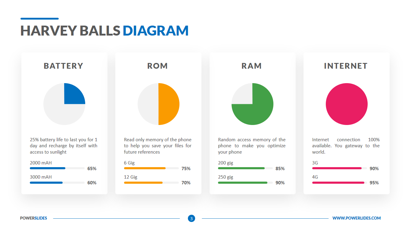
A Harvey ball diagram is a beneficial visual tool for making qualitative assessments very quickly. Harvey balls diagram consists of multiple circular shapes called Harvey balls, which are partially or fully shaded to show the extent to which an item fulfills particular criteria. The unshaded portion of these balls shows how much an item lacks certain criteria, which helps make different decisions when several options are available.
Harvey Balls chart is a type of state indicator usually used for comparison in presentations and reports. You might find this visual tool in several comparison types, such as comparing a product by price, weight, quality, taste, safety.
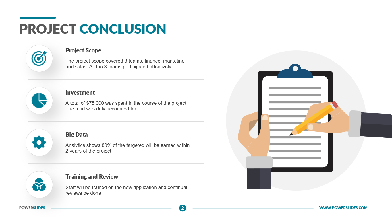
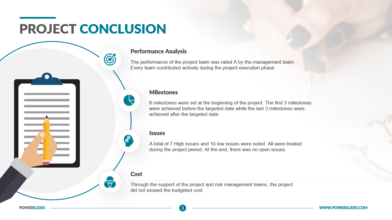
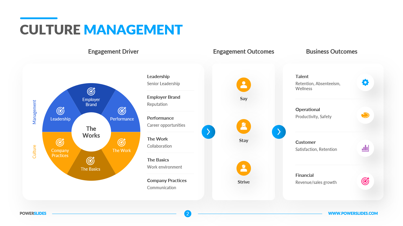
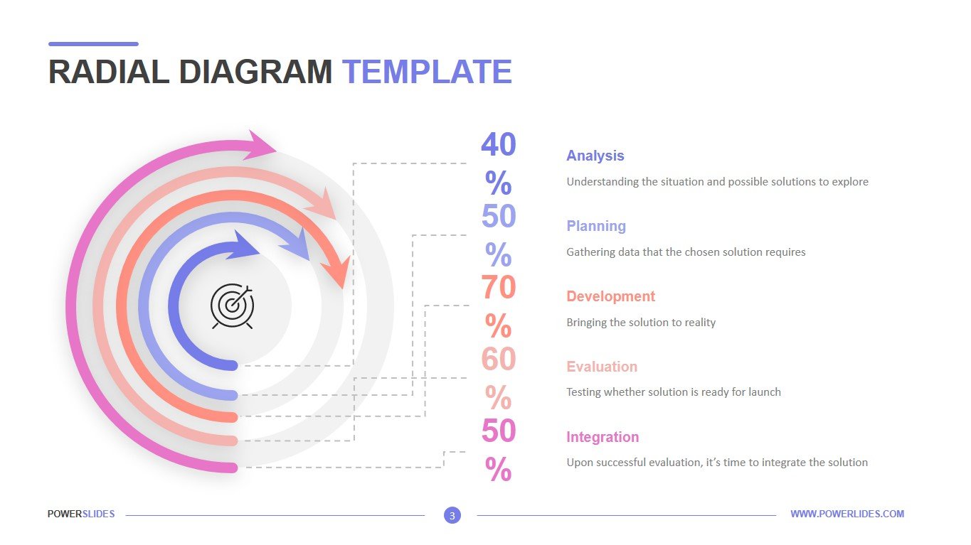
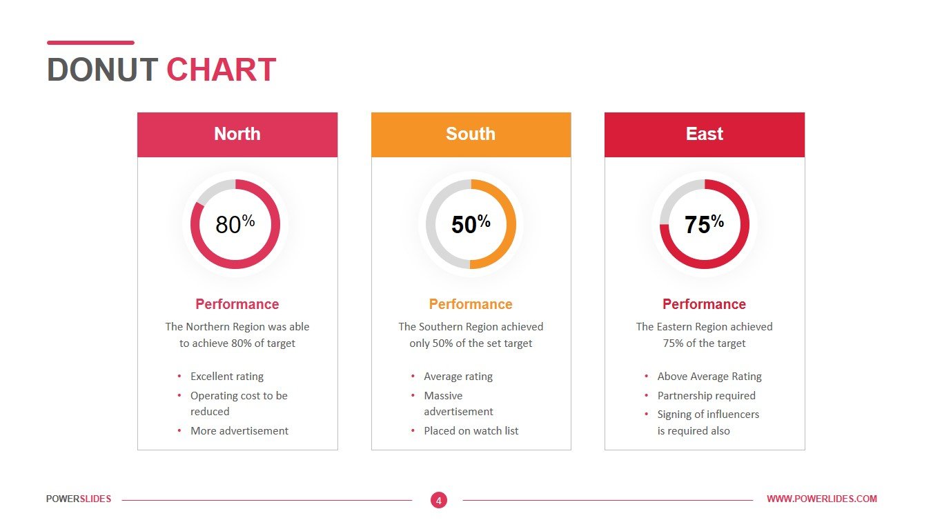
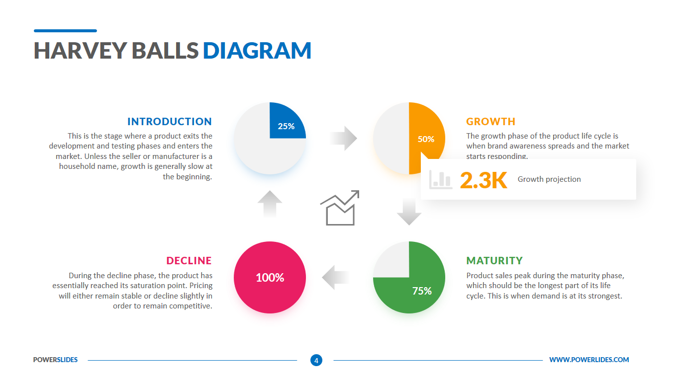
A simple, quick, and everyday use of the Harvey balls chart is to convey project status. Different Harvey balls in the diagram can be used to show the status of different aspects of a project, such as milestones, budget expenditure, etc. Financial teams, strategy consultants, and operations teams love using Harvey Balls Diagrams because it helps executives, clients and key decision-makers make qualitative assessments quickly.
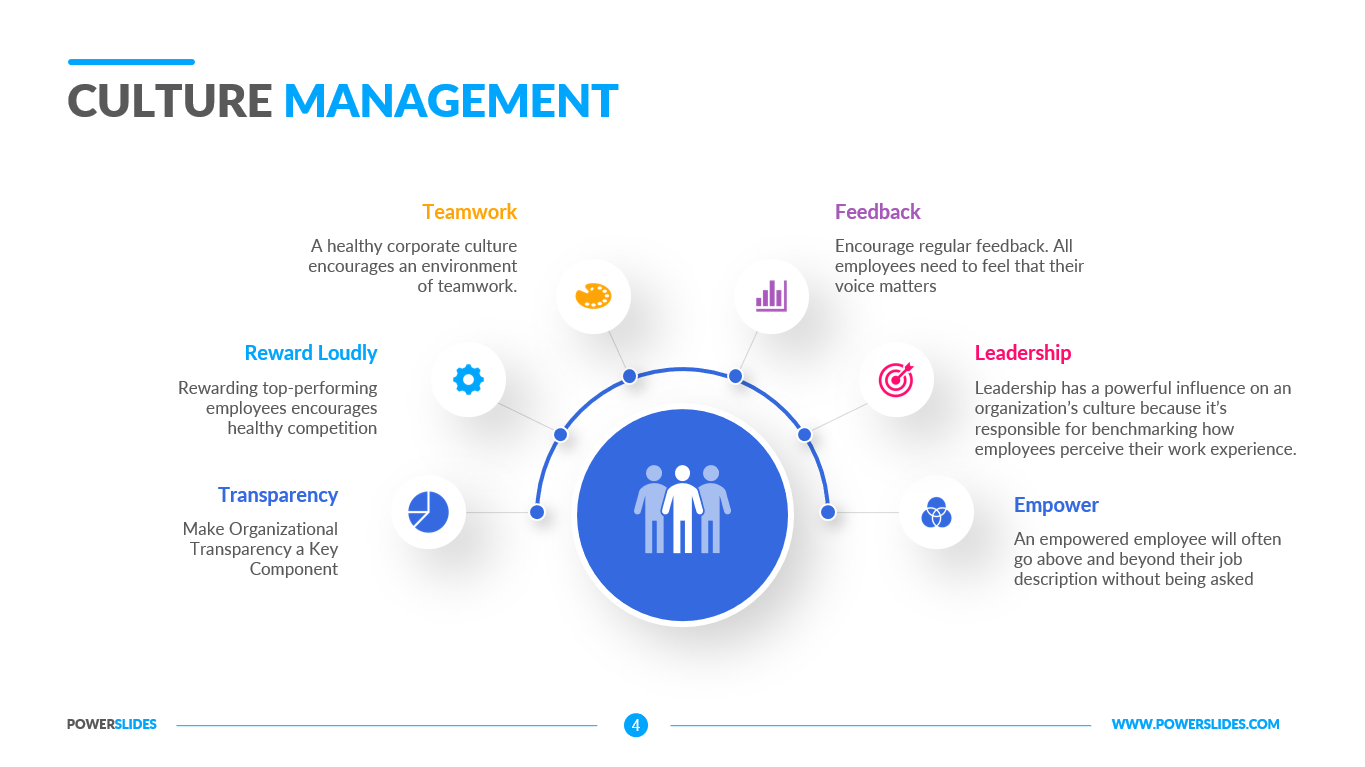
Rating and ranking employees is a challenge for human resource professionals and managers. Harvey balls are an easy, unbiased way to evaluate employees. Most managers aren’t ranking their employees solely on performance. Oftentimes, there are other characteristics a manager looks for: potential, work ethic, teamwork.
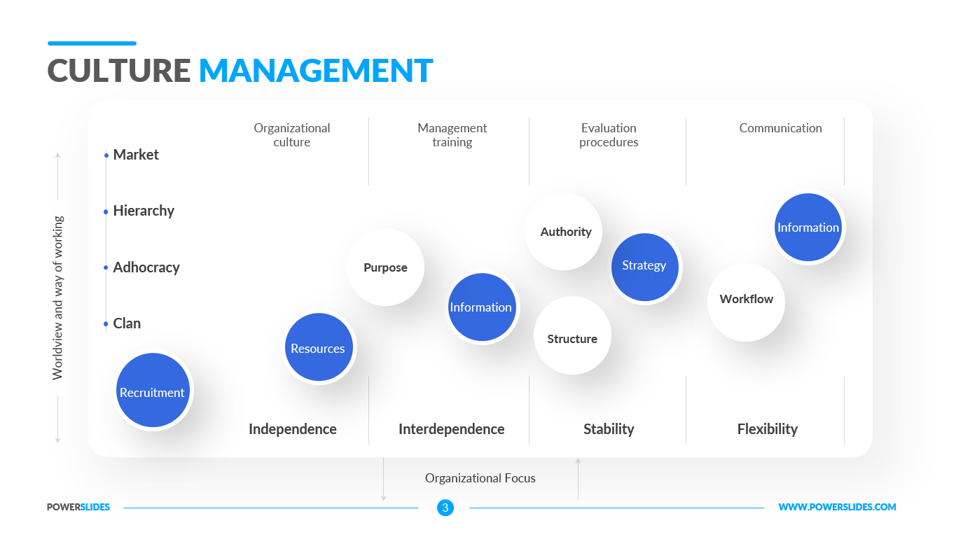
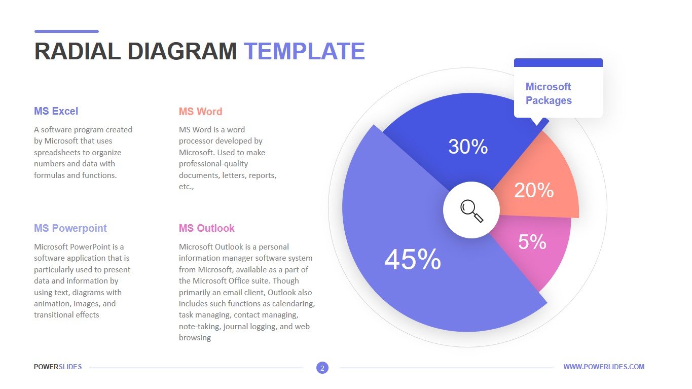
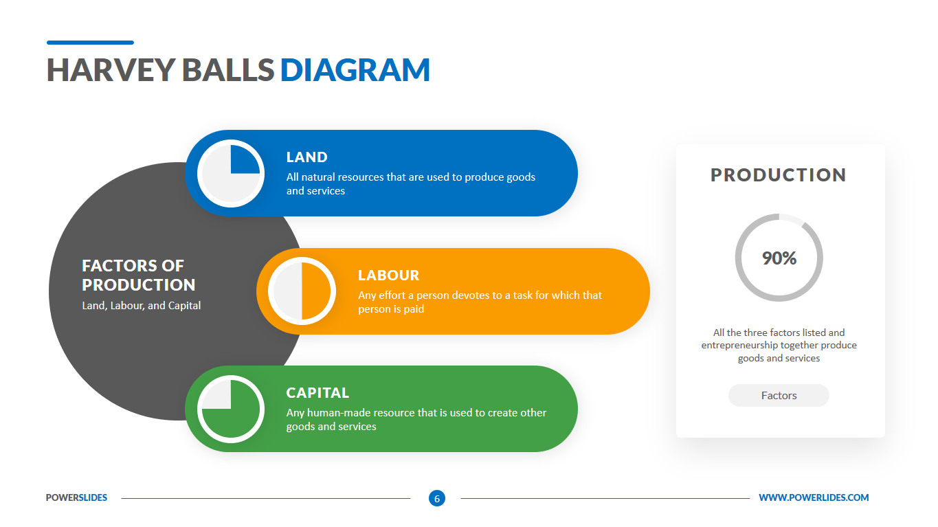
Harvey Balls chart compares a particular product or process to assess differences between their characteristics or features. While comparing products is often straightforward, Harvey balls are particularly useful for comparing more qualitative information, such as taste or quality, features, usability, and affordability. Harvey balls are a great visual tool that you can use in PowerPoint presentations to make your presentation appealing and easy to understand.
This template can be used by financiers and economists when preparing plans and reports of a financial nature. You can present complex data in a simpler form that will help your audience better understand the topic of your presentation. This template will also be useful for sales managers when preparing a sales report for the last month. You can compare your sales last month and visualize the comparison using the slides in this template.
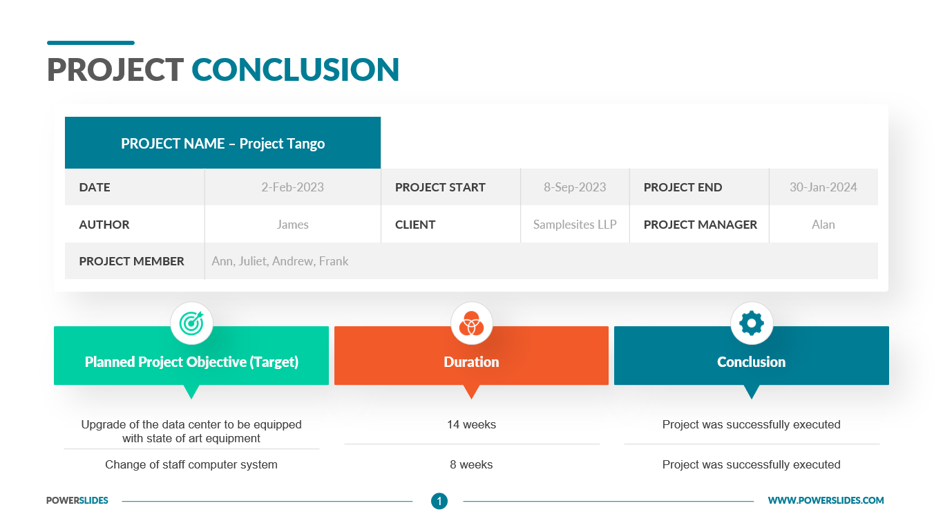
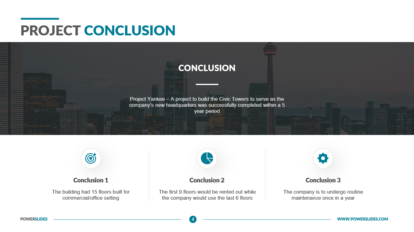
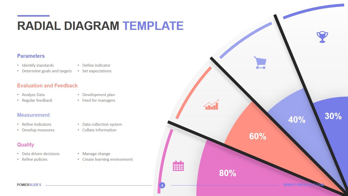
Project managers can use this template when preparing a project status report. You can use the slides in this template to show the progress of each type of work at various parallel stages of the project. Business leaders can use this template when preparing for a strategy session. You can use the tools of this template when preparing financial indicators of the company.
Team leaders can use this template in preparation for their weekly sprints. You can present the status of work for each user story and analyze the reasons for the backlog or ahead of the schedule. This will allow you to properly distribute the efforts of team members and, if necessary, add employees to complete the project on time.
Available in six design variations, this PowerPoint template is vibrant, colorful and modern. It’s presents even the most complex data in a simple-to-understand manner. Present various categories of content and distinguish their important through text-call outs, data visualizations, and measures for qualitative information. Regardless of industry, business size or function, this template will help you get to the decisions you’re looking to solidify quickly.


