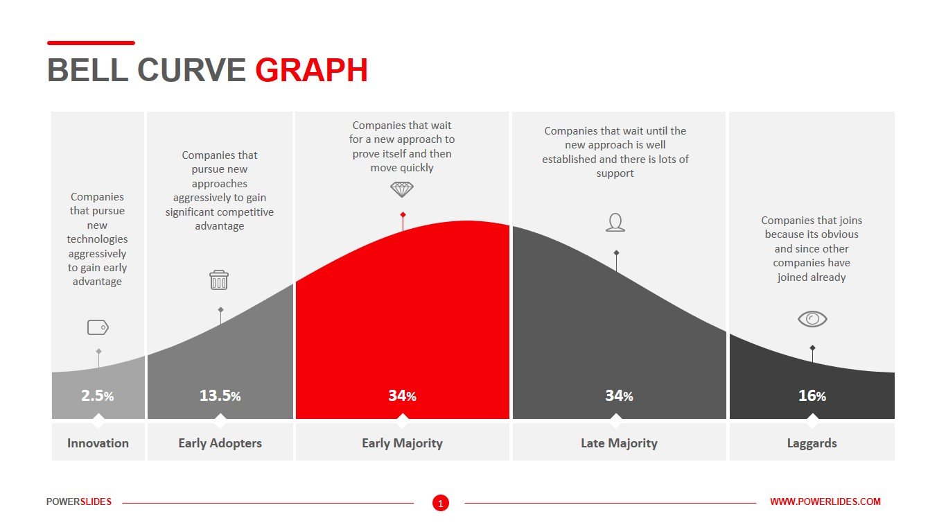
Bell Curve Graph
What do you think of this template?


 (2.50/ 5)
5 ratings

 4 Slides
 File size: 16:9
 Fonts: Lato Black, Calibri
 Supported version
PPT 2010, PPT 2013, PPT 2016
Supported version
PPT 2010, PPT 2013, PPT 2016

Product details
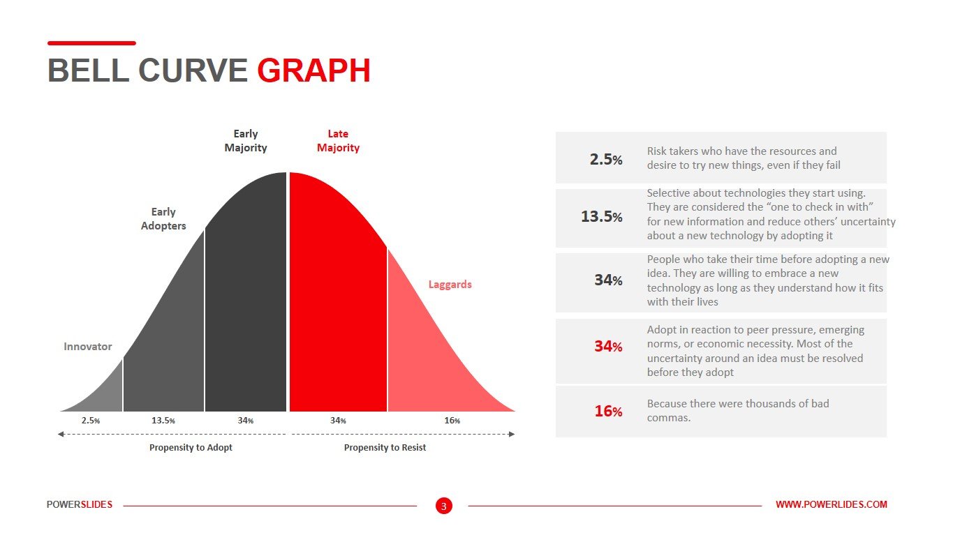
A bell curve is a common type of distribution for a variable, also known as the normal distribution. The term bell curve originates from the fact that the graph used to depict a normal distribution consists of a symmetrical bell-shaped curve. The highest point on the curve, or the top of the bell, represents the most probable event in a series of data. It is mean, mode, and median in this case. All other possible occurrences are symmetrically distributed around the mean, creating a downward-sloping curve on each side of the peak. The width of the bell curve is described by it is standard deviation.
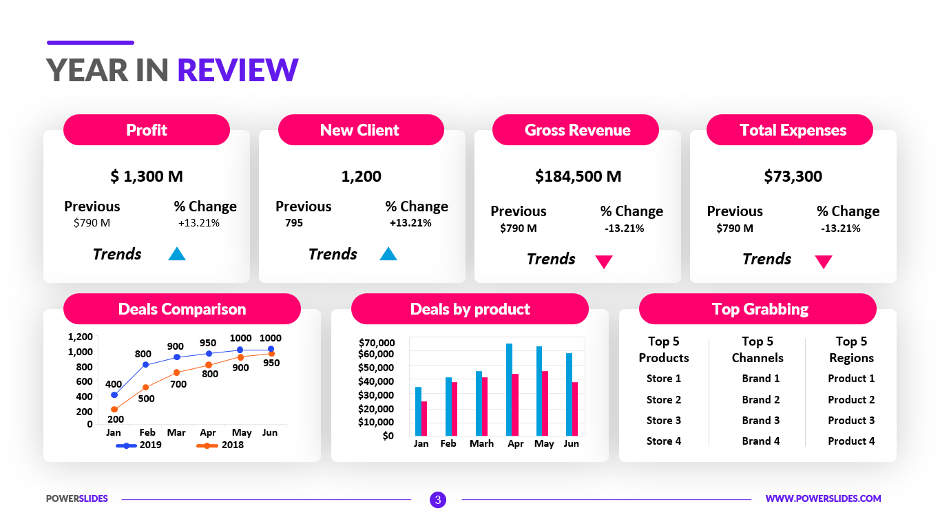
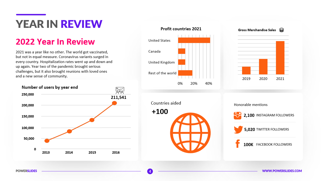
A standard deviation is a measurement used to quantify the variability of data dispersion, in a set of given values around the mean. The mean, in turn, refers to the sum of all data points in the data set or sequence and will be found at the highest point on the bell curve. Financial analysts and investors often use a normal probability distribution when analyzing the returns of a security or of overall market sensitivity. In finance, standard deviations that depict the returns of a security are known as volatility.
For example, stocks that display a bell curve usually are blue-chip stocks and ones that have lower volatility and more predictable behavioral patterns. Investors use the normal probability distribution of a stock’s past returns to make assumptions regarding expected future returns. The normal probability distribution assumption doesn’t always hold true in the financial world, however. It is feasible for stocks and other securities to sometimes display non-normal distributions that fail to resemble a bell curve. Non-normal distributions have fatter tails than a bell curve normal probability distribution. A fatter tail that skews negative signals to investors that there is a greater probability of negative returns.
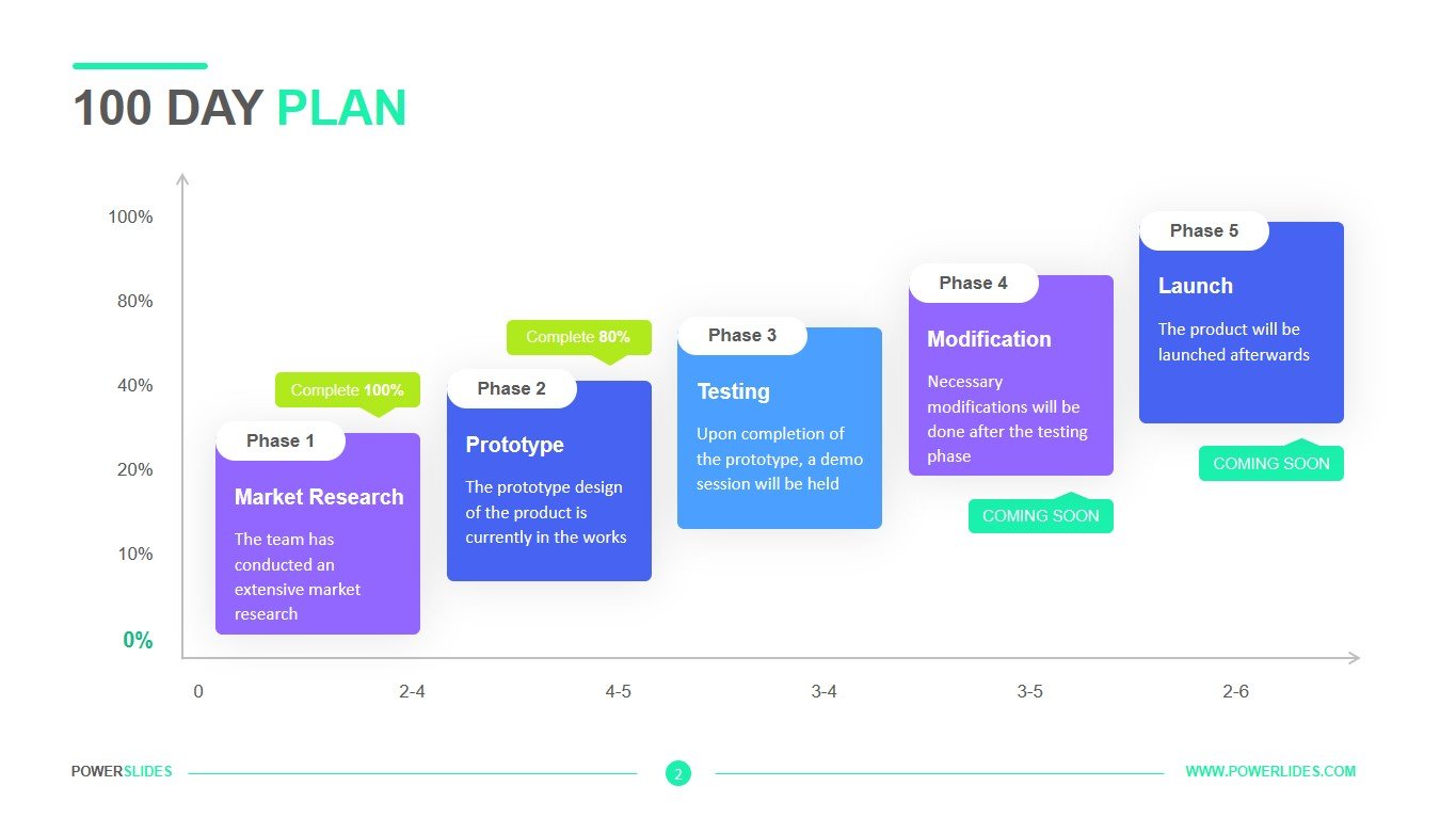
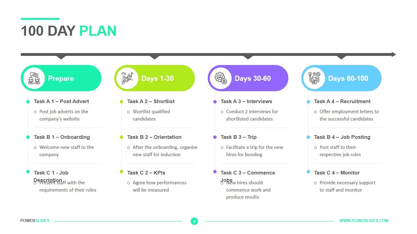
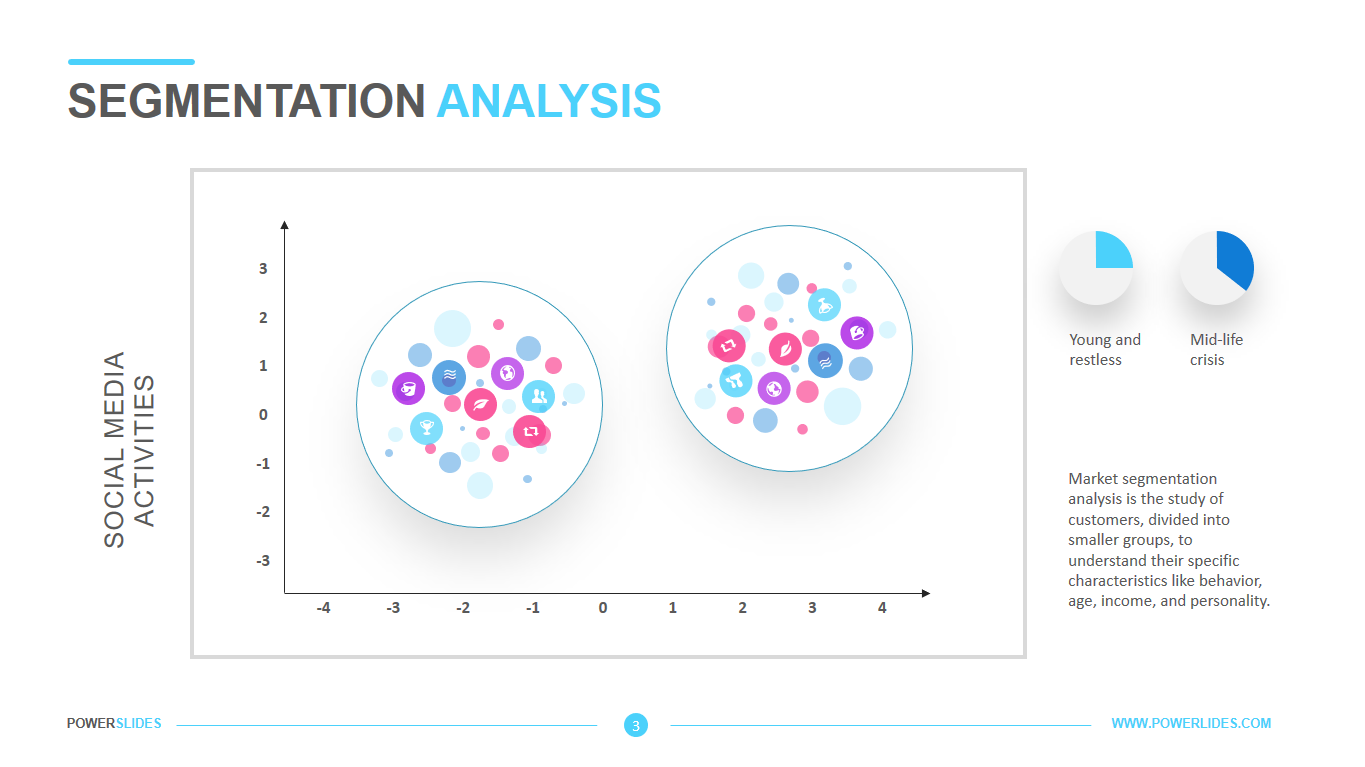
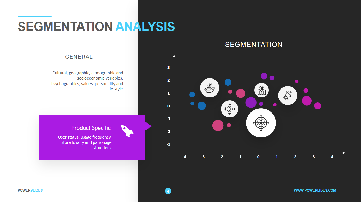
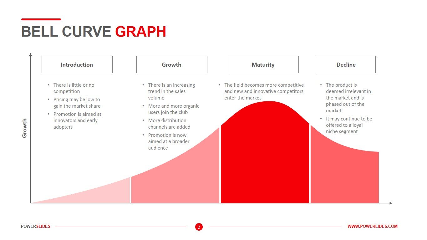
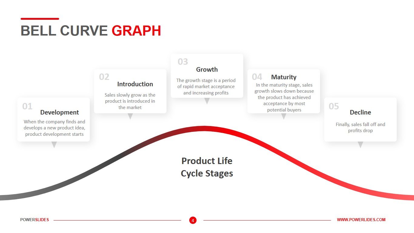
Bell Curve Graph consists of four slides that are in dark colors. The first slide of the template gives you the opportunity to describe your data in the following five categories – Innovation, Early Adopters, Early Majority, Late Majority, Laggards. The slide will be useful for statisticians and financial analysts in their daily work. The next slide can be used to analyze your social media followers. Marketers can use this slide to prepare a lead allocation model for serving ads across different distribution channels. The third slide will be useful for startups when preparing a lead analysis. Also, this slide can be used by investment companies when analyzing the stock exchange. The last slide can be used by product managers when preparing a model for the product life cycle. All slides of the Bell Curve Graph template are easy to edit and can be used with other slides in your presentations.
Also, this template can be used by business trainers when preparing their courses on marketing and financial topics. This template will take its rightful place in your collection of professional presentations.


