Comparison Charts
What do you think of this template?


 (3.67/ 5)
11 ratings

 4 Slides
 File size: 16:9
 Fonts: Lato Black, Calibri
 Supported version
PPT 2010, PPT 2013, PPT 2016
Supported version
PPT 2010, PPT 2013, PPT 2016

Product details
In a nutshell, a comparison chart provides a visual representation of various options that can be compared to each other. It can have their pros, cons, key features, etc. that would depict vital differences between these entities (or choices). Since there is no rule of thumb with comparison charts, they can depict both quantitative and qualitative characteristics. Mostly, comparison charts are easy to make and can help us in educational purposes or to make data-driven decisions. For instance, consider this example in which different phone models are compared to each other. In this, a table is created with key parameters for each phone model. It would help readers know the difference among phone models and they can pick the device they wish to buy. Therefore, this comparison chart would be useful in both educational and decision-making features. Since the concept of comparing things is not new, the history of comparison charts can be dated back to the 18th century. One of the first major comparison charts was made by William Faden about the comparison of coastal profiles. Although it was Charles Smith’s comparison chart of heights and mountains, it began to gain wider acceptance. Today, the concept has evolved and is used to compare not just buildings or mountains, but executive decisions and is even used in research methodologies. To compare different entities, tables, matrices, graphs, bars, scales, bubbles, and all sorts of vectors are used.
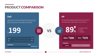
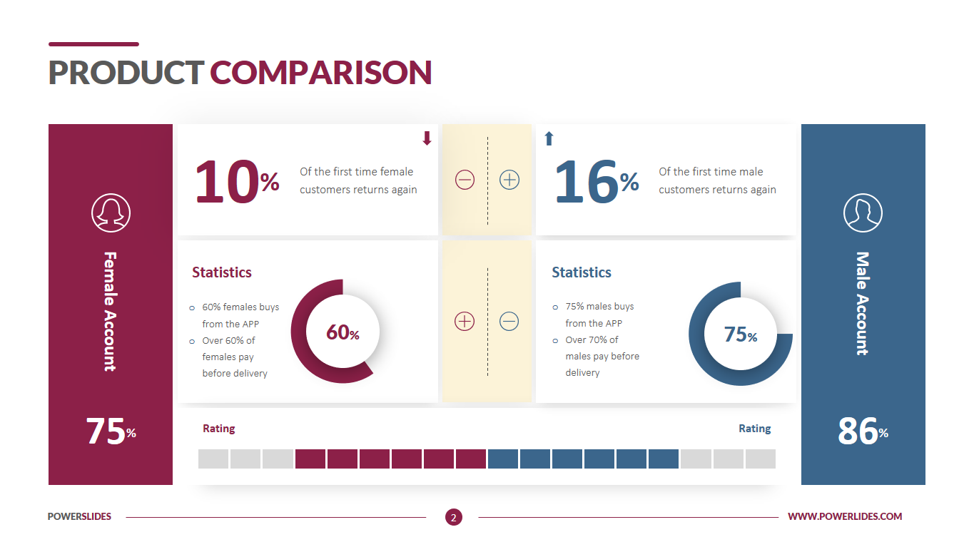
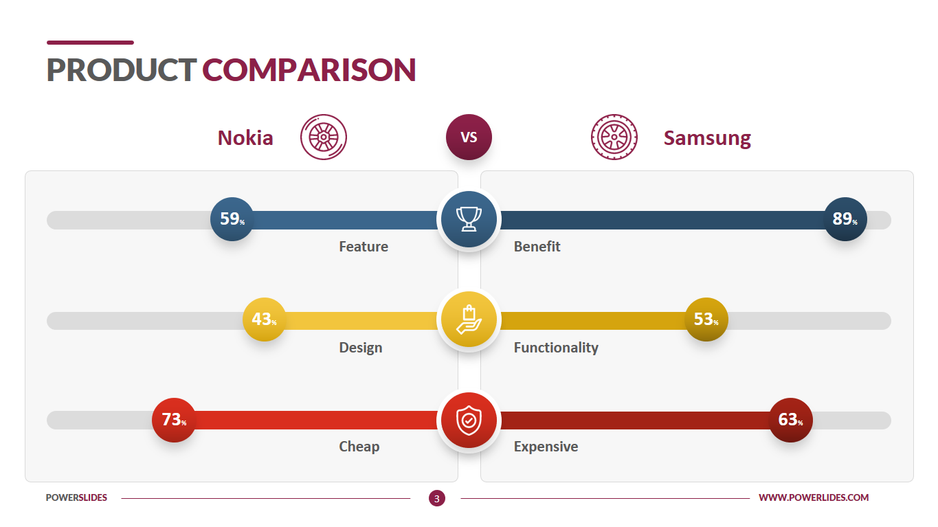
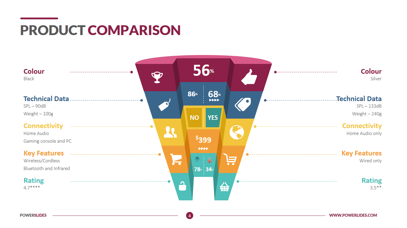
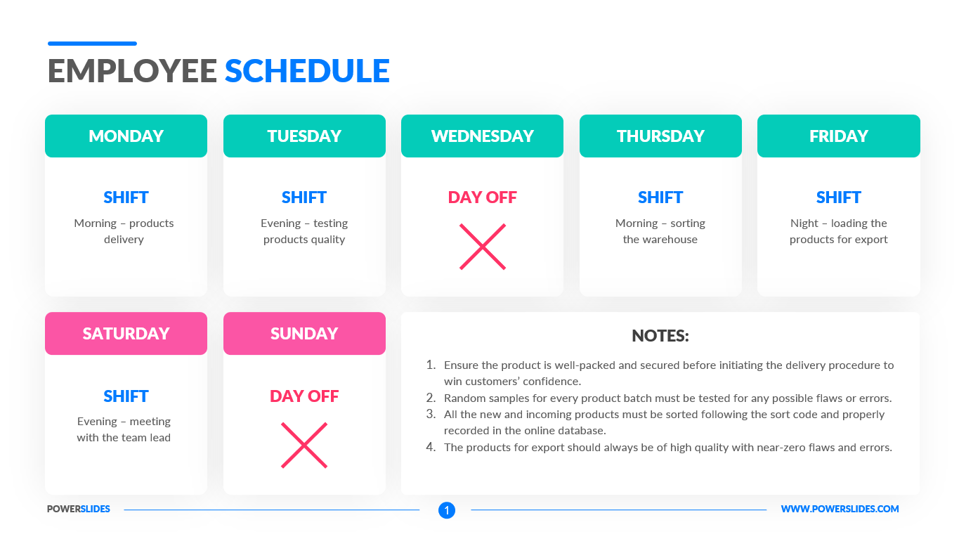
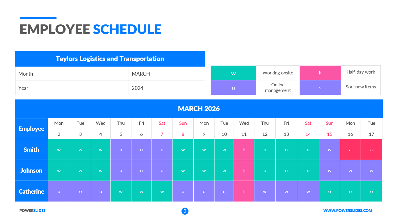
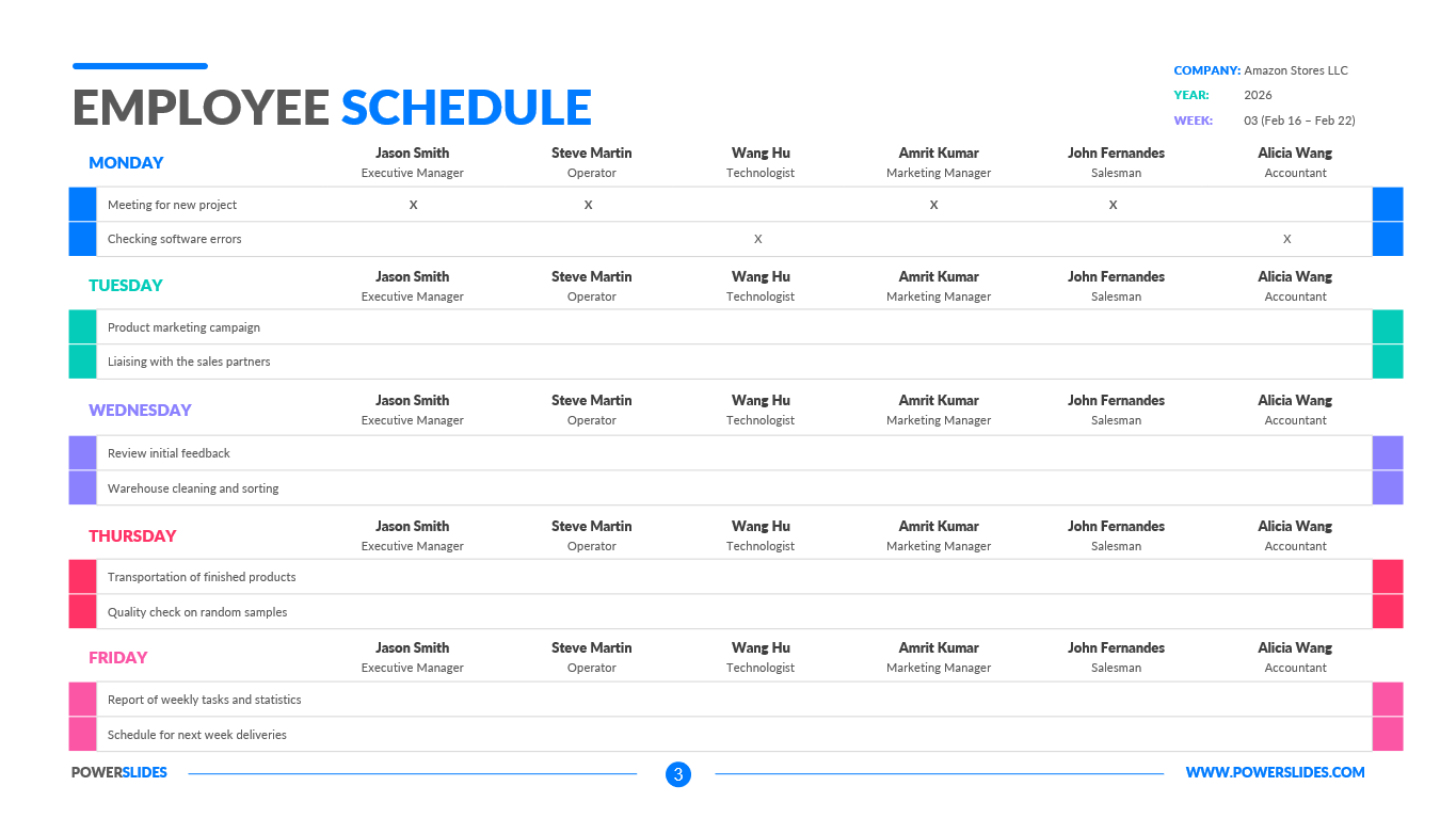
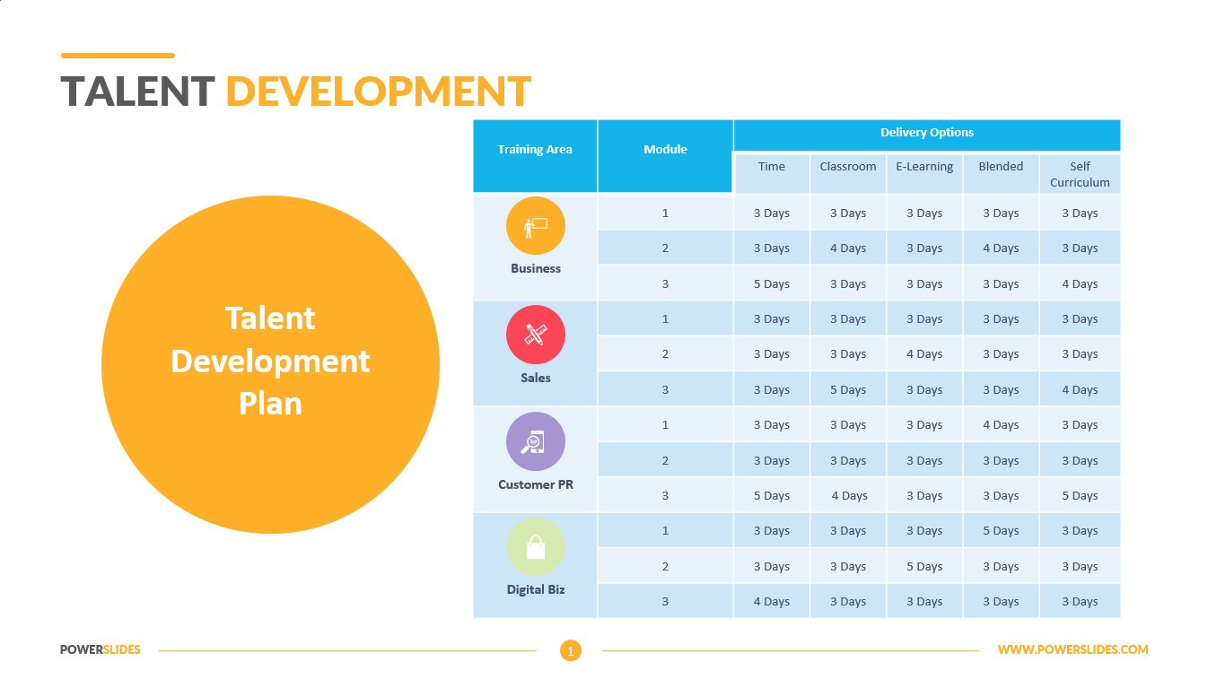
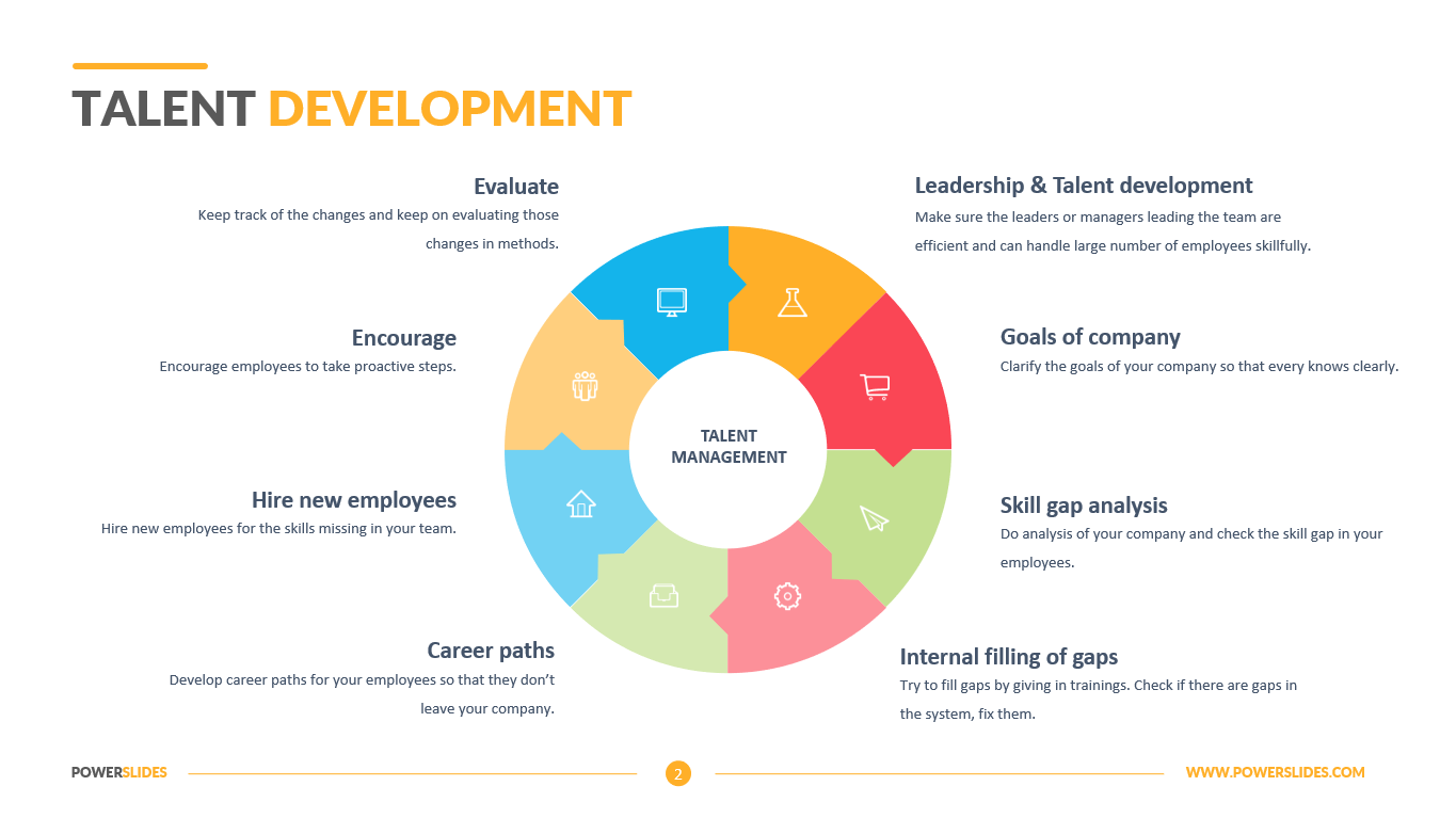
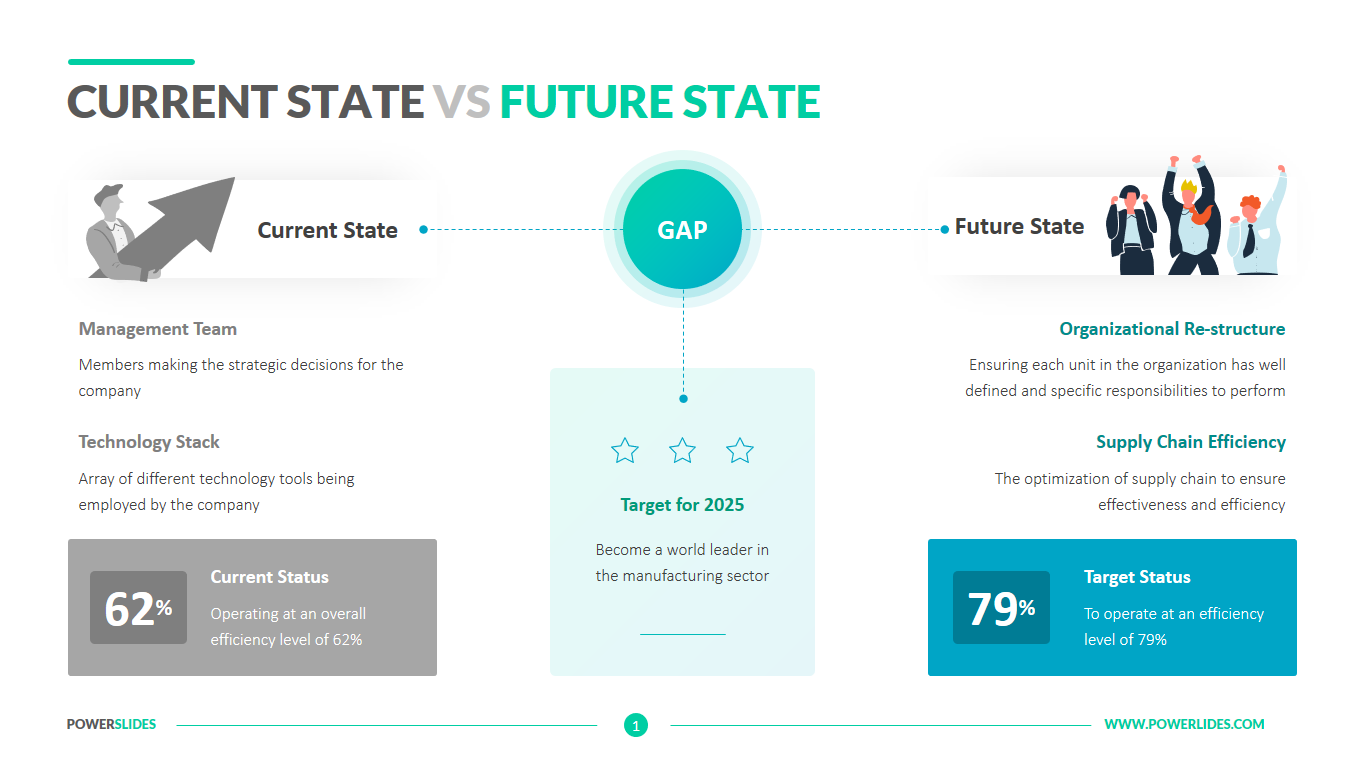
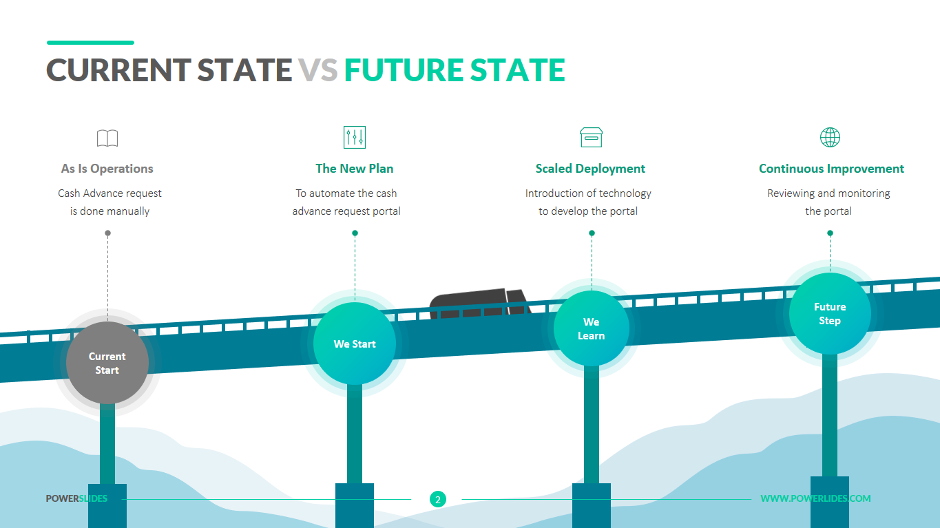
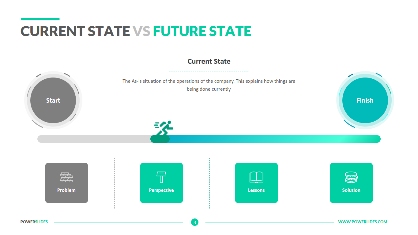
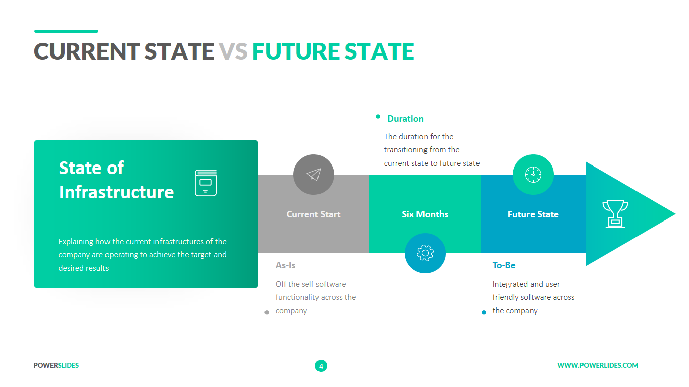
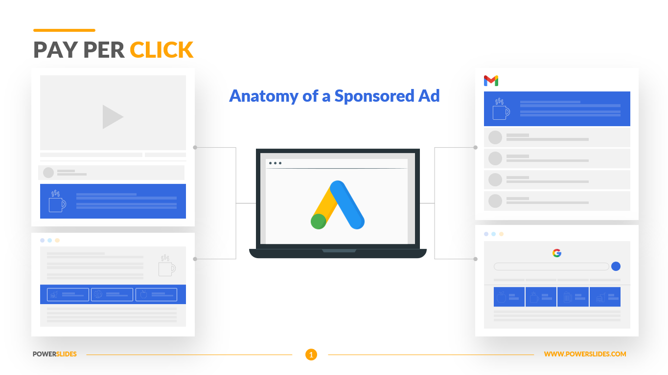
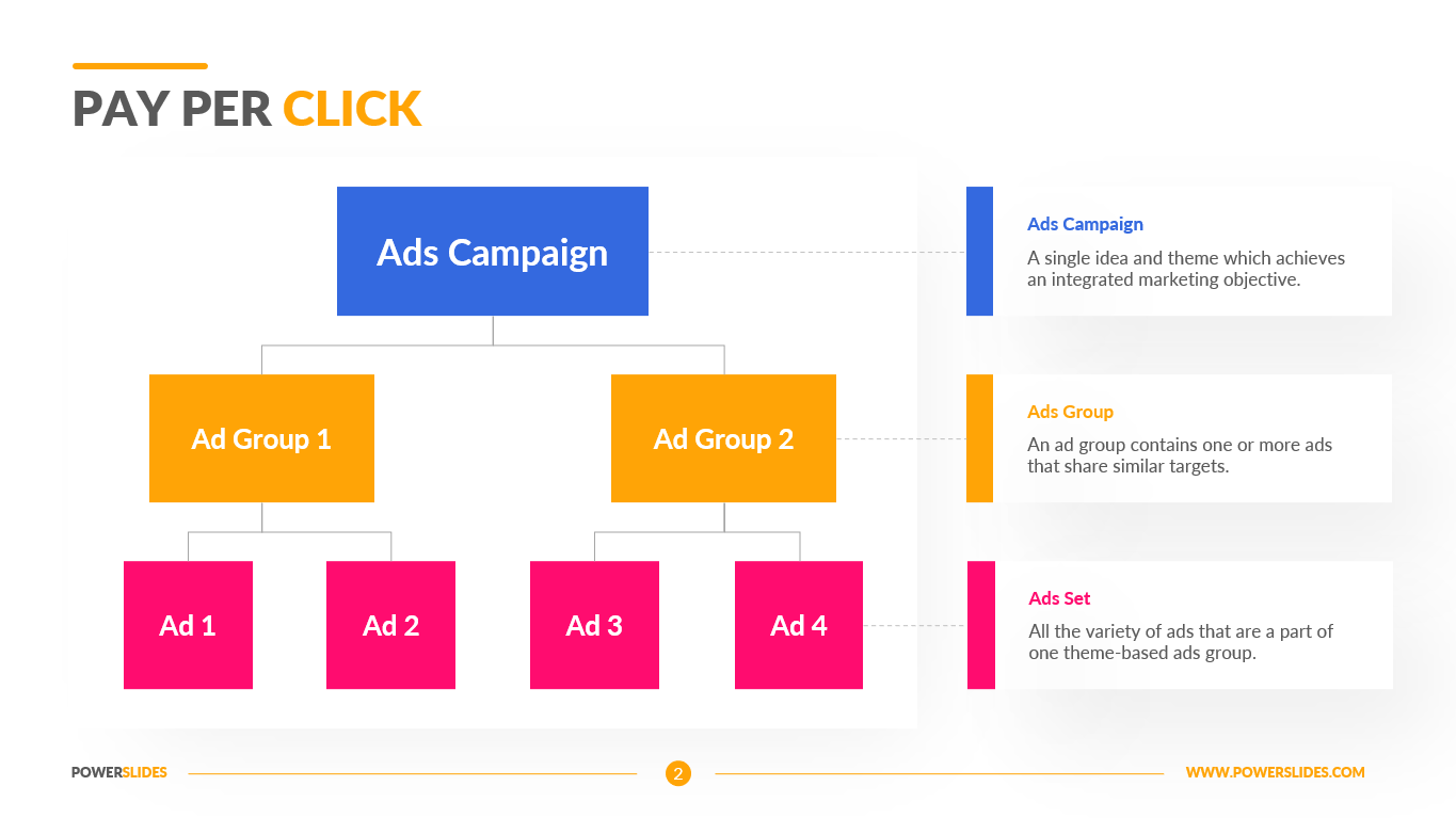
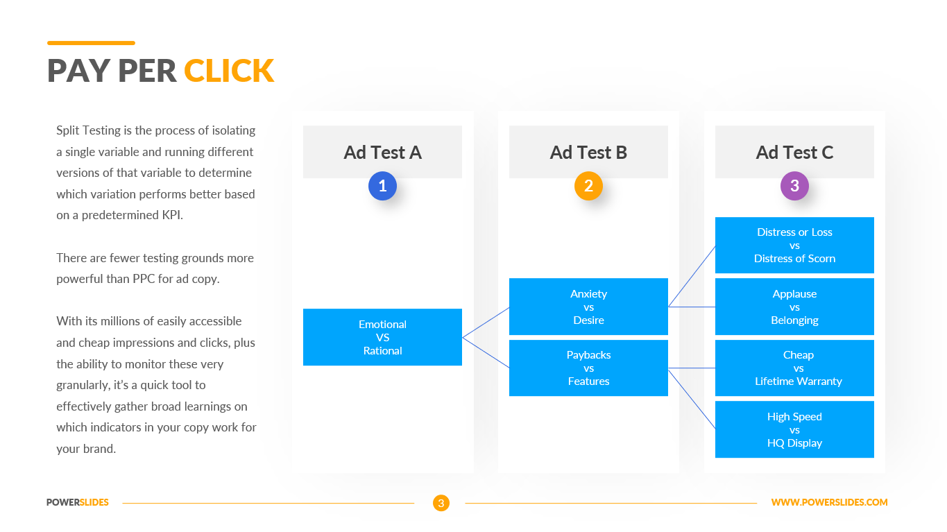
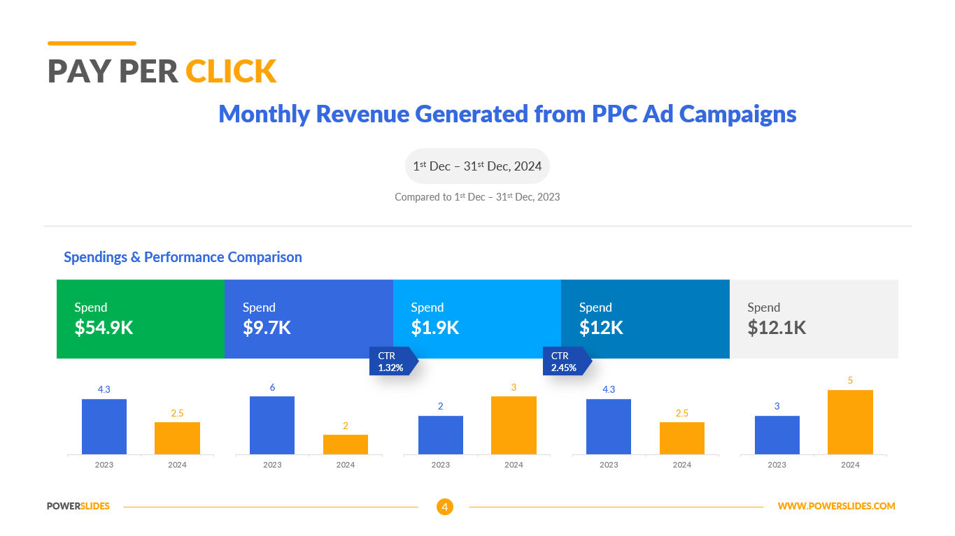
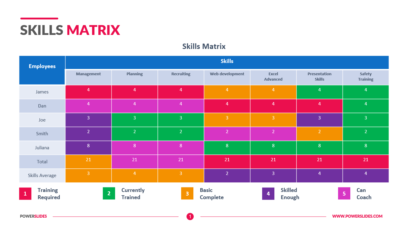
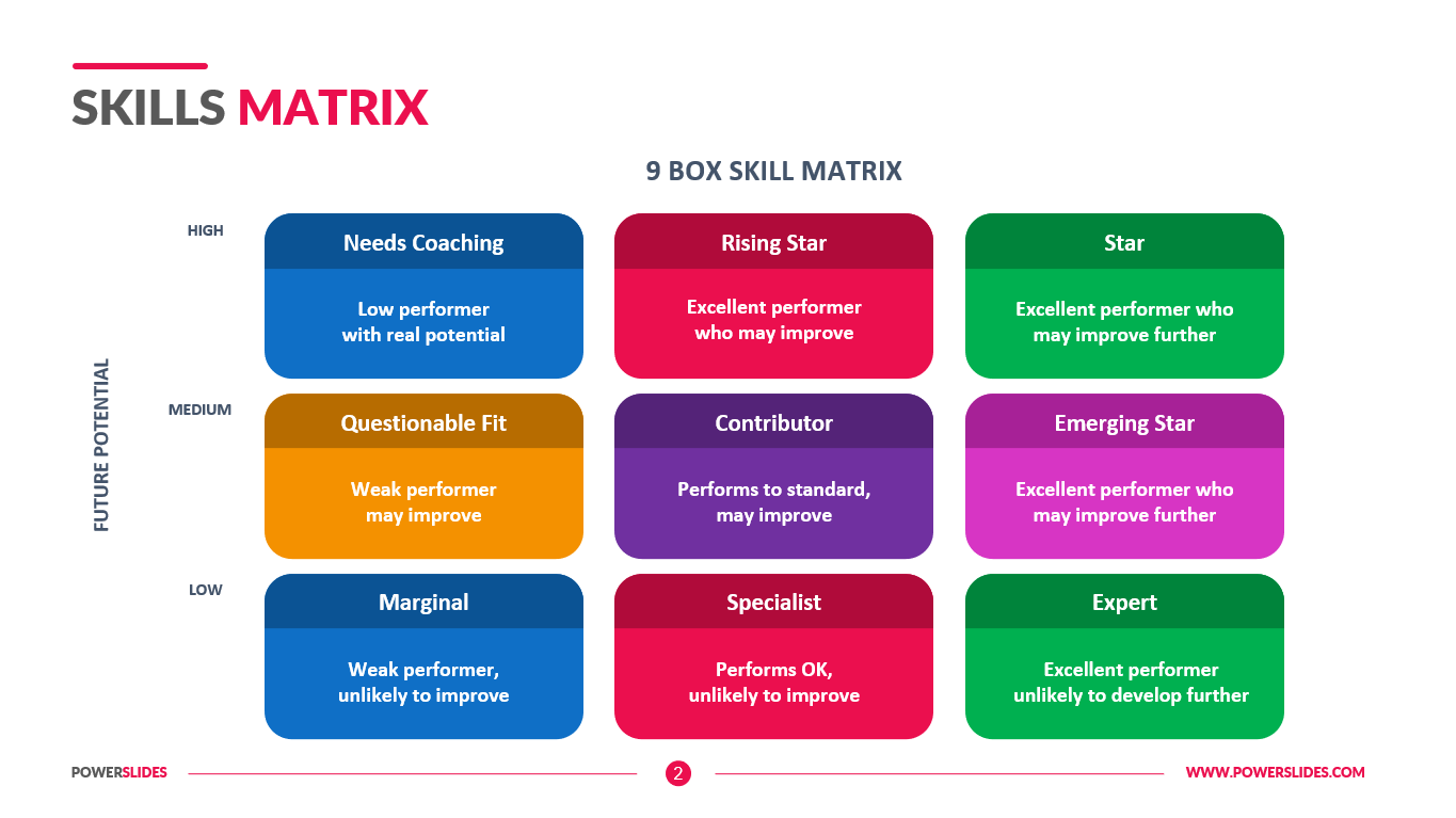
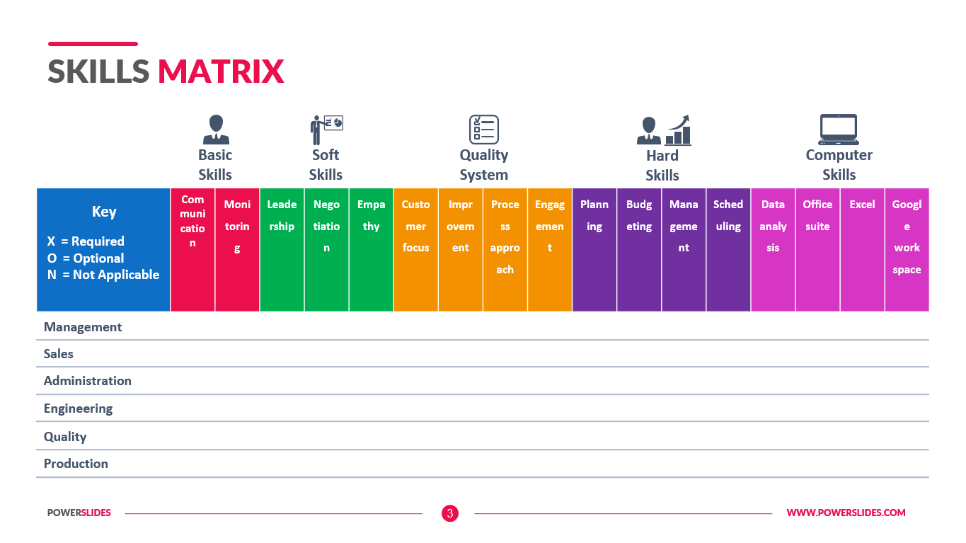
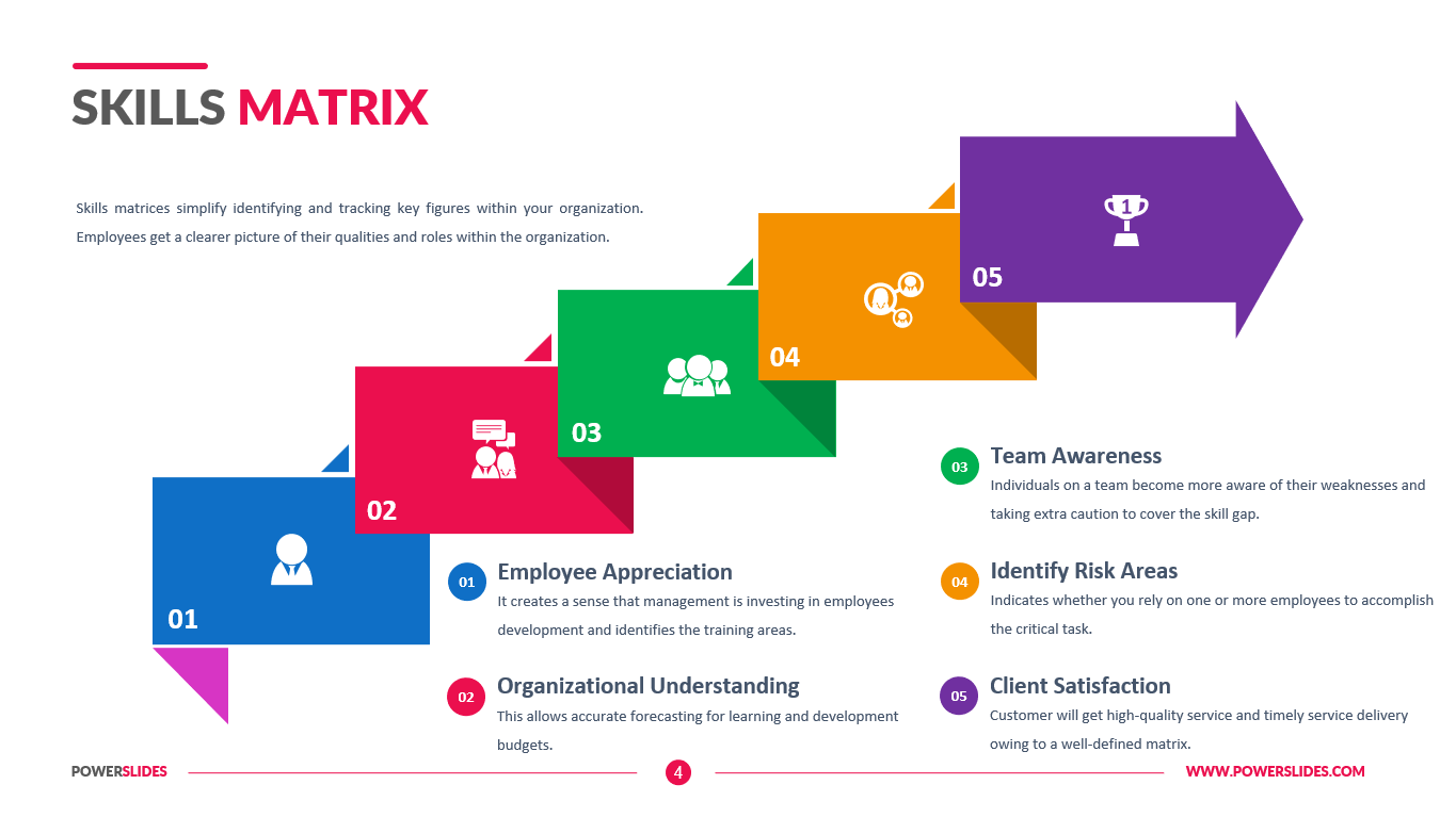
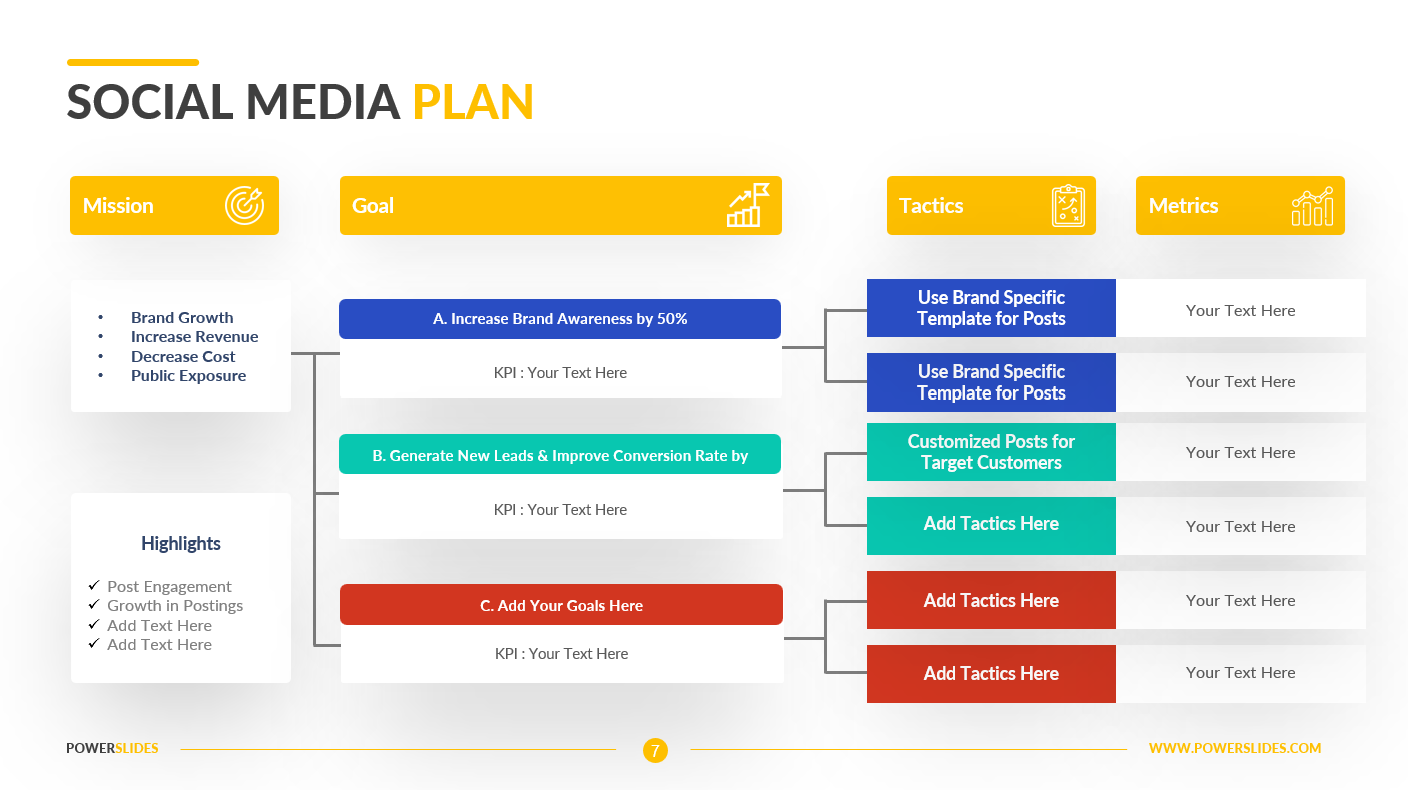
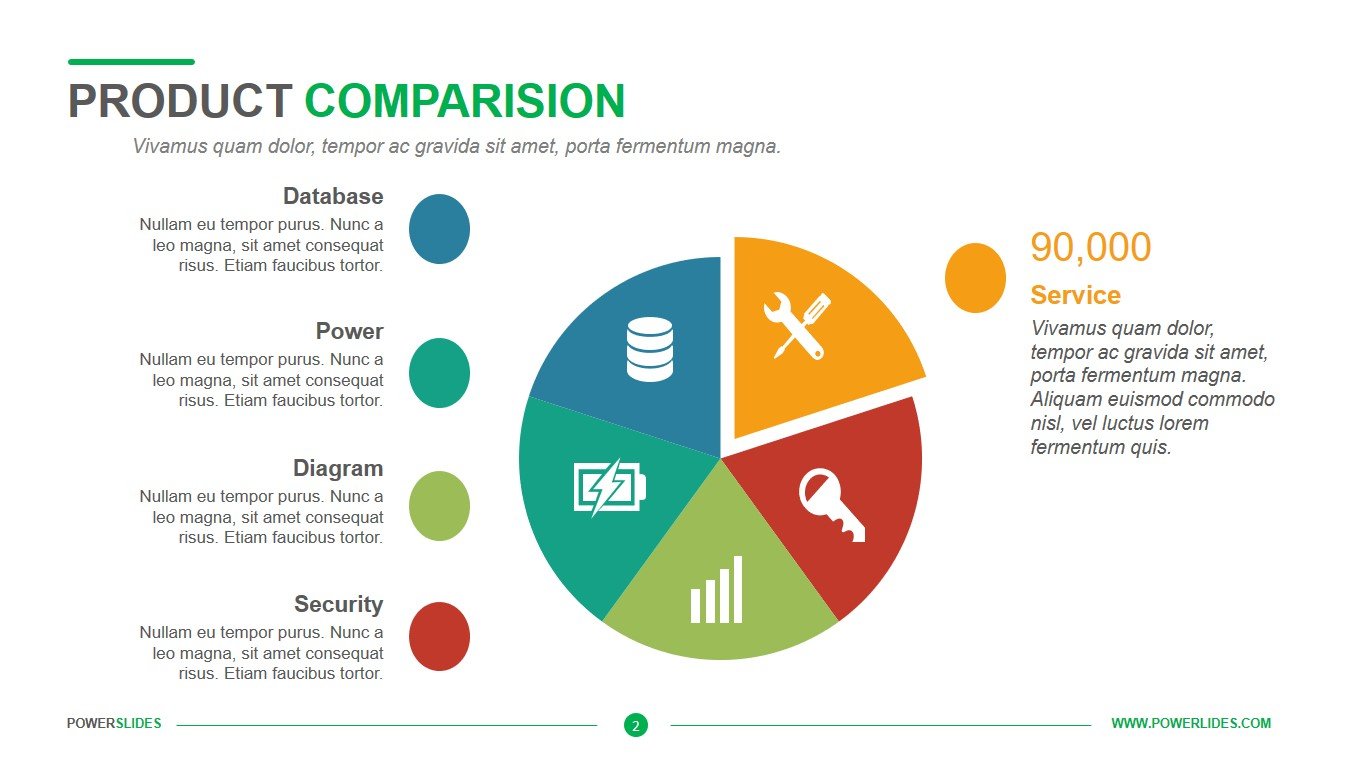
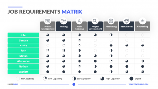
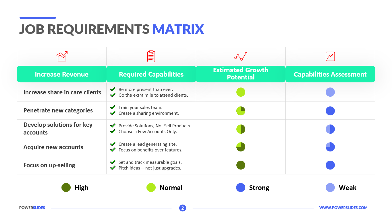
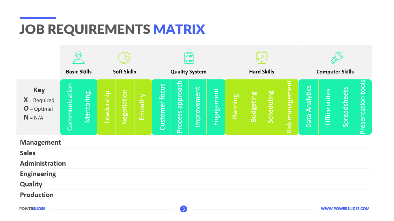
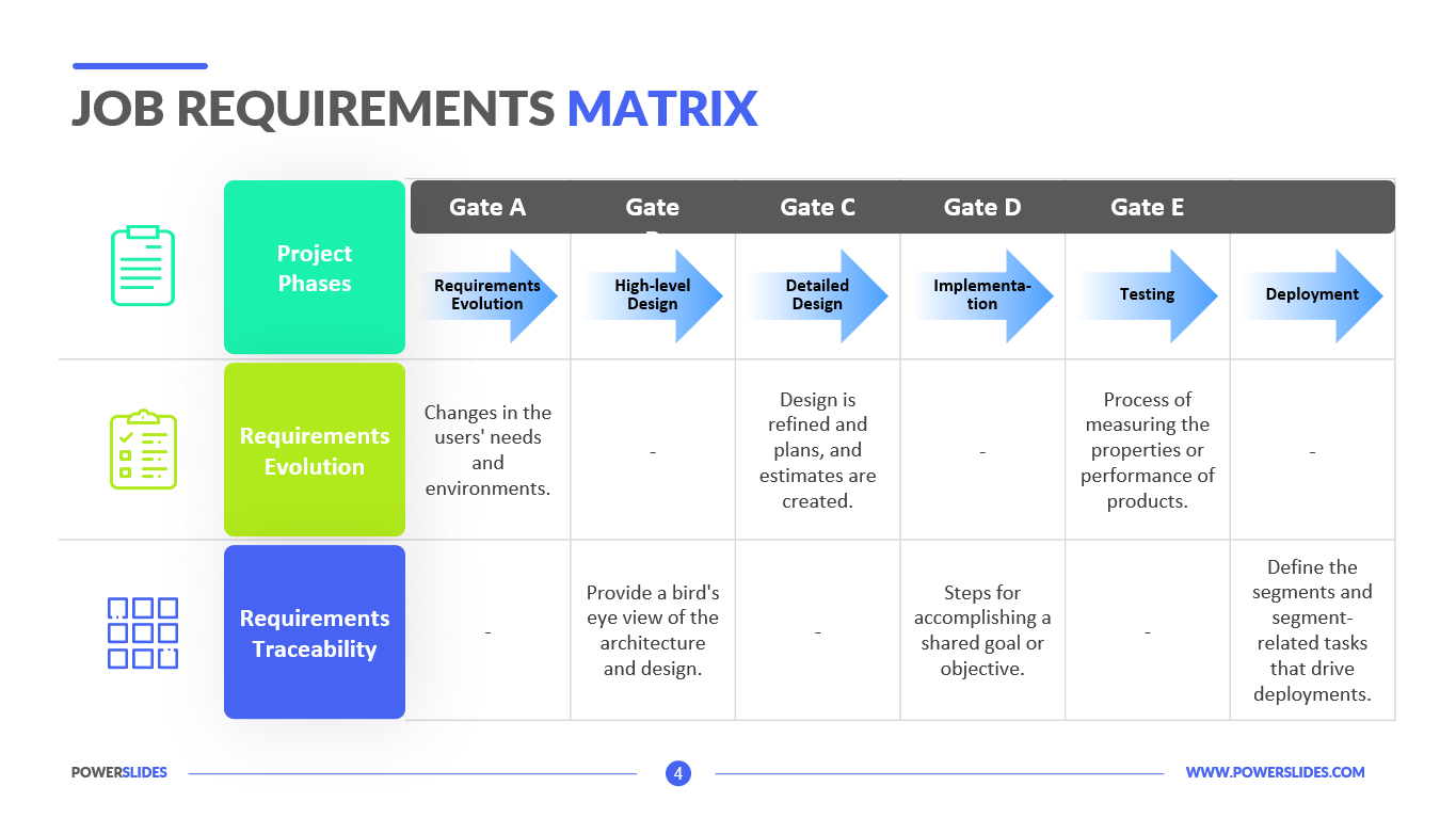
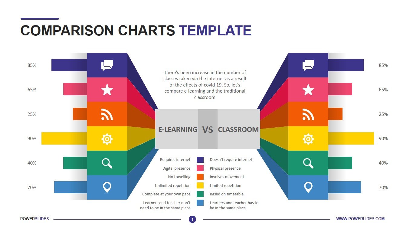
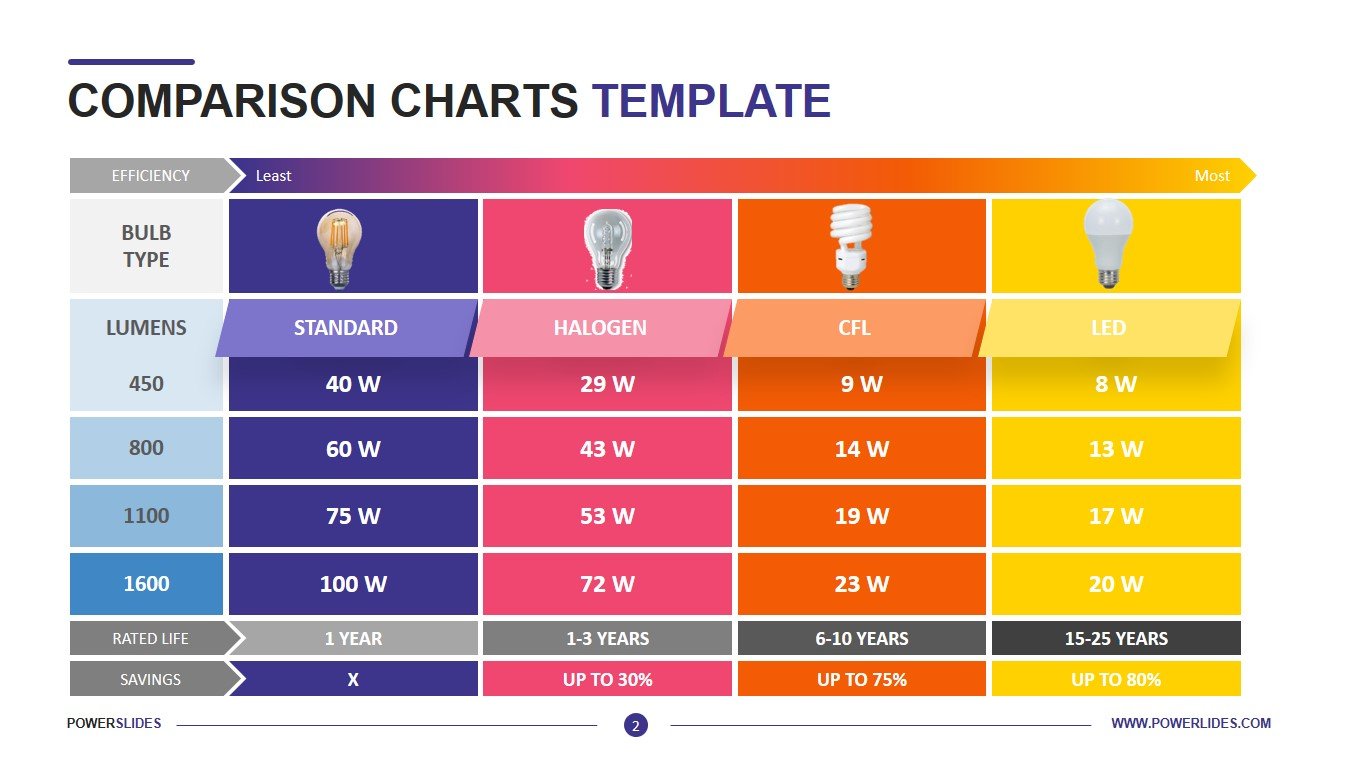
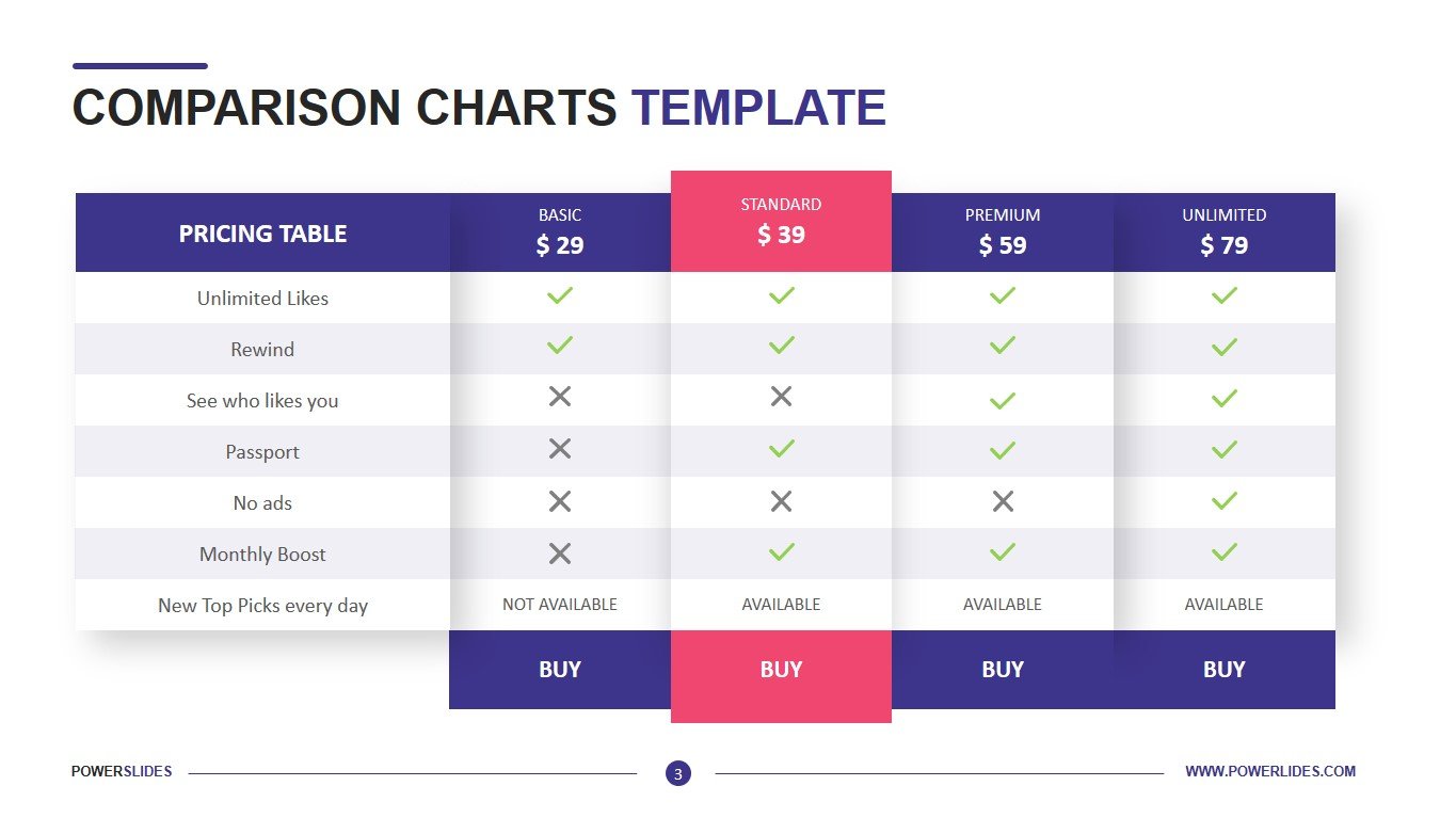
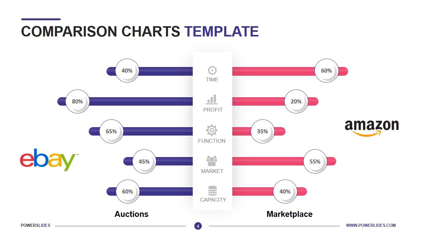
The Comparison Charts Template consists of four slides that are presented in a vibrant color scheme. The first slide is presented as a comparison of many parameters. The infographics have a 3D effect. In the middle of the slide, you can indicate the main characteristics of the products that you plan to compare. For example, you can compare online learning to classroom learning. The second slide is presented as a table that allows you to compare up to four objects. This slide will be useful for sales managers and marketers. For example, you can develop a catalog in which you compare similar products. The next slide will be useful for software developers. You can submit different rates for your service. You can highlight one of them and thus draw the attention of users to this particular service package. The last slide is presented in the form of stylized bar charts. The template can be used to prepare a comparison of the economies of two countries. The slide will be useful for marketers and advertising agency specialists, sales managers and analysts.
You can edit all elements of the slide if necessary. The template will be useful for business trainers when they prepare courses. Also, this template will be useful for investment companies and startups when preparing an analysis of the competitive environment. Comparison Charts Template will be a great addition to your collection and will organically complement any of your presentations.


