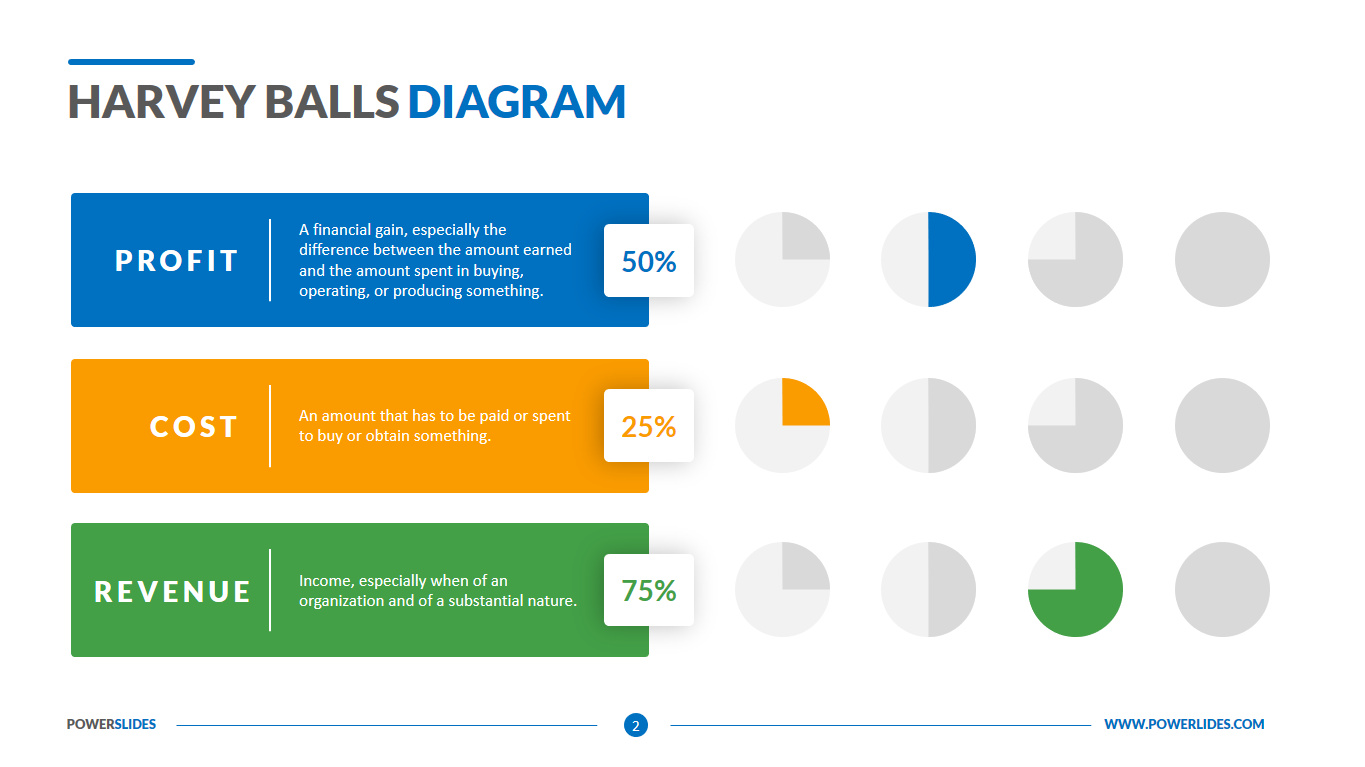
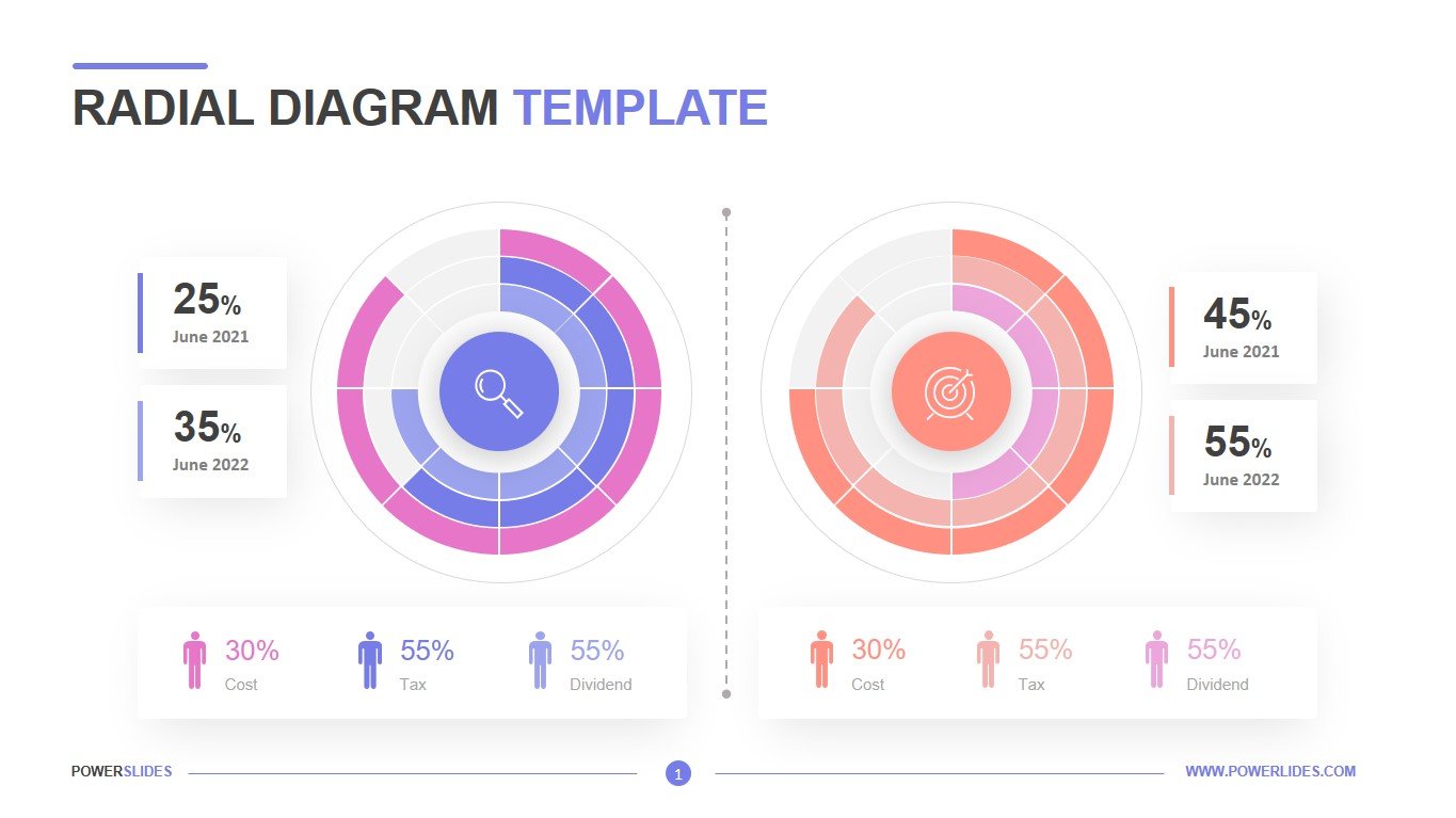
Radial Diagram
What do you think of this template?

 (3.00/ 5)
3 ratings

 4 Slides
 File size: 16:9
 Fonts: Lato Black, Calibri
 Supported version
PPT 2010, PPT 2013, PPT 2016
Supported version
PPT 2010, PPT 2013, PPT 2016

Product details
Radial Graphs are multi-axis graphs that show a number of similar ideas in one graphical presentation. They are so called because the axes, of which there are usually five or six, radiate out from a central point. Researchers tend to use radial graphs not only to allow them to present five or more sets of data on one diagram at once, but also because it allows them to compare the relative strengths of the different variables at the same time as the overall strength of the location compared to others. Once plotted, the points of a radial graph can be joined together to form a shape. This shape can be compared with others that have been plotted on the same axes and this comparison may allow the reader to identify patterns across a range of different sites. A shape with a clear point may indicate that one variable dominates in one field, while a more circular shape will show that all the variables may hold roughly equal weights. Equally the different shapes can be drawn in different colors over one another on the same set of axes, allowing a comparison to be made more easily between different sites, different groups of people, or different years. One form of a radial graph is a Rose Graph. This is a circular histogram, with multiple axes radiating out from the center. Instead of points being plotted along an axis, bars are drawn to show the quantity of that variable. A common use of a rose graph is in showing wind speed or noise levels. The ‘axes’ for the graph are the directions of a compass and the speed of the wind or the decibel level is then drawn in the appropriate direction.
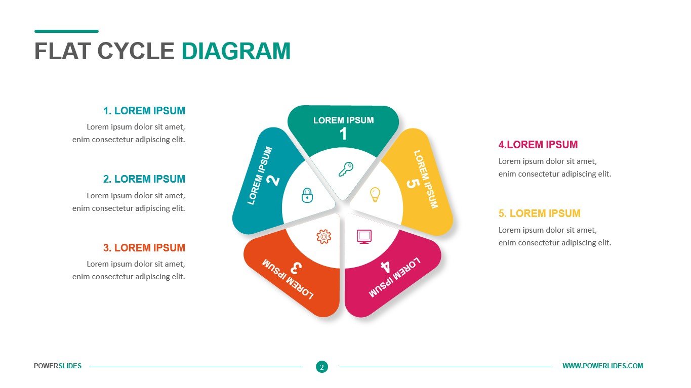
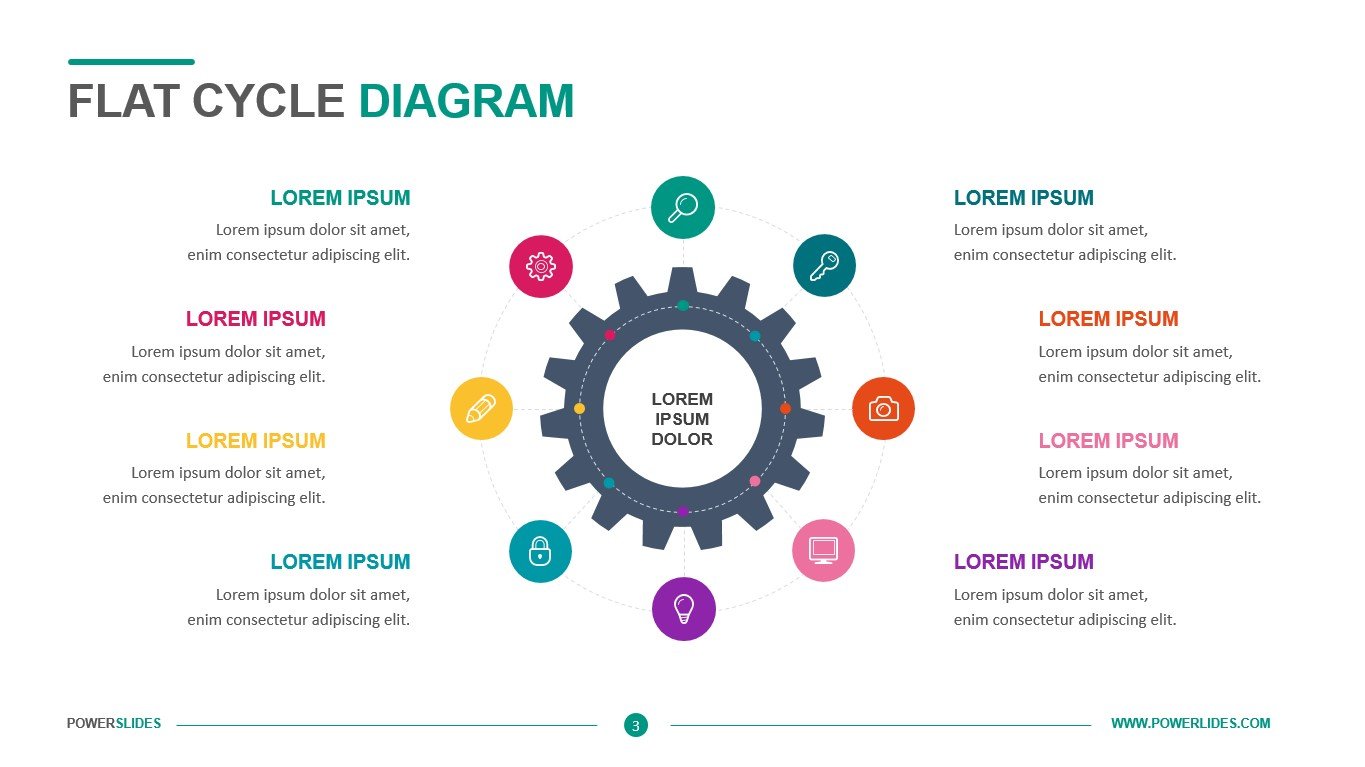
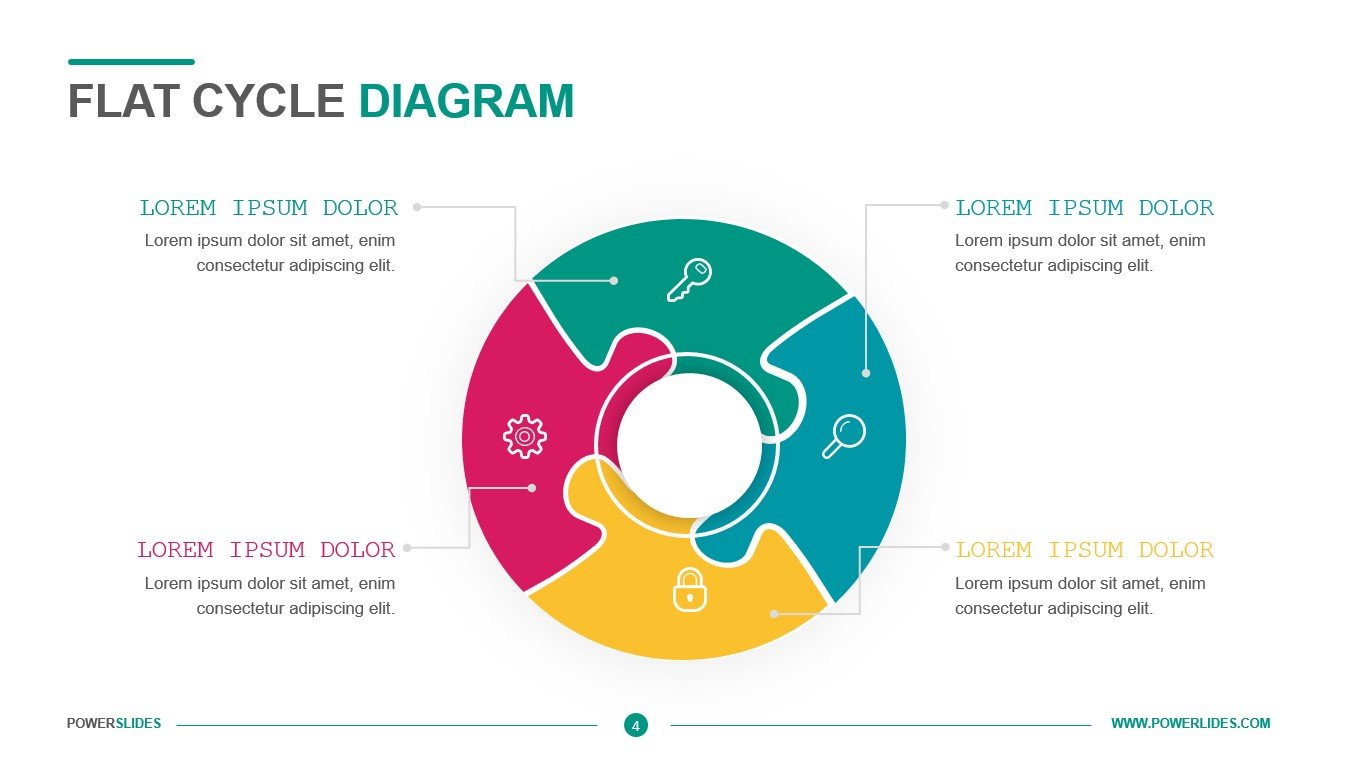
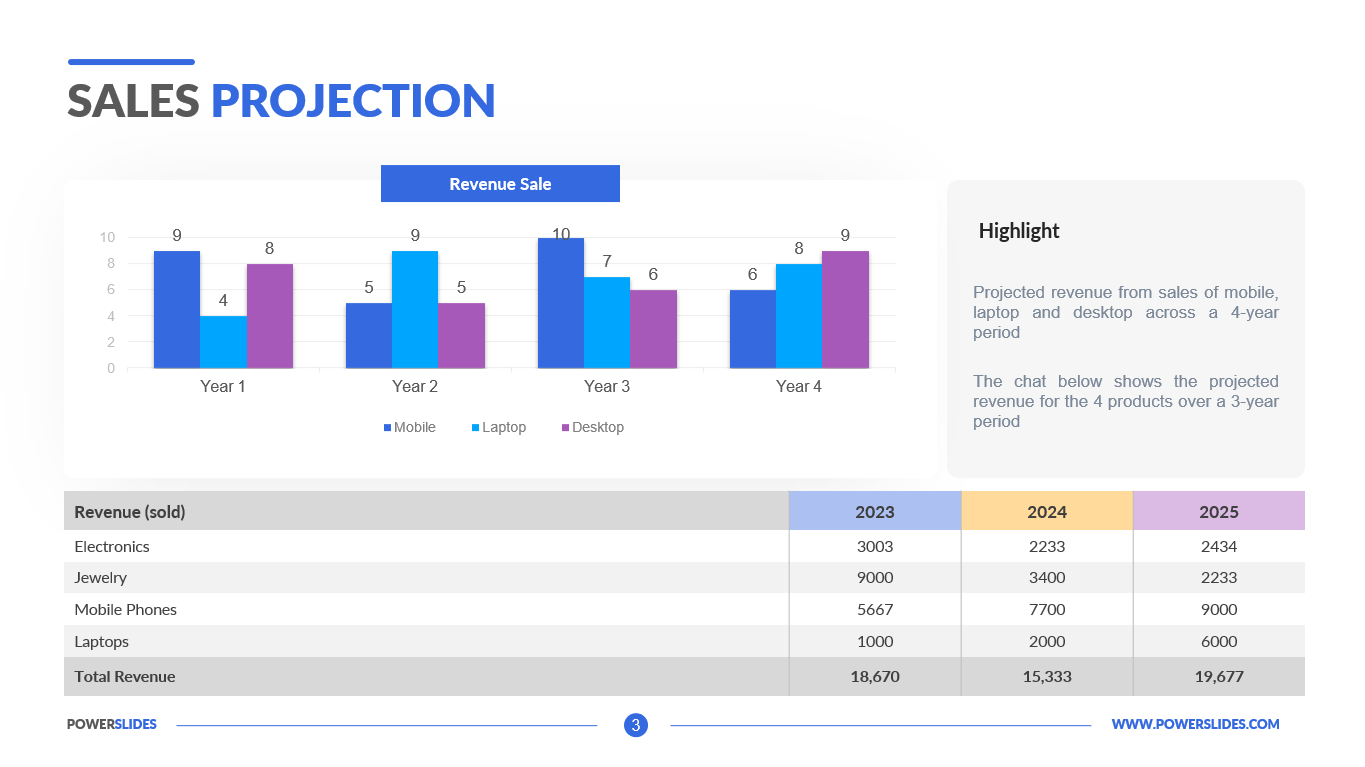
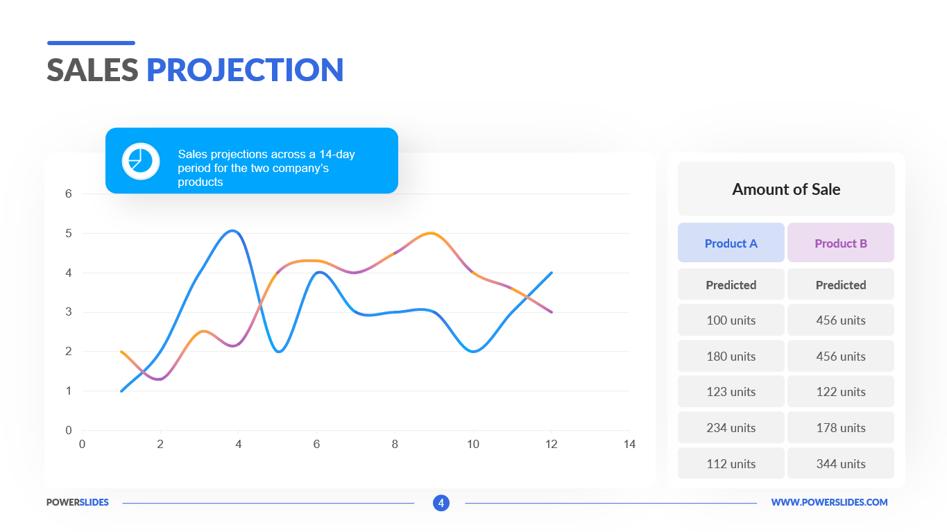
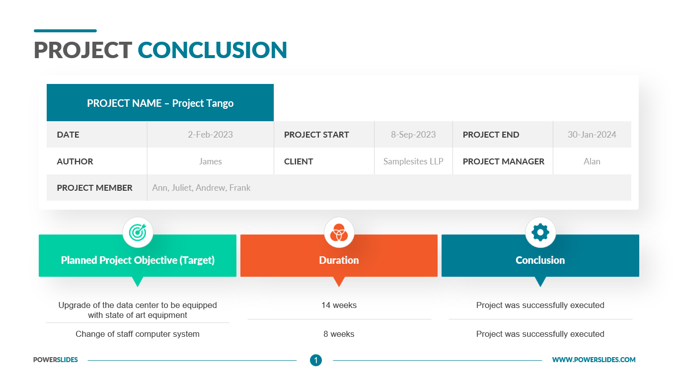
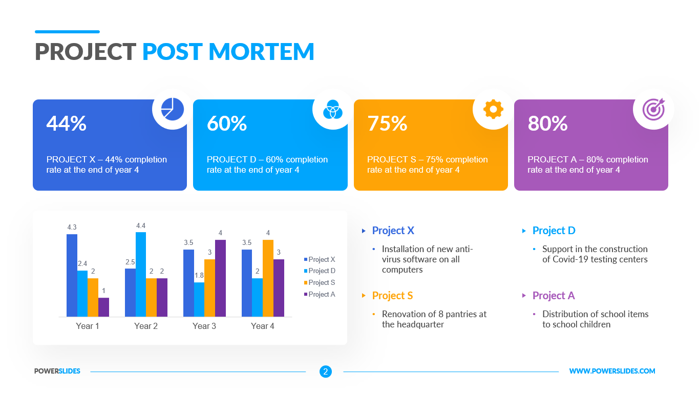
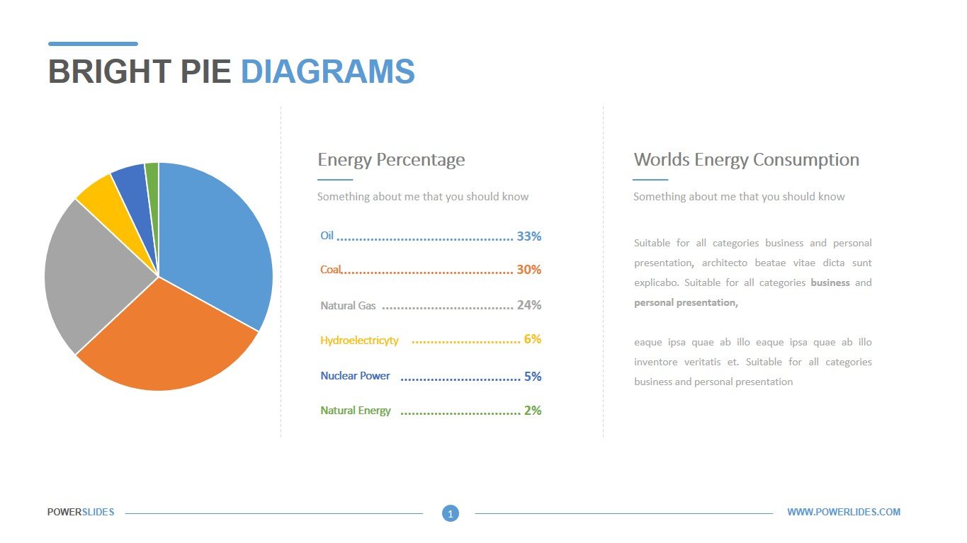
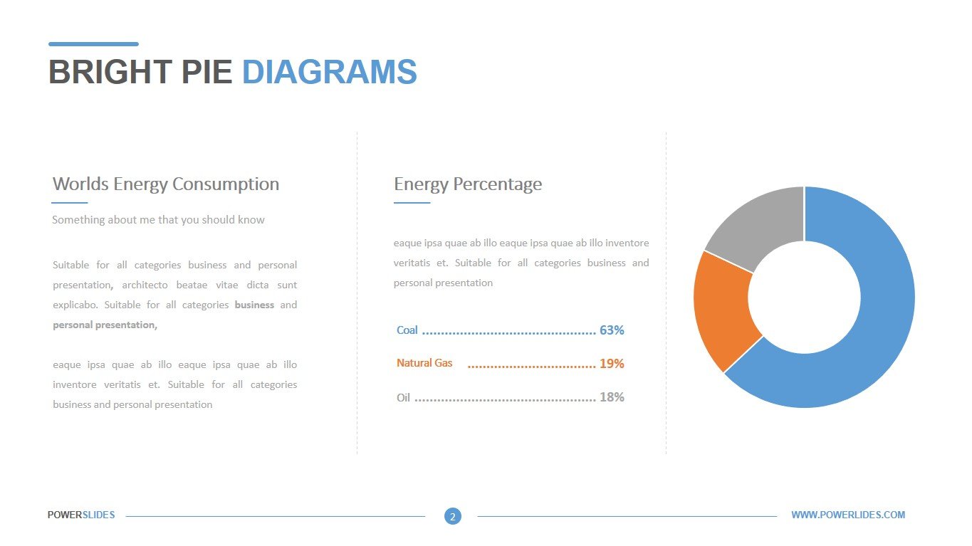
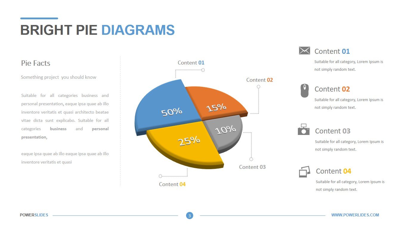
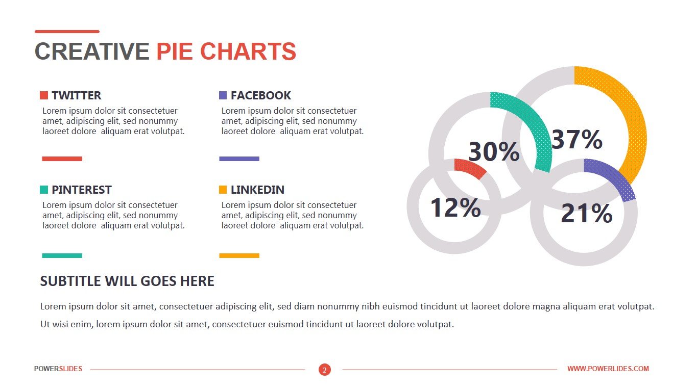
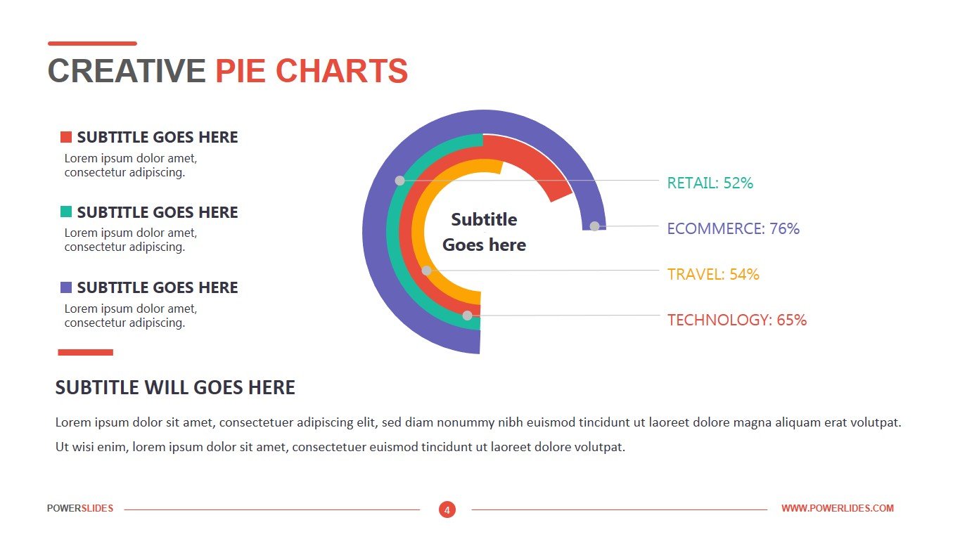
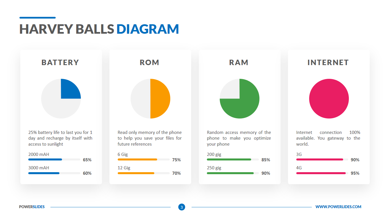
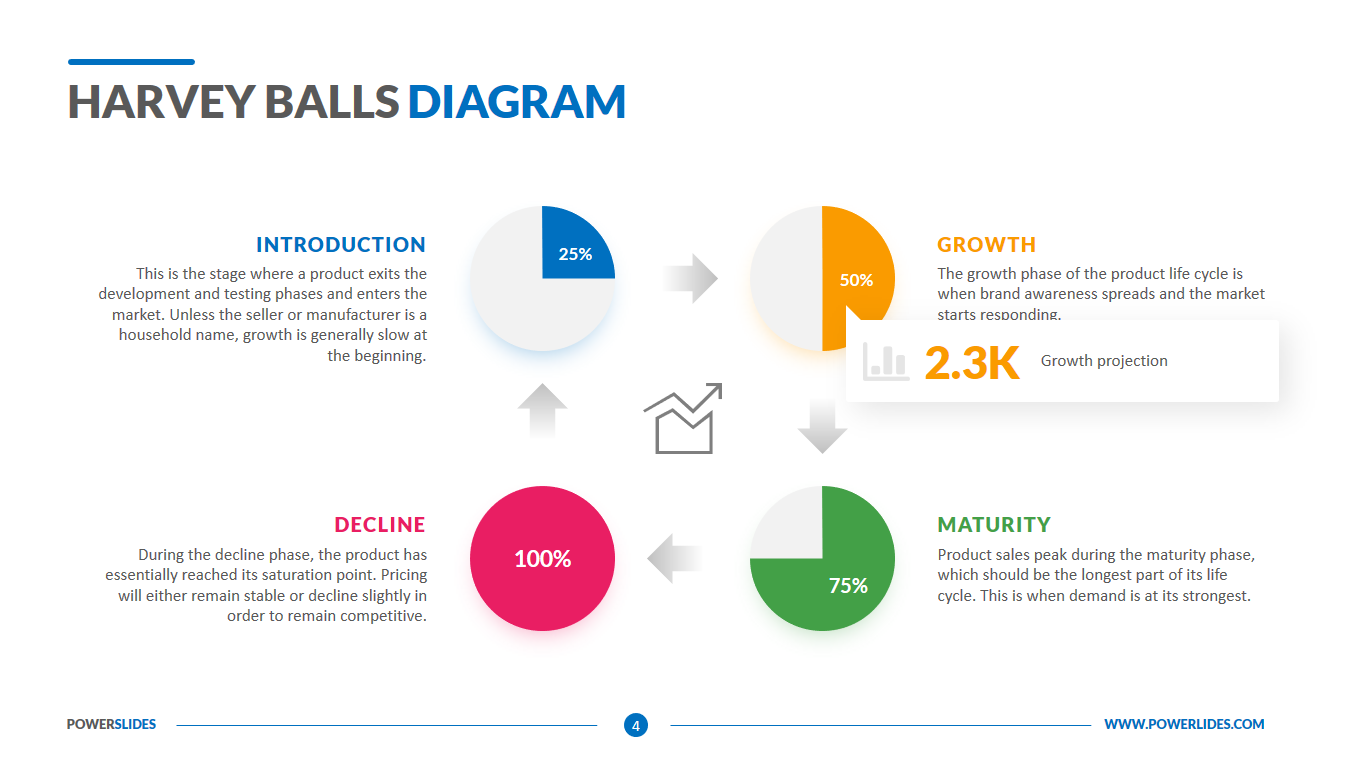
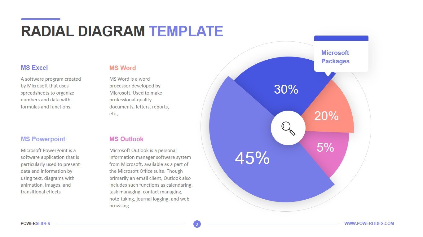
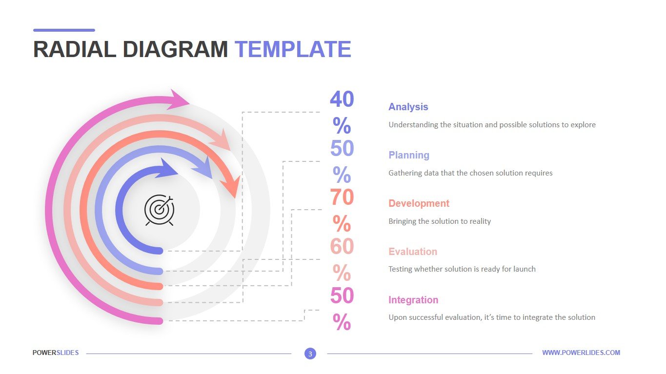
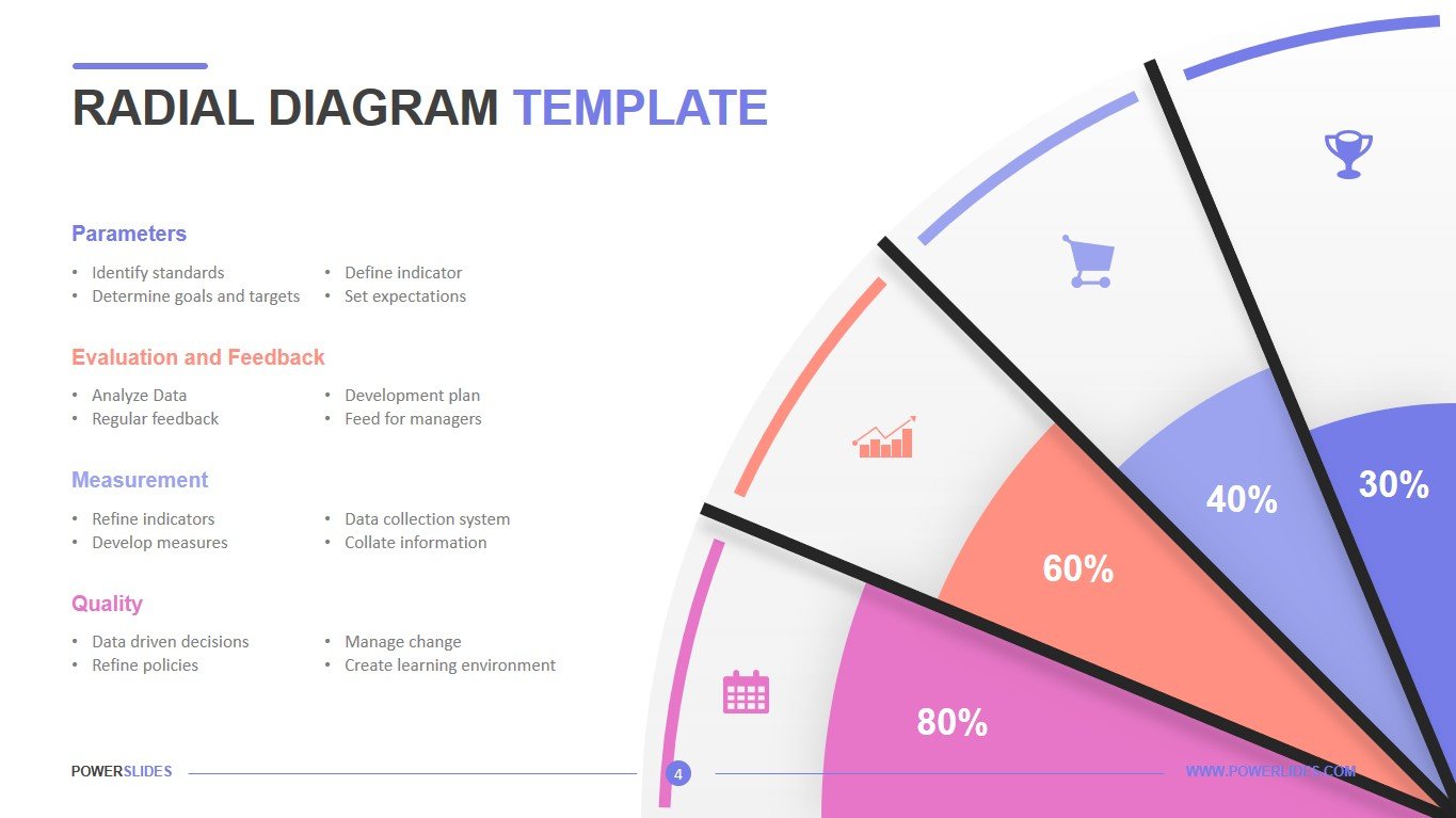
Radial Diagram Template is made in accordance with the latest design trends. The first slide of the template allows you to compare on several indicators over a certain period. For example, you can specify expenses, taxes and dividends for different development strategies of the company and specify periods of comparison. This slide will be useful for economists and financiers of any company. Also, this slide can be used when preparing stock quotes when predicting stock returns. The next slide gives you the opportunity to describe the different categories of data presented in the chart on the right side of the slide. This slide will be useful for logisticians and purchasing managers when preparing a report on various categories of costs for the transportation and purchase of products. Also, this slide can be used by employees of the HR department when preparing information on the percentage of employees of different departments. The next slide can be used to prepare the work plan report. For example, you can specify the percentage of completion for each type of work. Economists can also use this slide when preparing a report on a company’s major cost categories. The last slide has very expressive chart infographics that immediately grabs the audience’s attention. This slide can be used by sales managers when preparing a report on sales of major product groups. For example, you can specify sales shares by grocery department in a supermarket. All slides in the template are easy to edit. Radial Diagram Template will be a worthy addition to your slide collection.


