Speedometer KPI Charts
What do you think of this template?

 (4.14/ 5)
29 ratings

 5 Slides
 File size: 16:9
 Fonts: Lato Black, Calibri
 Supported version
PPT 2010, PPT 2013, PPT 2016
Supported version
PPT 2010, PPT 2013, PPT 2016

Product details
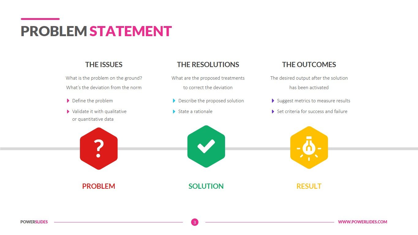
Key performance indicators have always been the most critical part of a company. Without KPIs, a company roams blindly into uncontrollable performance management issues and risks losing its business. But utilizing KPIs is not the only thing an organization should focus on. Choosing the right KPI and connecting it to others to create a proper data-story is one of the crucial elements that will enable managers and team members to stay on track for reaching and outperforming company’s goals and objectives.
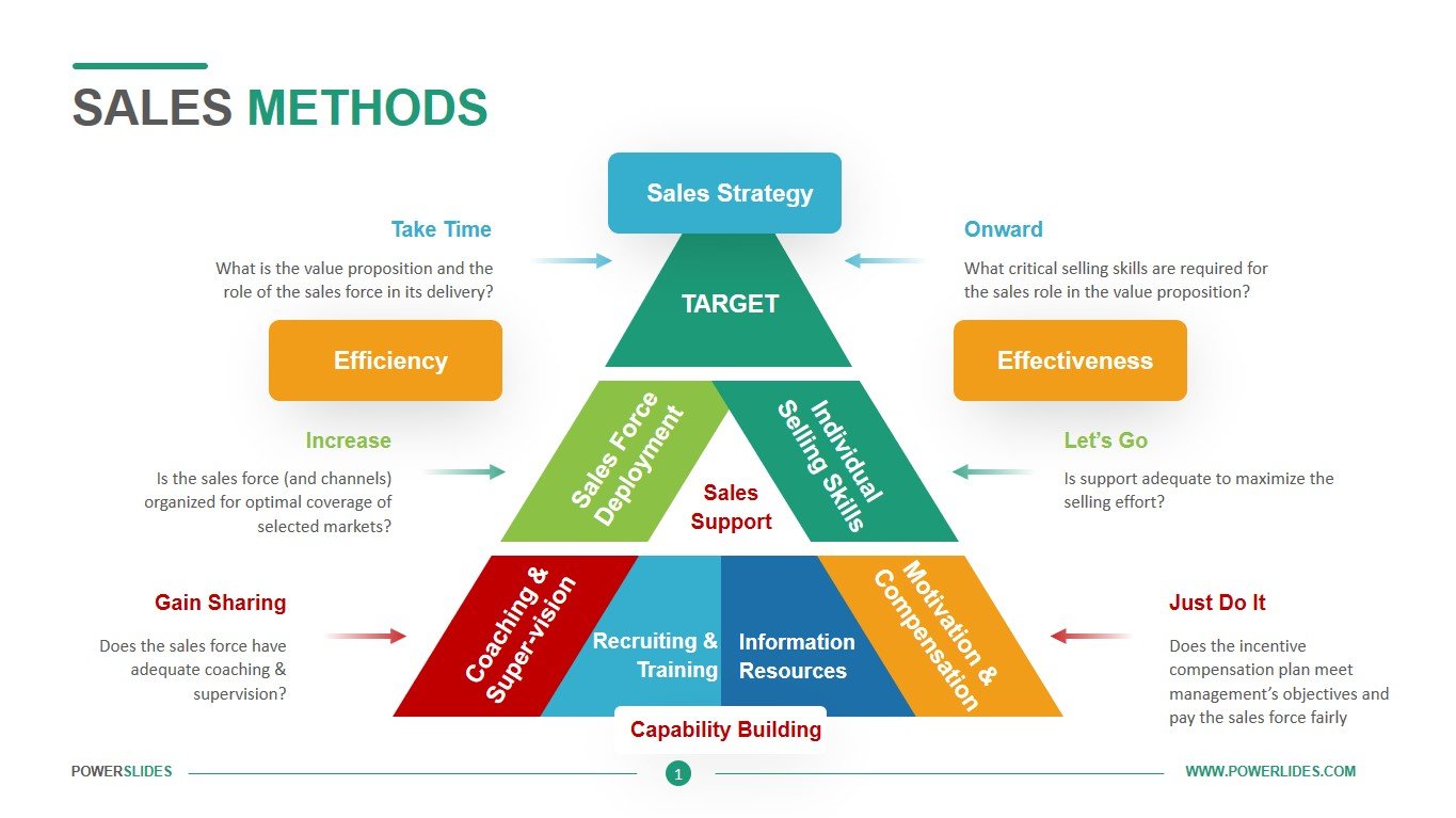
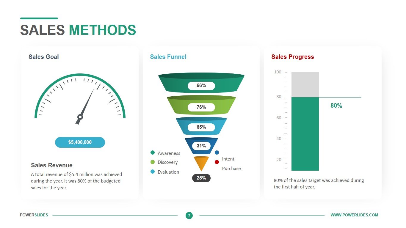
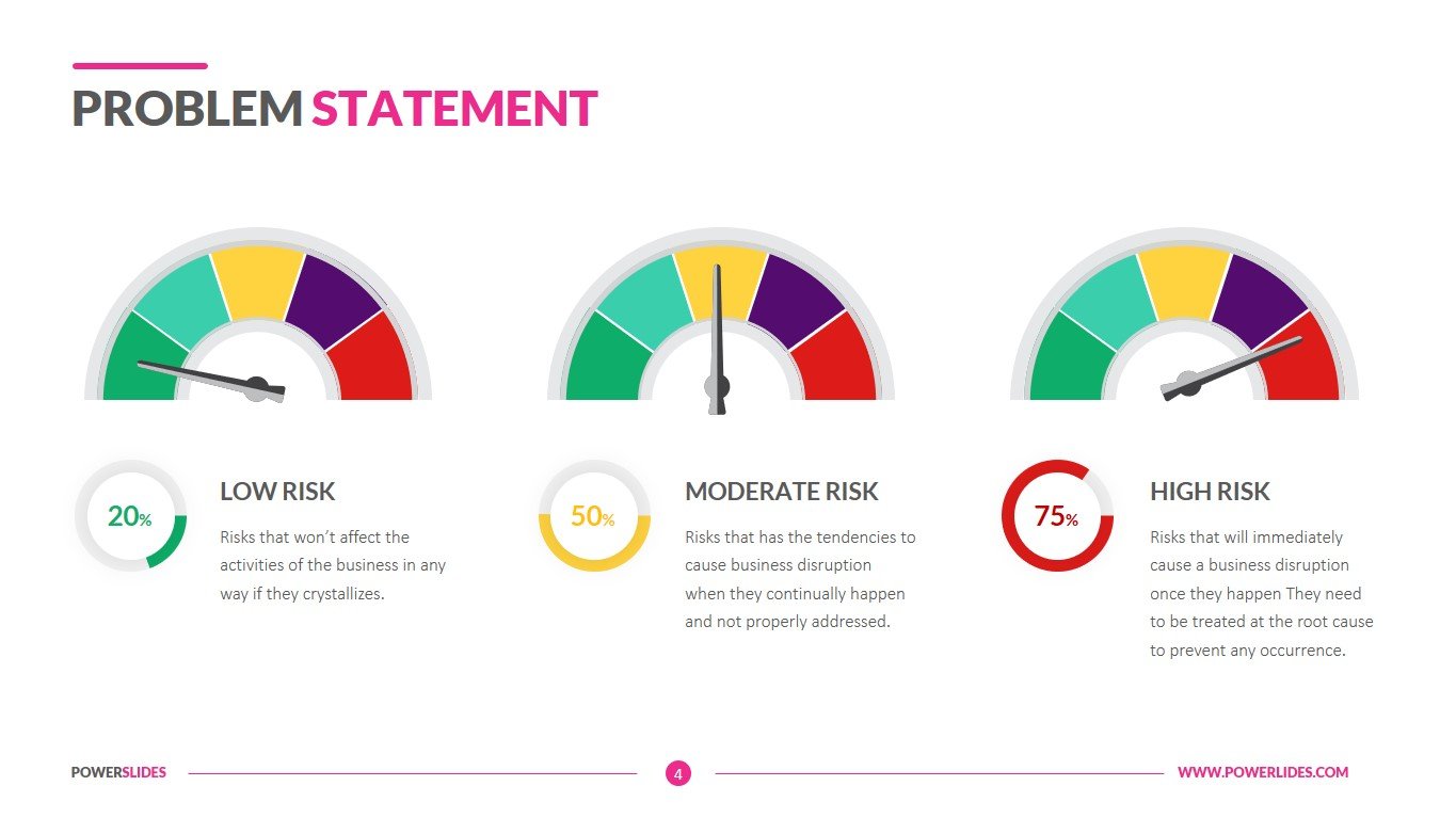
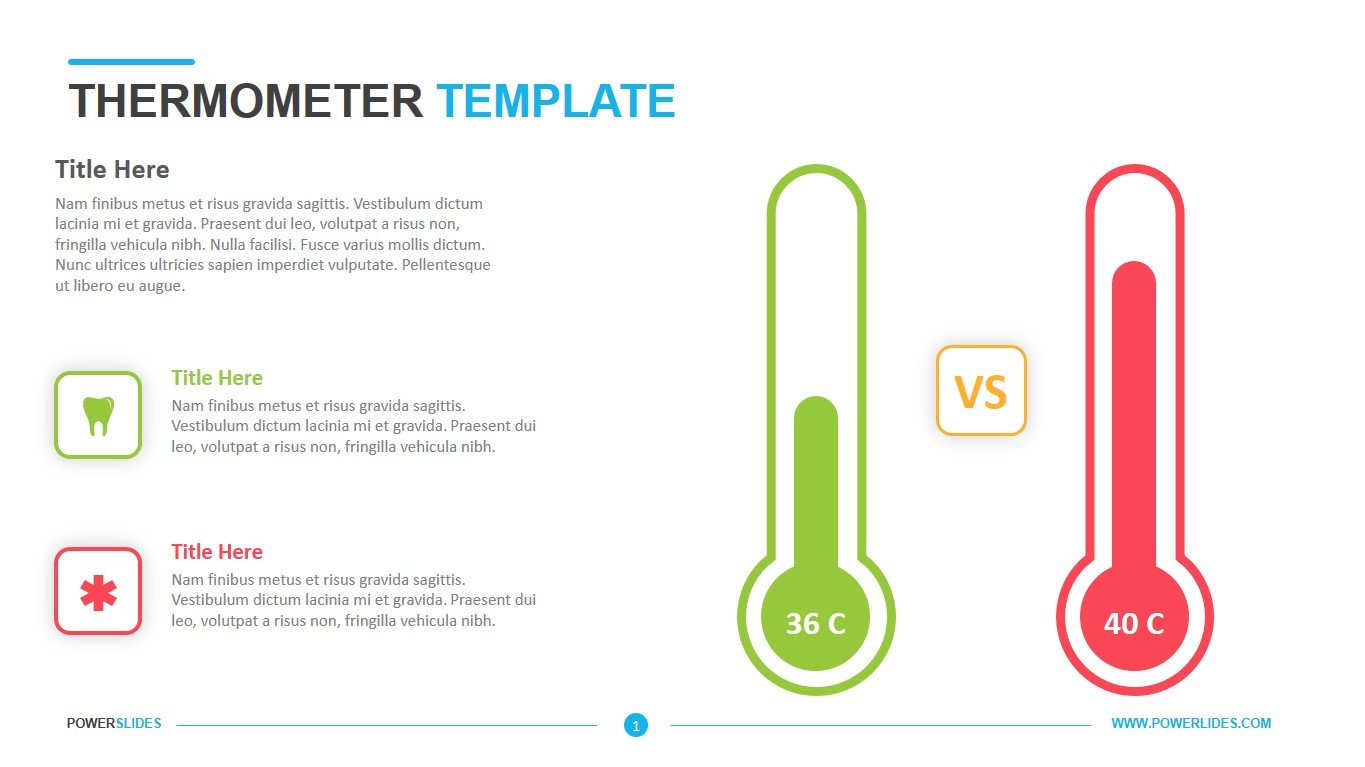
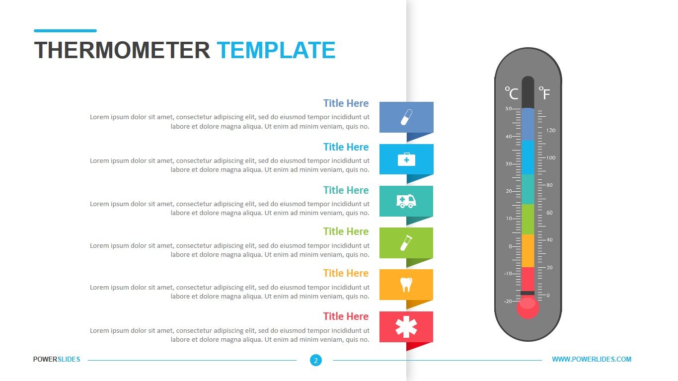
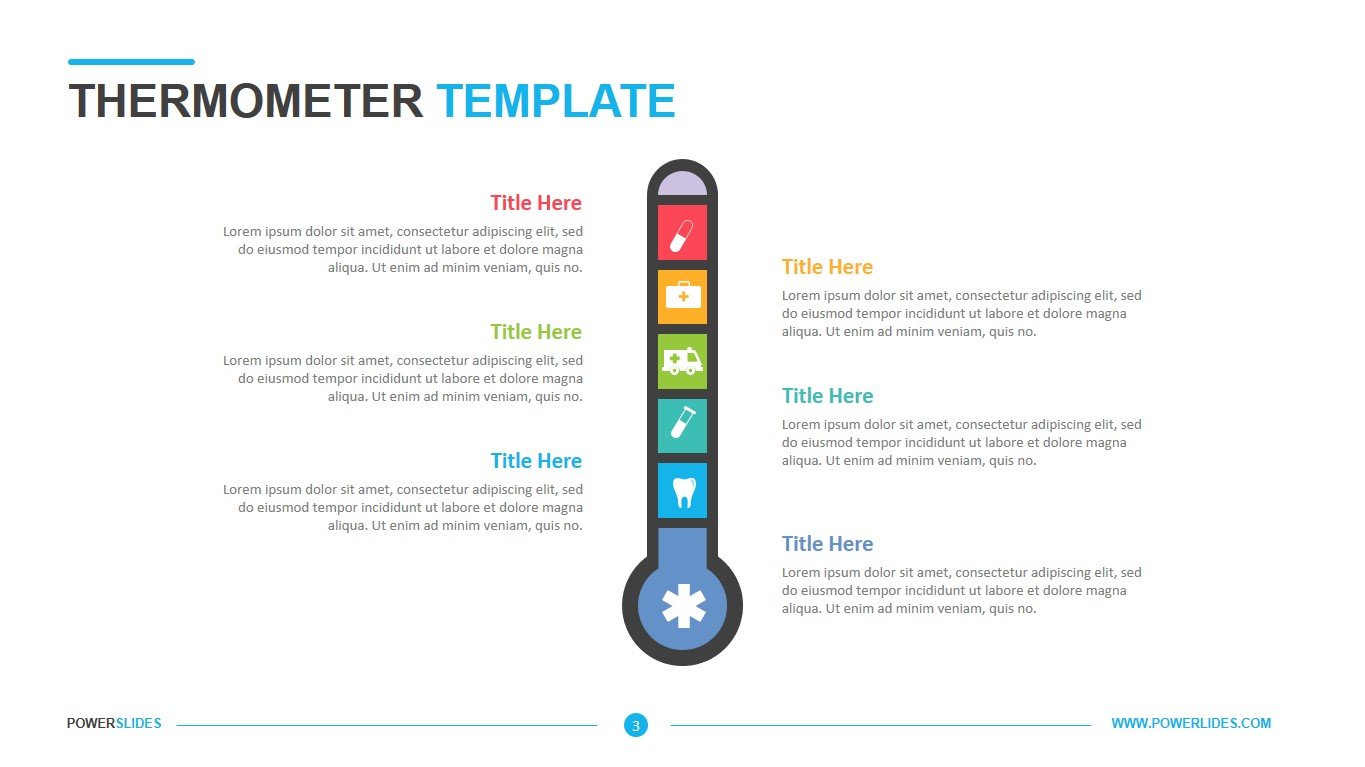
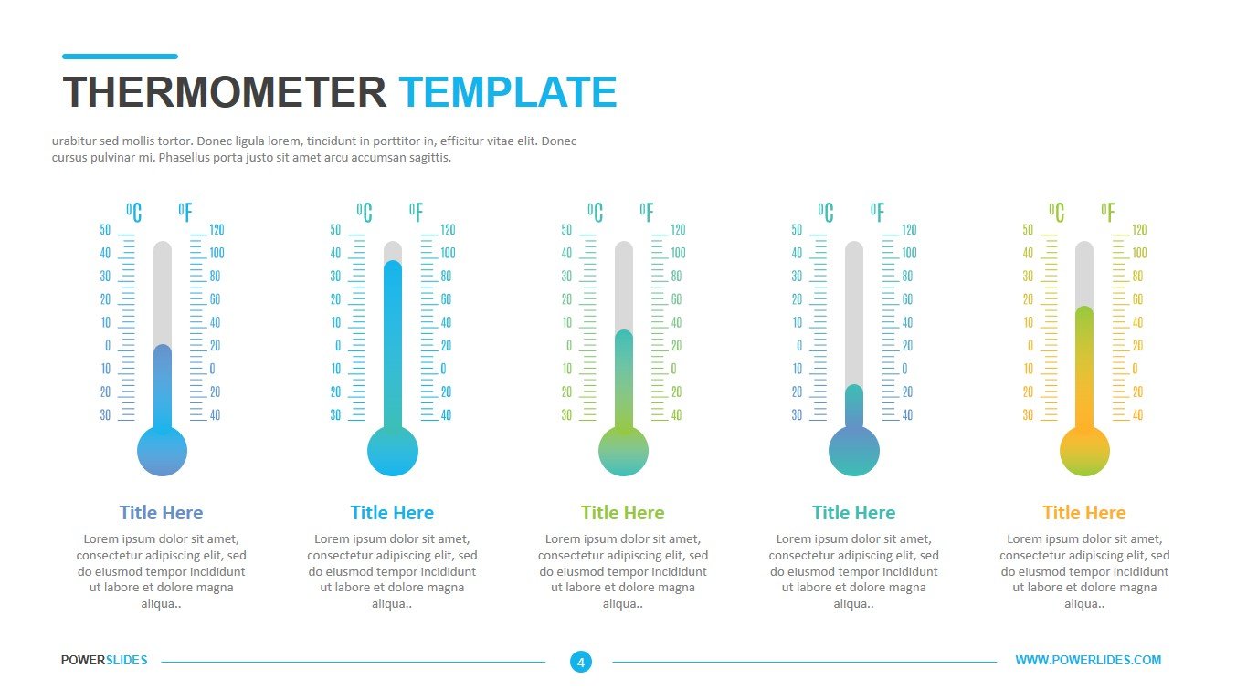
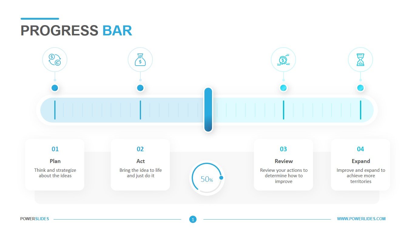
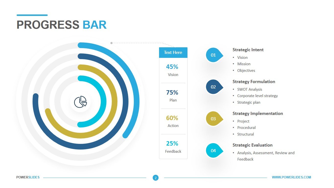
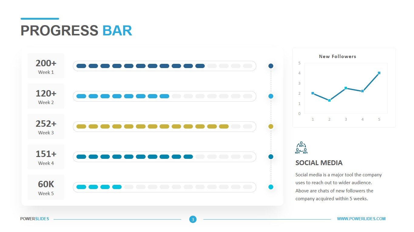
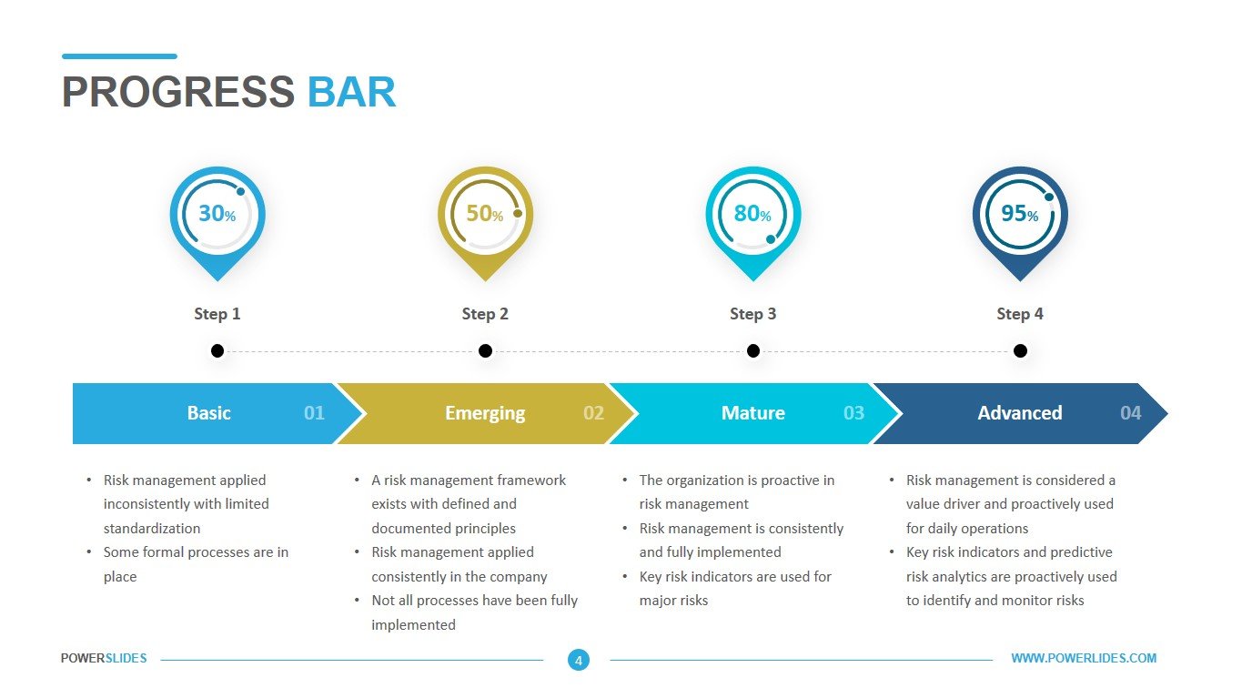
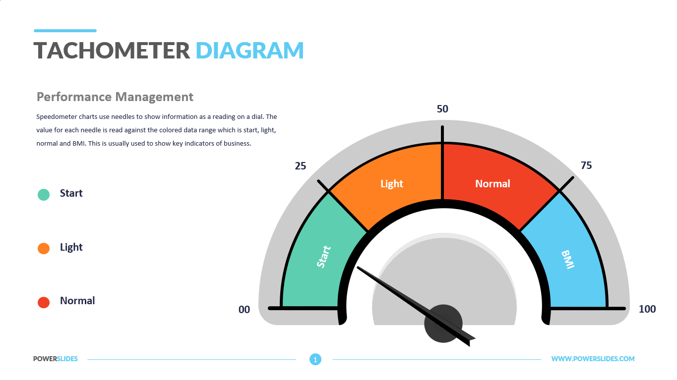
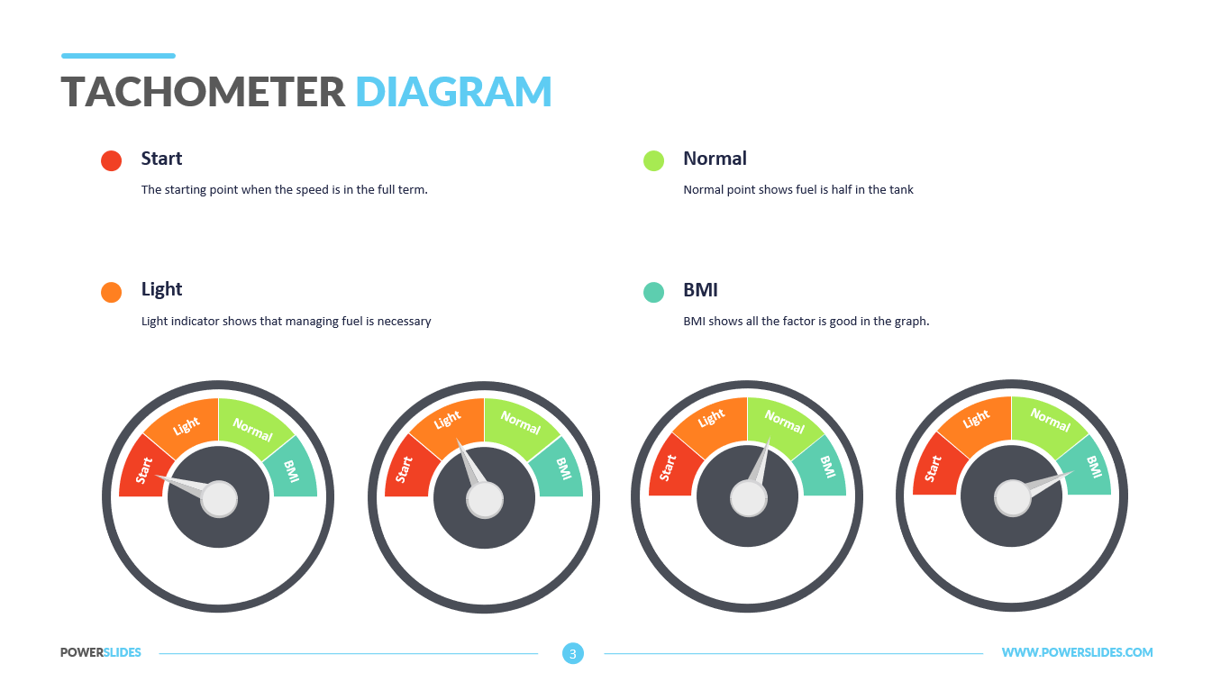
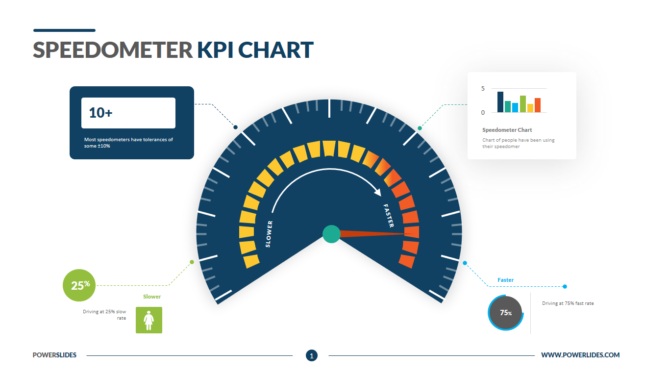
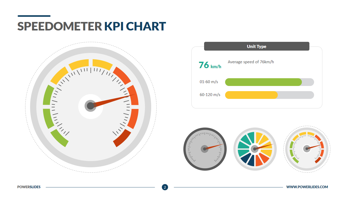
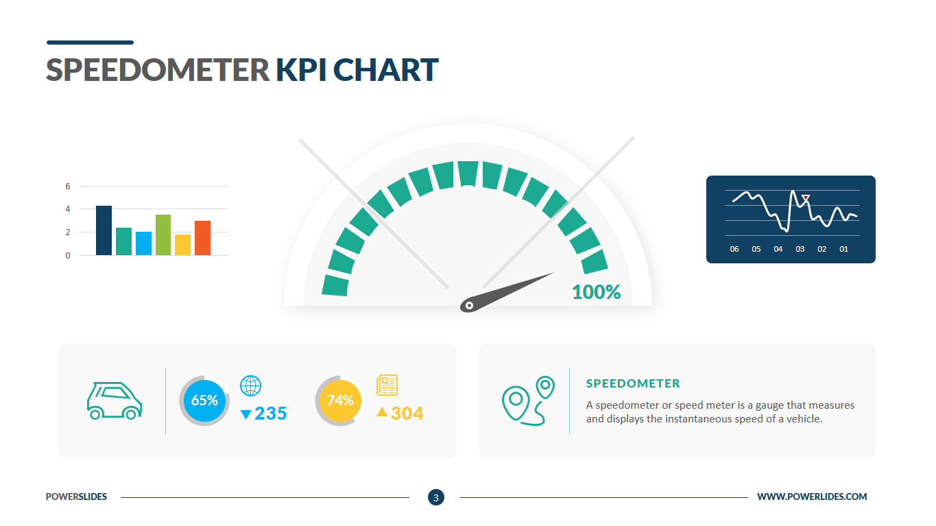
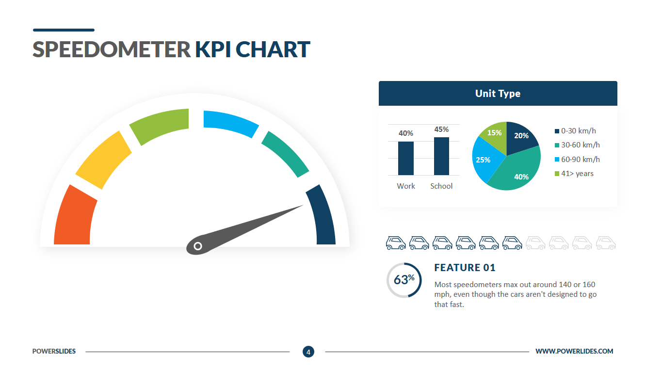
Gauges are a familiar metaphor and everyone can understand them. That’s why we’ve created a modern, simple template that mirrors a speedometer or gauge. A speedometer chart compares results against a predefined set of key performance indicators. The template is often used to represent team progress and sales performance. This straightforward visualization helps you explain the status of deliverables, programs and product launches to internal employees, executives and clients.
This template will be useful for company executives and department heads. You can use the slides from this template to visualize your company’s KPIs on one screen. For example, you can present the company’s profitability indicators, a graph of the company’s expenses and income, payments to shareholders, and planned investments. This approach allows you to immediately see the patterns between various economic indicators and make decisions based on the analysis of all financial indicators of the company.
Also, this template will be useful for heads of startups when preparing a reporting meeting with investors. You can present the main KPIs in detail and give a complete analysis for each of them.
Business trainers and university educators can use the slides in this template to prepare their courses on financial analysis or develop and implement KPIs in the enterprise. Financial analysts and bankers can use this template in their day-to-day work. For example, you can use this template when preparing weekly reports on the analysis of financial performance of key market players or large bank clients.
The PowerPoint template is 100% customizable and editable. Available in five design variations, the chart includes data call-outs, text descriptions, color-coded gauges, line graphs and bar charts. This dynamic visualization tool is perfect for displaying data-heavy information in a easy-to-comprehend manner. This template is most useful for team leads, strategic planners, marketers, financial analysts, project managers and operations consultants. This template has a large number of graphs and charts, and also has all the necessary tools to build a professional presentation. The Speedometer KPI Charts template will organically complement your old presentations and will be a great addition to your collection of professional presentations.


