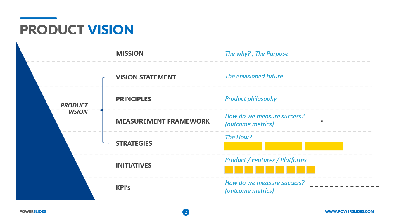
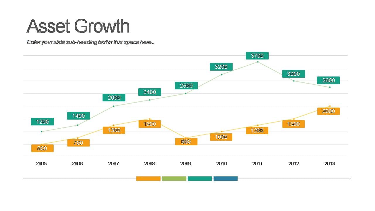
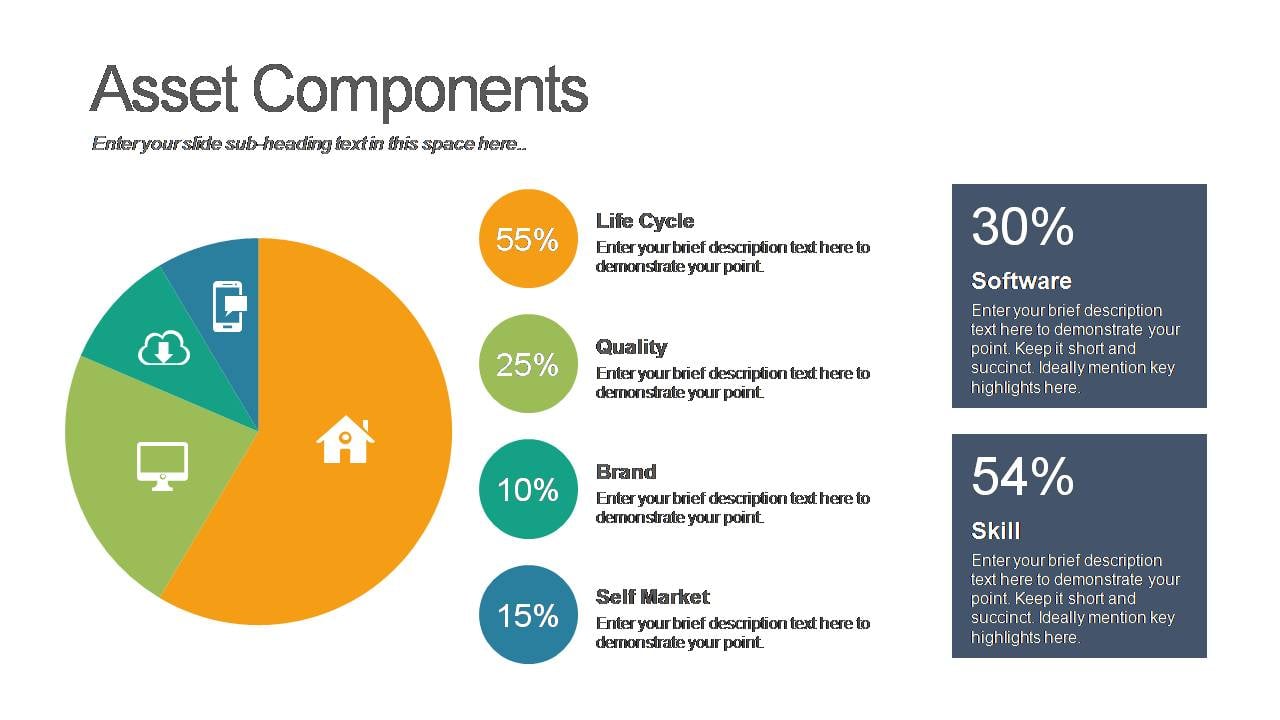
Bar Graph
What do you think of this template?
 (5.00/ 5)
5 ratings

 5 Slides
 File size: 16:9
 Fonts: Lato Black, Calibri
 Supported version

Product details
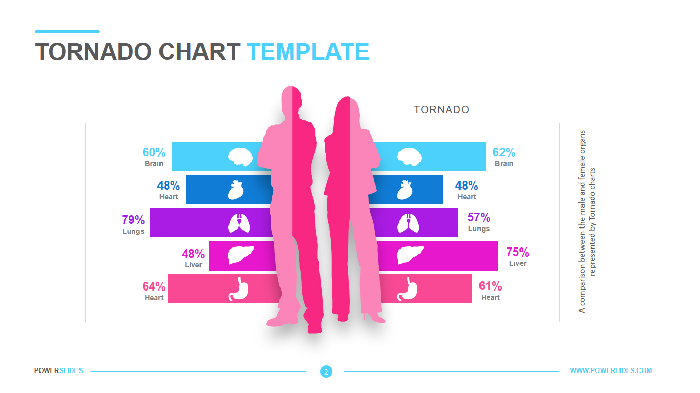
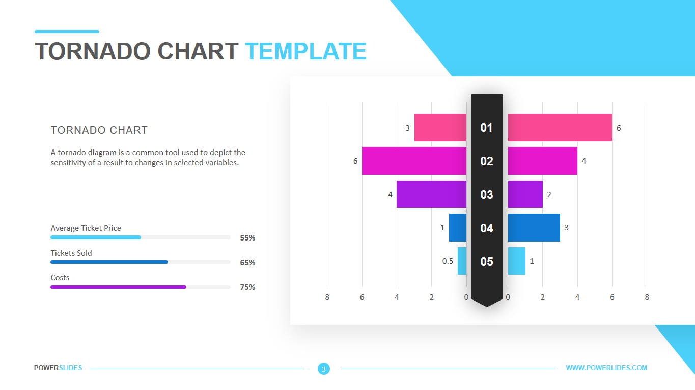
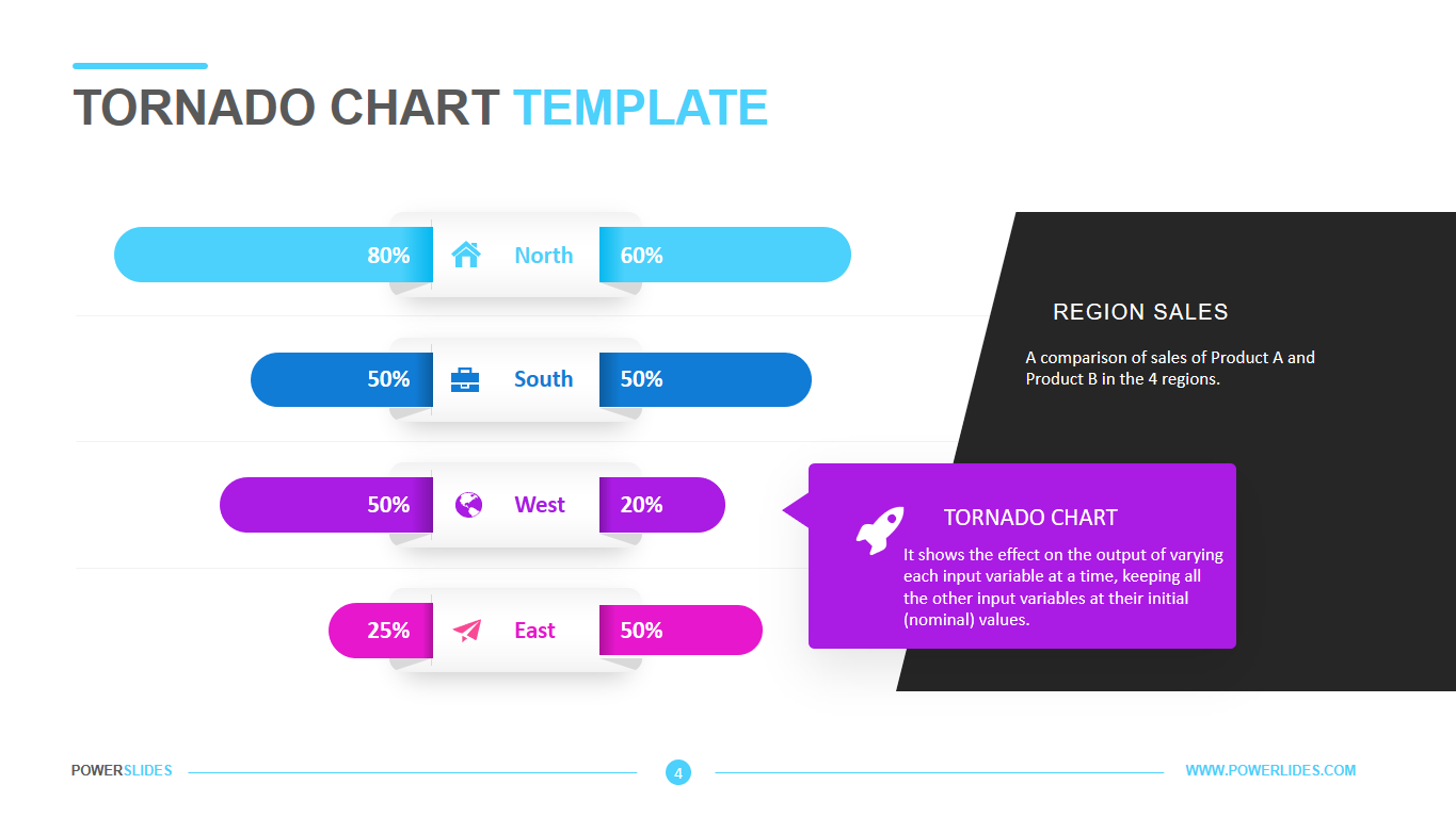
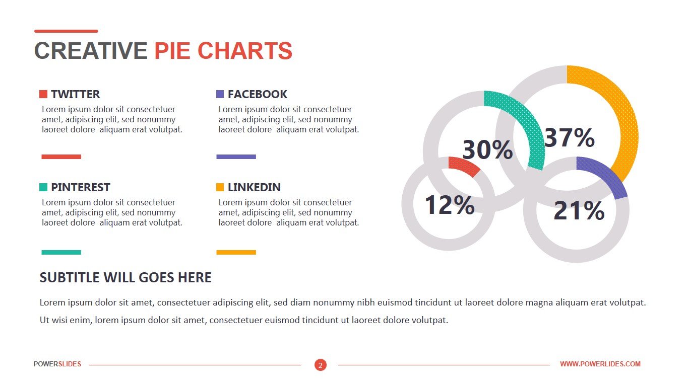
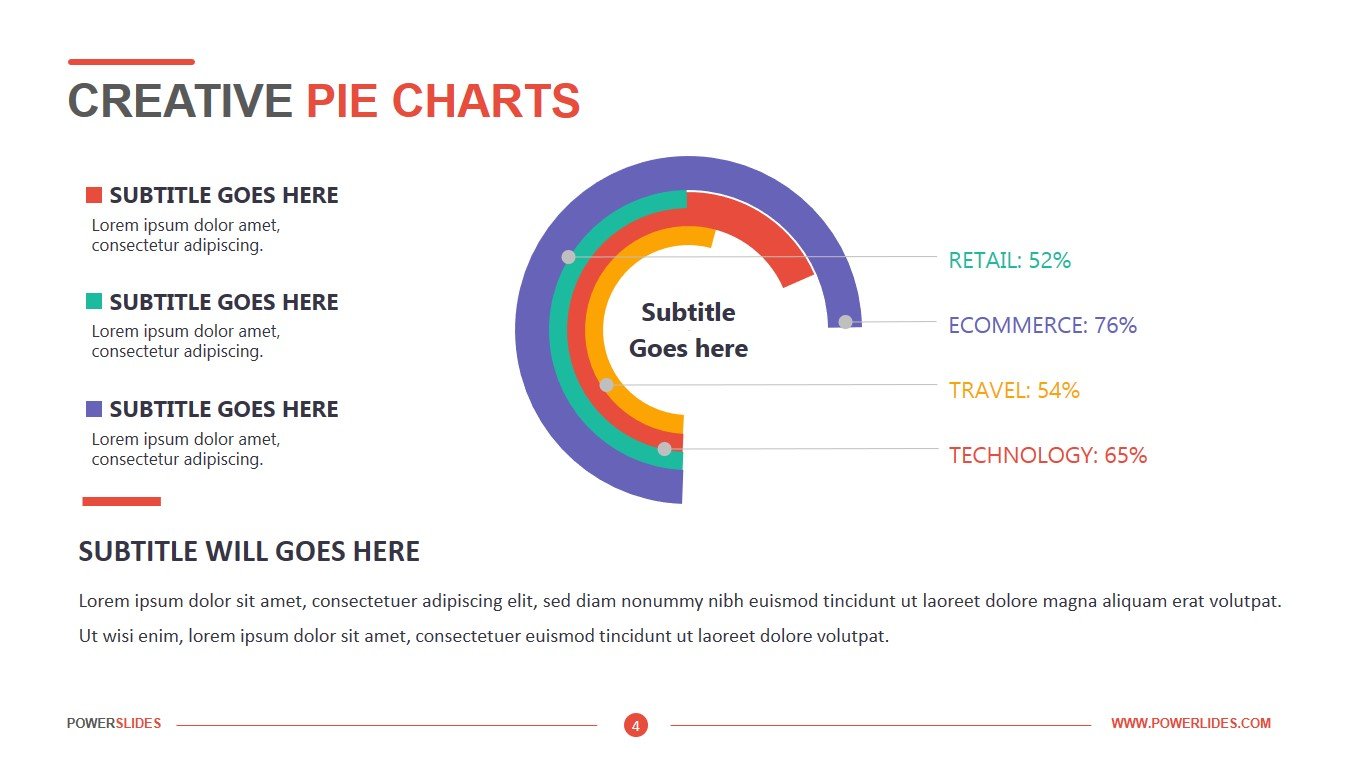
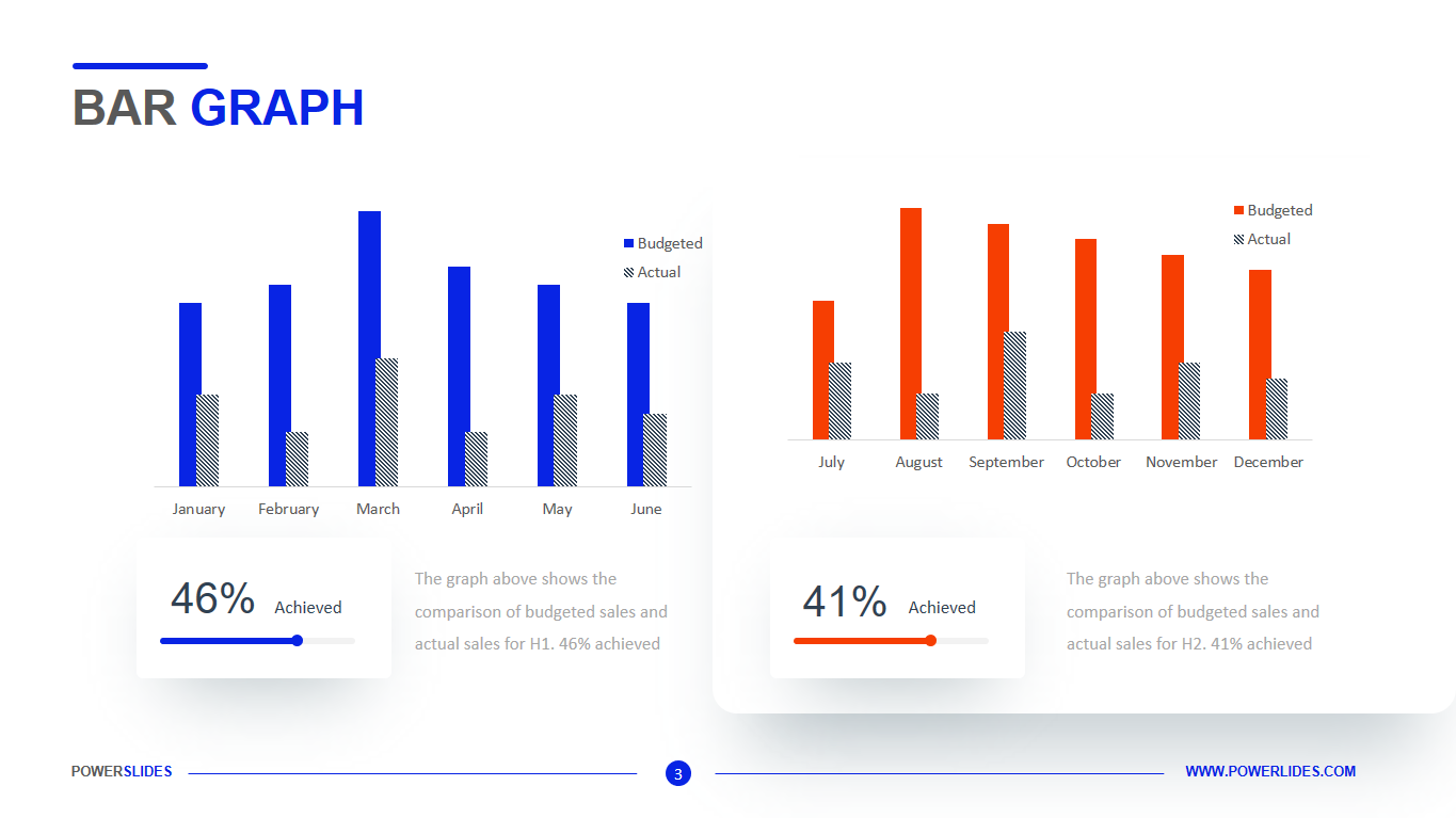
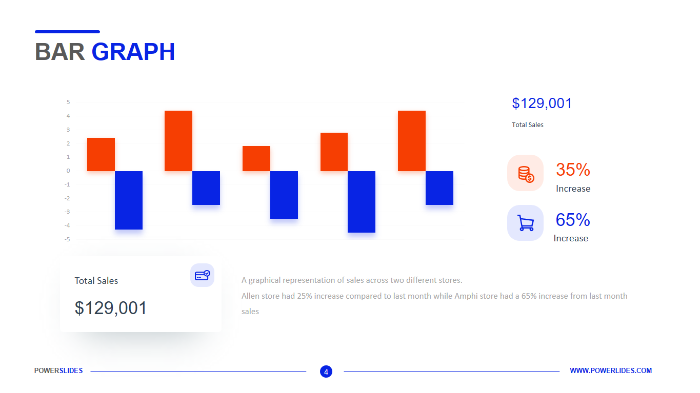
A bar graph is a chart that plots data using rectangular bars or columns (called bins) that represent the total amount of observations in the data for that category. Bar charts can be displayed with vertical columns, horizontal bars, comparative bars (multiple bars to show a comparison between values), or stacked bars (bars contain multiple types of information). Bar graphs are commonly used in financial analysis for displaying data. A stock volume chart is a commonly used type of vertical bar graph. The purpose of a bar graph is to convey relational information quickly as the bars display the quantity for a particular category. The vertical axis of the bar graph is called the y-axis, while the bottom of a bar graph is called the x-axis. When interpreting a bar graph, the length of the bars/columns determines the value as described on the y-axis. The x-axis could be any variable, such as time, or the category that is being measured, such as earnings per share (EPS), revenue, and cash flow. Some graphs may also have a legend that specifies what various colours represent, such as in a stacked bar graph. Bar graphs are ideal for comparing two or more values, or values over time. Data is displayed either horizontally or vertically. Single bar graphs are used to convey discrete values of an item within a category. Grouped bar graphs, also called clustered bar graphs, represent discrete values for more than one item that share the same category. Stacked bar graphs or composite bar graphs divide an aggregate total into parts. These parts are typically identified by utilizing different colours for each section. A bar graph is a way to display information. How the data is chosen to be displayed could affect its interpretation. For example, if too large of a scale is chosen, then the data may appear insignificant — when in fact it could be very significant, but the scale doesn’t allow for an appropriate comparison. Bar graphs may also make data look compelling when it actually could be lacking substance. As with all data, verify the source it comes from, and make sure it is from a large enough pool or sample.
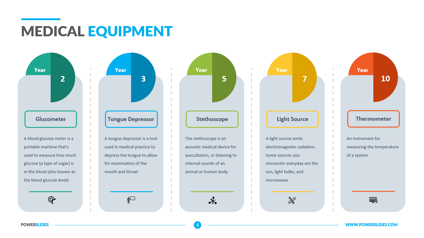
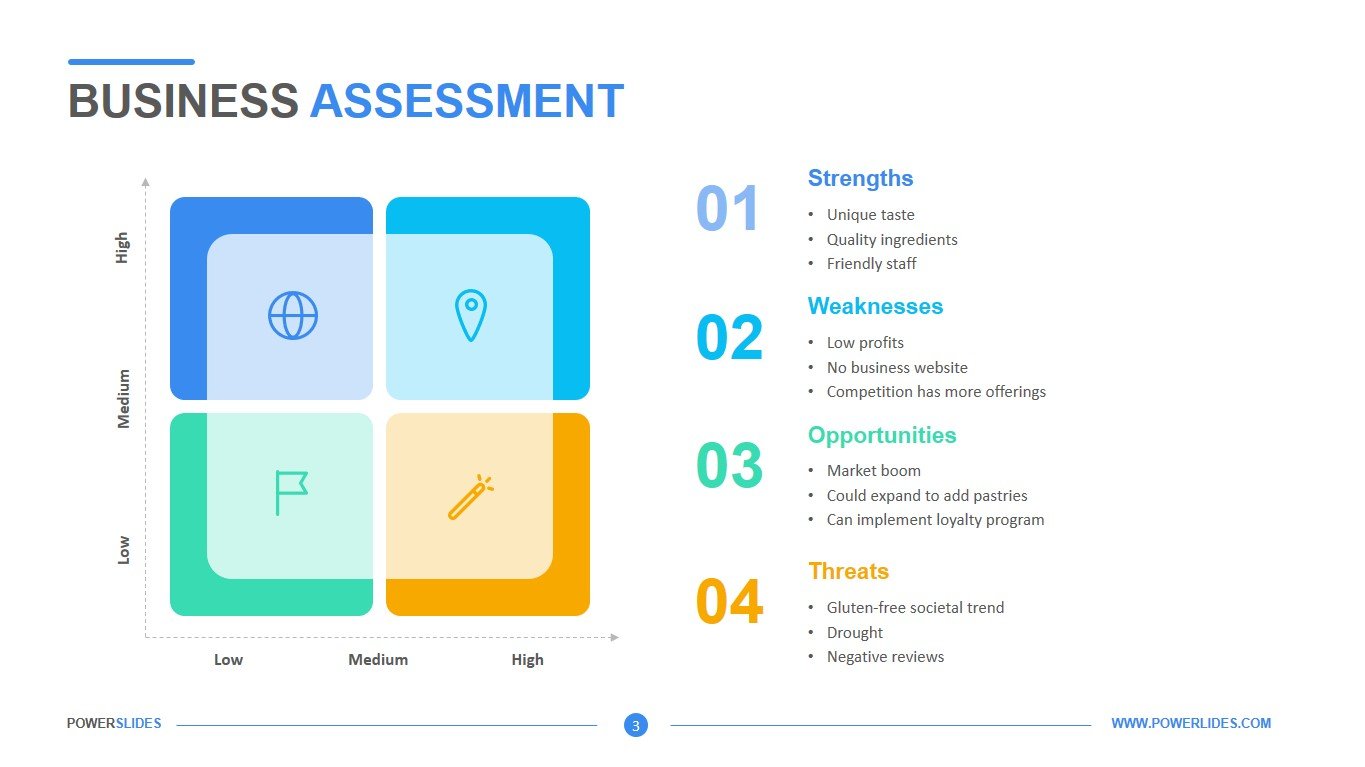
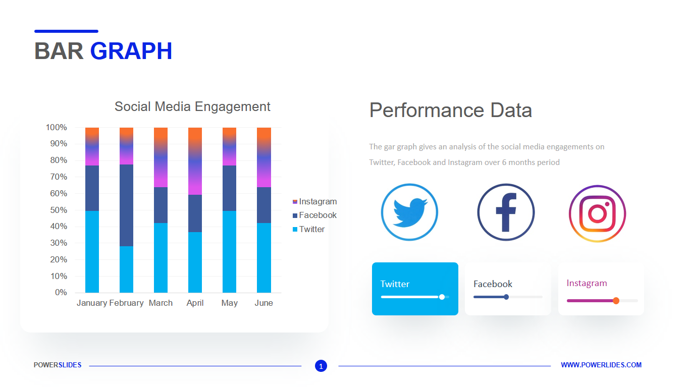
The Bar Graph template consists of five slides that contain a wide variety of Bar Graphs. This template will be useful for specialists who often use various data analysis in their work. For example, the first slide will be useful for marketers and advertising professionals. You can present an analysis of the views of your posts on Twitter, Facebook, Instagram. The second slide can be used by hospital staff to determine the number of patients for each specialized department in the hospital. Also, this template will be useful for financiers and economists in their daily work. Stockbrokers can also use this template when analysing the behaviour of stocks on the stock exchange. The slide will also be useful for investment companies and startups.


