Empathy Map
What do you think of this template?


 (3.40/ 5)
34 ratings

 4 Slides
 File size: 16:9
 Fonts: Lato, Calibri
 Supported version
PPT 2010, PPT 2013, PPT 2016
Supported version
PPT 2010, PPT 2013, PPT 2016

Product details
Are you preparing a study on consumer behavior? Want to provide information about users’ thoughts, feelings? Do you know what motivates them to do just that? If you are a UX professional, then this template is for you. Our Power Slides will help you present your user research in a beautiful and understandable way. We bring to your attention our go-to Empathy Map Template.
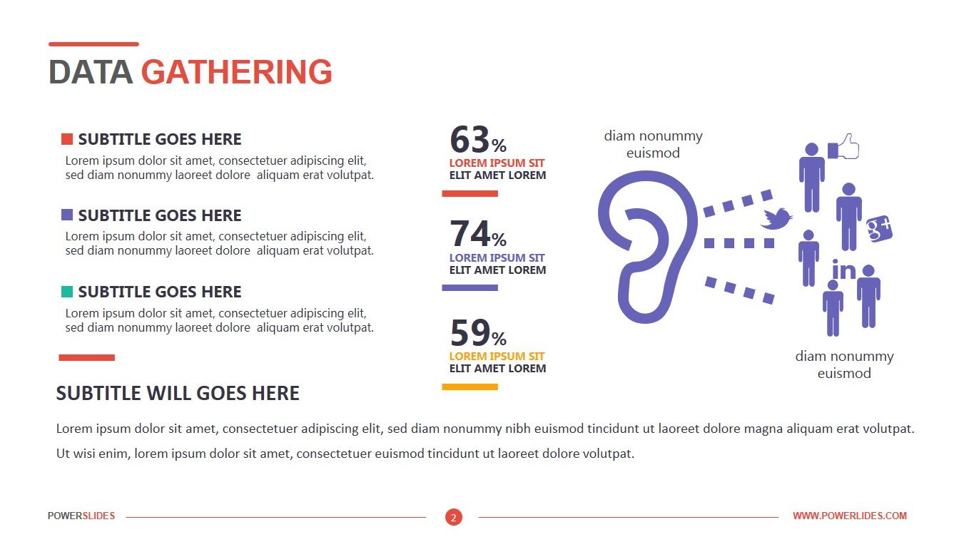
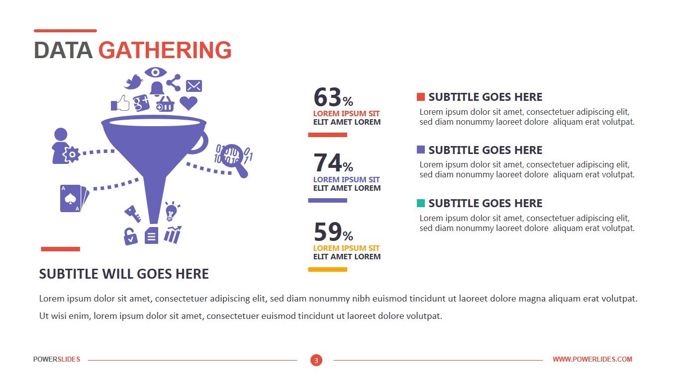
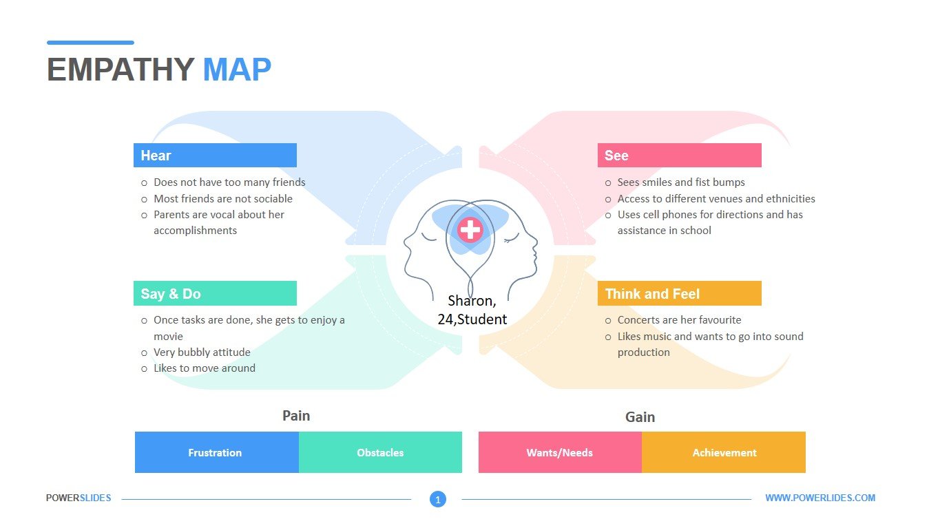
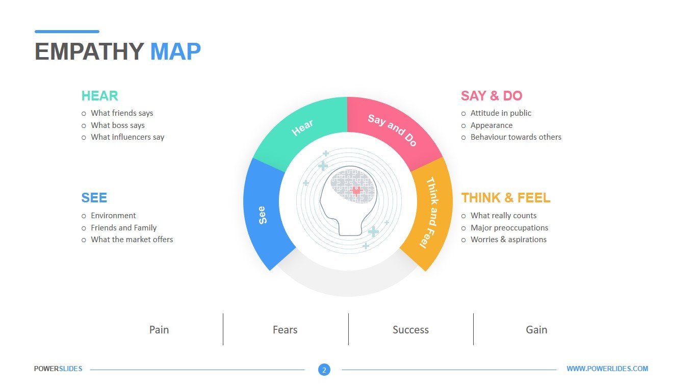
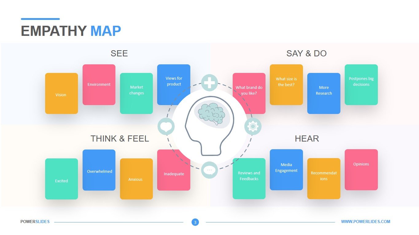
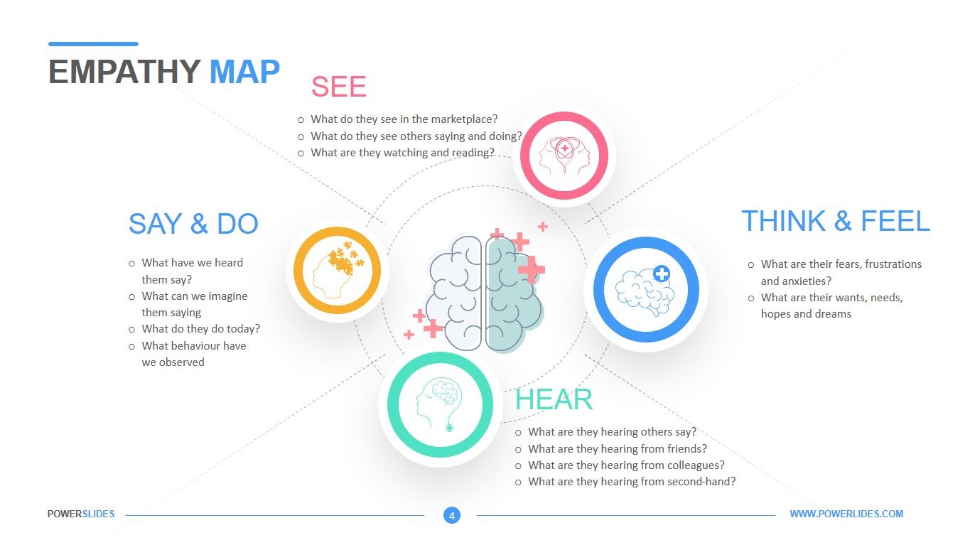
What is special about this template and why this one is ideal for those involved in project thinking. This template is ideally suited to your needs for providing information about users – their thoughts, actions, feelings when choosing a product. Empathy Map is divided into 4 main quadrants. In the first quadrant, how the user perceives information by ear. In the second quadrant, what the users say and do. The third quadrant is the data on the visual perception by users of product information. The fourth quadrant is a description of the user’s emotional state and thoughts when interacting with the product. The slides of our Empathy Map Template allow you to present information on all four quadrants in a form convenient for your audience. The first slide shows what all four quadrants have in common. On this slide, it is also possible to indicate the “pain” of the client and his benefit from the product. The second slide allows you to enter information in the form of basic descriptions for each of the actions – hear, say & do, see, think & feel. The third slide has more visual effects, which are divided into several colors. Each colored rectangular area describes certain feelings, actions, thoughts. The fourth slide is divided into four sections, each of which corresponds to a certain type of perception.
A bit about presentation design. The color scheme of the slides is generally neutral and combines both warm and cold colors. The slide has cool colors on the left and warm colors on the right. This will keep the attention of the audience and help to better perceive the information that you prepare. Some slides are almost completely filled with infographics, but this does not prevent the audience from perceiving information. In this case, it even enhances the understanding of the presented data on the study of behavioral factors. Text color and infographics do not contrast with each other and organically complement each other. The size of the main elements is harmoniously combined with the selected areas and brief descriptions. The main design decisions that distinguish this presentation from others, of course, are beautiful graphic images of the human brain. These large graphic elements draw the attention of the audience to the main aspects of your report. A presentation with a white background seems lighter and allows listeners to better understand the information. Empathy Map Template will help you to make your research in the field of project thinking a real masterpiece and help the audience understand what really drives users when deciding on a product.


