PowerPoint Heatmap
What do you think of this template?

 (3.00/ 5)
3 ratings

 4 Slides
 File size: 16:9
 Fonts: Lato Black, Calibri
 Supported version
PPT 2010, PPT 2013, PPT 2016
Supported version
PPT 2010, PPT 2013, PPT 2016

Product details
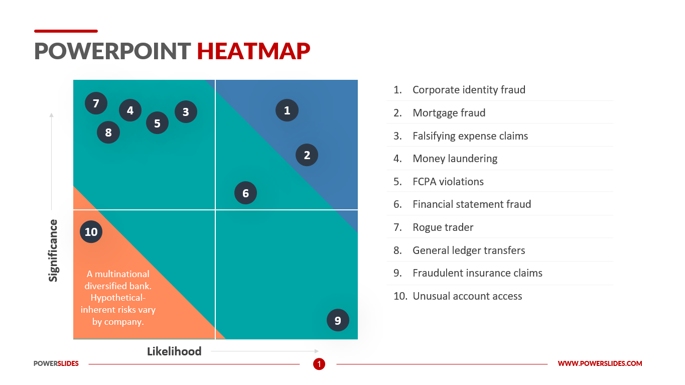
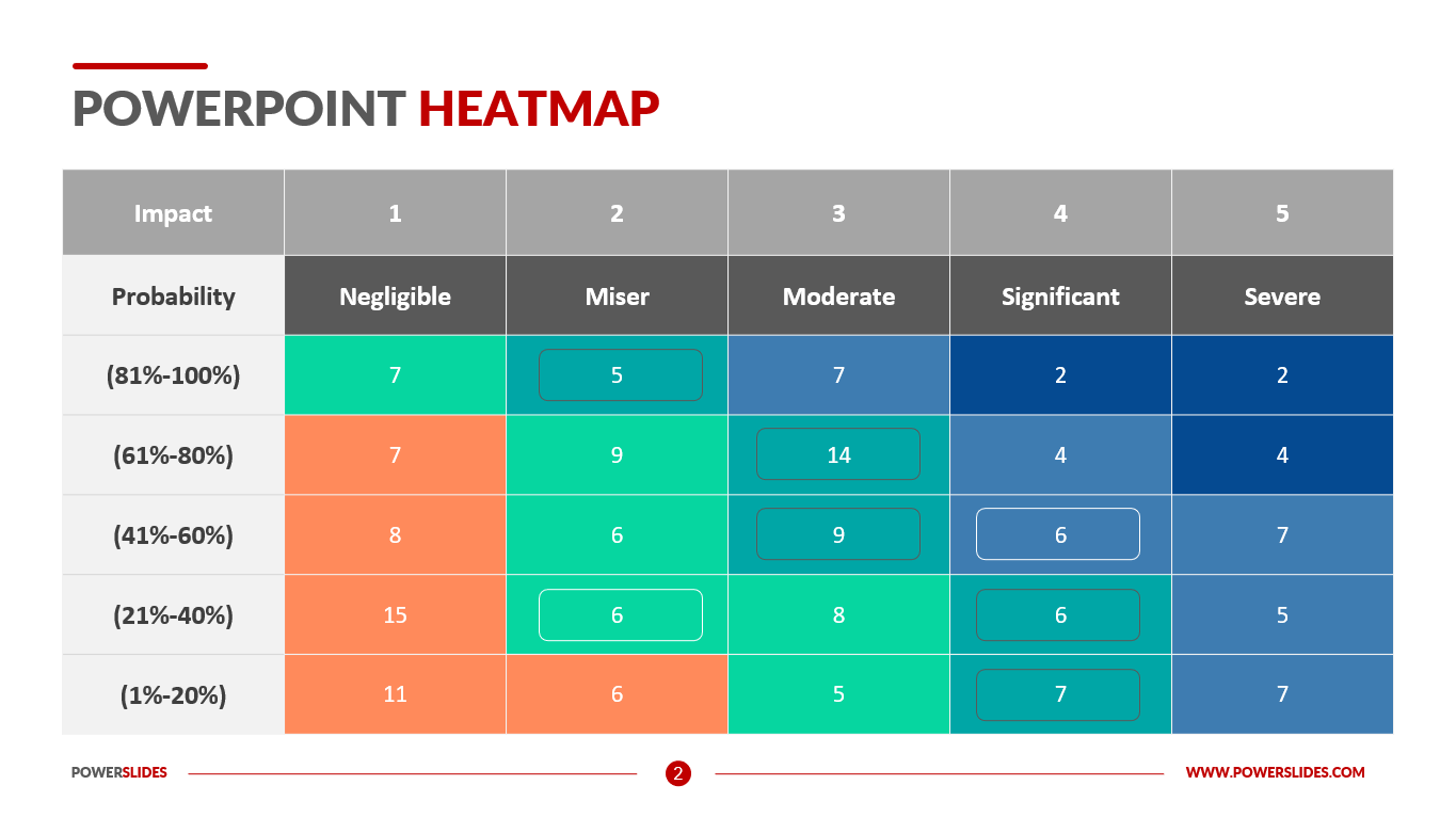
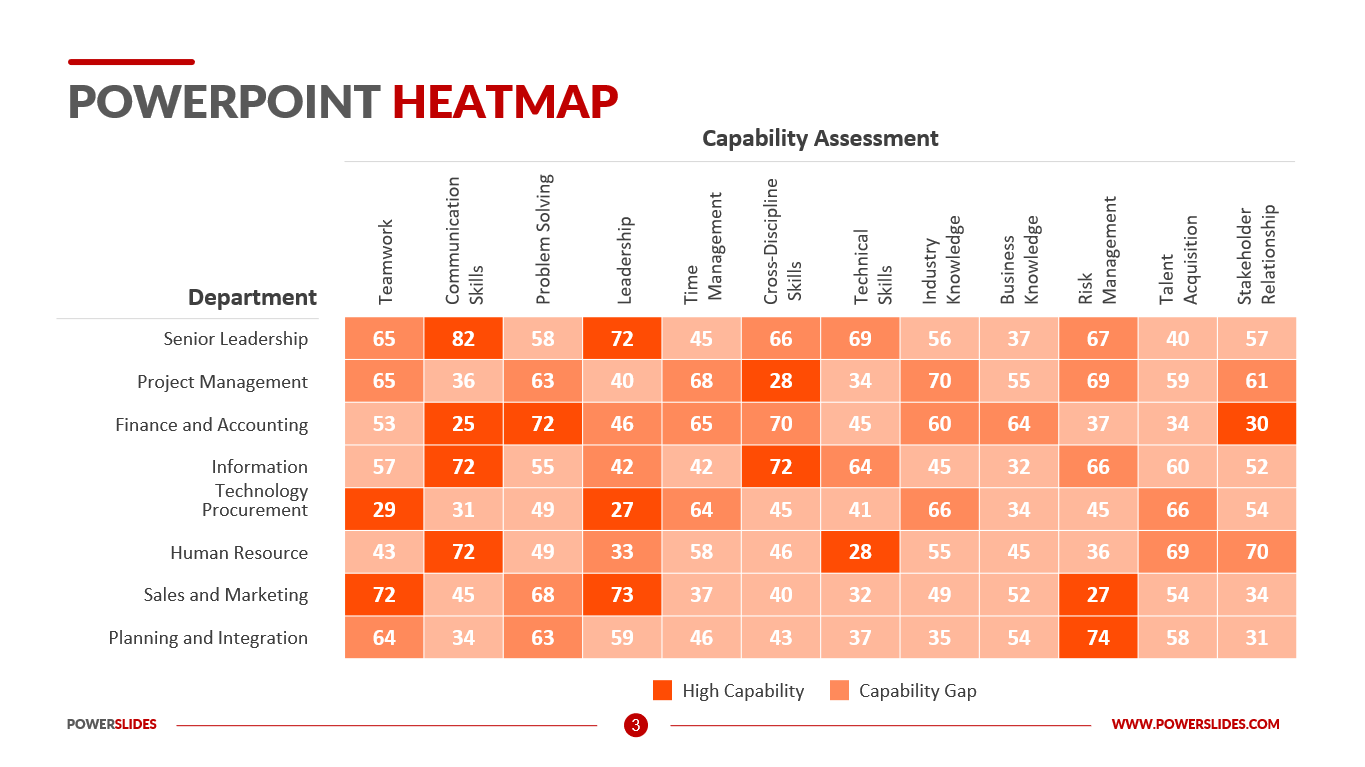
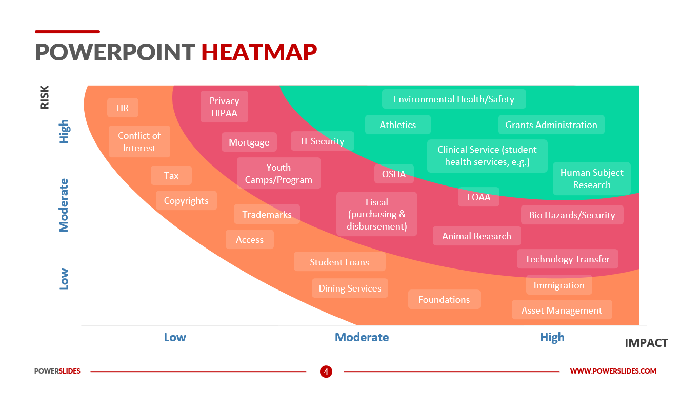
Heatmaps are a method of representing data graphically where values are depicted by colour, making it easy to visualize complex data and understand it at a glance. Heatmaps can be created by hand, though modern heatmaps are generally created using specialized heatmapping software.
A variety of colour schemes can be used when creating heatmaps, including grayscale and rainbow. Rainbow-schemed maps are often preferred, though, since humans can perceive more shades of colour than they can of grey.
Generally speaking, warmer colours—reds and oranges—represent more used or more popular sections, while cooler colours—blues and purples—represent less frequently used sections of your map. Each heatmap works differently, though. For example, click maps typically use different shades of one colour – the darker the colour the more that area is clicked.
Heatmaps are visual representations of user reactions on various pages on your website, providing visual context for easy analysis. They help you gather visitor behaviour insights, which you can then use to customize your website to better meet visitors’ expectations—increasing conversions, reducing bounce rates, or boosting sales, among other goals. How a heatmap is created depends on the type. There are multiple types, but they can generally be bucketed into two categories: interaction and attention heatmaps.
Interaction heatmaps measure different types of engagements and use tracking codes to record interactions between a user and a website, like clicks, scrolls, mouse movements, and more. Attention heatmaps are more complex, and monitor how users look at your website content by monitoring or predicting their eye movements. Using heatmaps, marketers can understand which parts of a page or an advertisement people’s eyes gravitate toward, and which parts tend to be ignored.
Heatmaps are helpful because they can provide an efficient and comprehensive overview of a topic at-a-glance. Unlike charts or tables, which have to be interpreted or studied to be understood, heatmaps are direct data visualization tools that are more self-explanatory and easy to read.
Heatmaps can also be more user-friendly for consumers. In particular, they benefit those consumers not accustomed to reading large amounts of data because they are more visually accessible than traditional data formats.
This template will be primarily useful for advertising professionals. You can use the slides in this template when preparing an ad campaign performance report. For example, you can provide data about the most viewed ad sites or types of ad promotion channels.
Analysts can use this template to prepare market financial information and present investment data from cool to warm colors. Also, this template can be used by programmers when analyzing user preferences on the site.
Powerpoint Heatmap template will be useful for marketers and specialists of the advertising department, analysts and startups. All slides in this template have all the tools you need to build a professional presentation. You can customize colors, block sizes and infographics yourself. The Powerpoint Heatmap Template will be a worthy addition to your collection of professional presentations.


